Watson operates in a space where decisions carry weight. Board appointments. CXO hires. Leadership choices that shape companies for decades. For over 20 years, Watson has advised Flipkart, Amazon, Walmart, and India’s most influential boards. The work was serious. The outcomes were proven. But the digital presence did not reflect the gravity of ₹3 crore decisions being made behind closed doors.
After the new experience system launched, the shift was immediate.
1. Founders spent more time understanding Watson’s philosophy, not just its services.
2. Board members engaged deeper with process and people, not credentials alone.
3. Trust signals became clearer, quieter, and stronger.
4. And most importantly, Watson’s website began to feel like a place where leadership decisions actually belong.
That is the power of perception led design. When clarity is designed, confidence follows.
The Context: When Serious Work Looked Ordinary
Executive search is not hiring. It is judgment. It is foresight. It is responsibility.
Yet most leadership firms look like recruiters online. Metrics heavy. Noise driven. Transaction oriented.
Watson was different in reality. But the digital experience failed to communicate that distinction.
The Challenge: To Design for the Top One Percent
Watson does not serve job seekers. It serves founders, investors, and boards.
The challenge was to design a system that feels strategic, not salesy understated, not empty confident, not loud
A site that speaks to people who already understand power.
The Insight: Why Trust Needs Fewer Words
Most firms overwhelm with statistics. Watson didn’t need many.
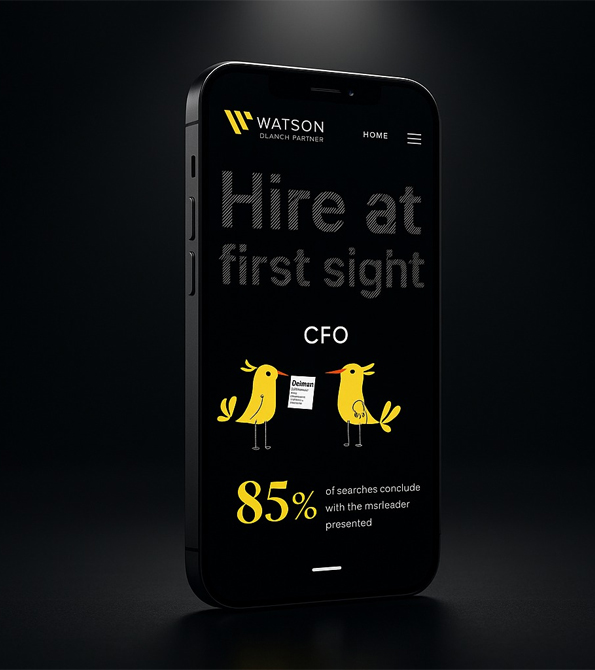
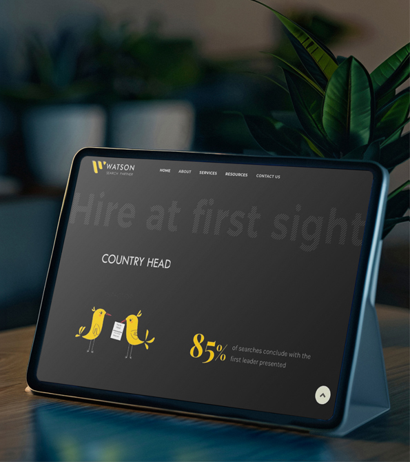
One number said everything. 85 percent of searches close with the first leader presented.
Design insight was clear.
Memory beats volume.
One truth remembered is stronger than five claims ignored.
We built the experience around clarity.
Our strategy revolved around three principles
– Purpose signal judgment, not volume
– Design remove noise until meaning remains
– Tone calm, precise, and assured
The website had to feel like a conversation, not a pitch.
The Strategy: Designing Focus as a System
The Hero Section: Making Focus Visible
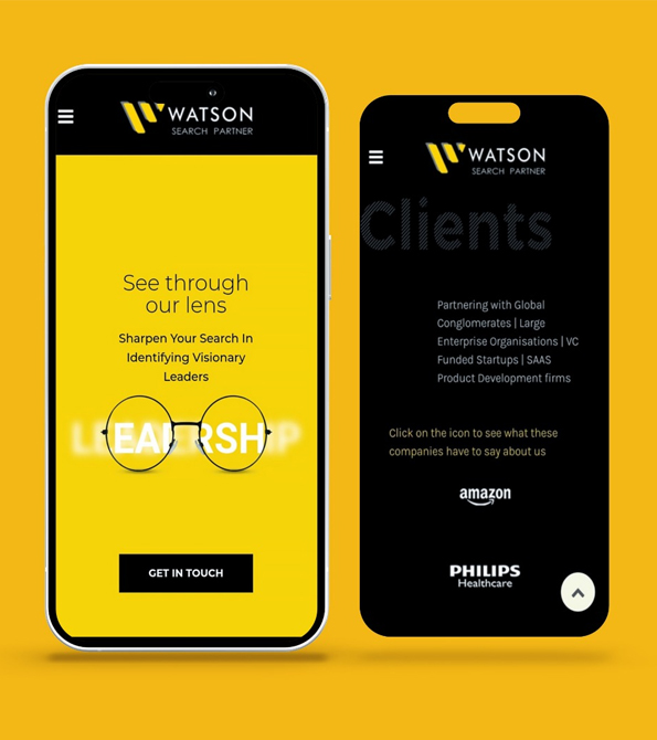
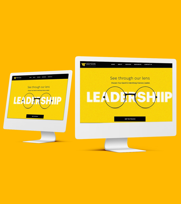
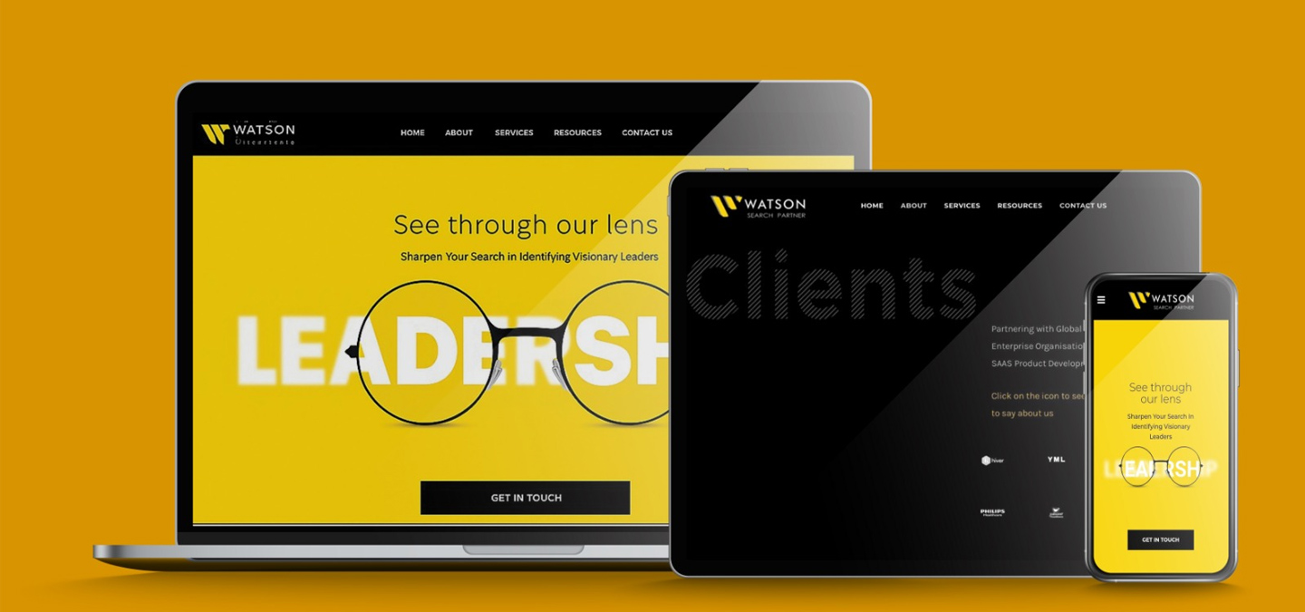
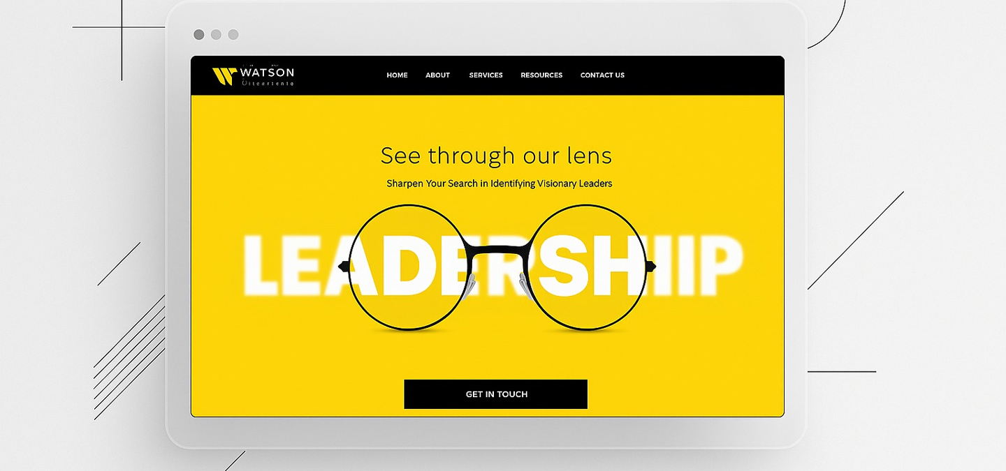
The word LEADERSHIP begins blurred. Then sharpens through glasses.
A simple metaphor. For Watson’s work. And for great design.
Design does not add. It brings focus.
The Experience Flow: Proof Before Promise
We structured the site like trust is built in real life.
– proof first
– process next
– people last
Every scroll earned. Every section sequenced. Nothing rushed.
The experience mirrors how boards actually decide.
Every detail was intentional.
– typography readable even in low light
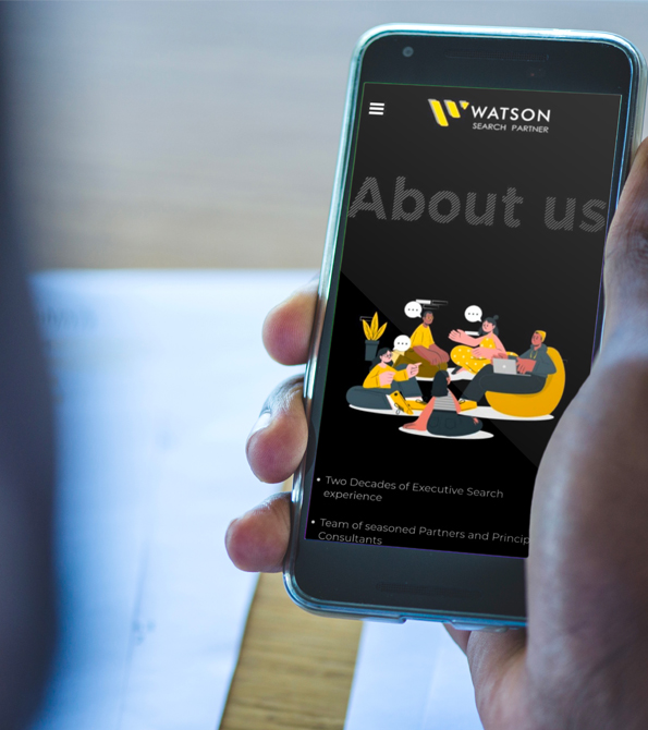
– whitespace designed for long mobile reading
– CTAs placed with restraint, never urgency
– hover states designed to feel like decisions
The site does not sell. It signals.
The Interaction Design: UX That Thinks Like a Leader
sharp icons
modular blocks
navigable logic
Complex judgment was translated into visible structure. Methodology stopped feeling abstract. It felt like insight.
The Methodology Layer: Making Thinking Tangible
Watson’s search process was reduced into a clear system.
The Proof Layer: Real People, Real Outcomes
This was not a logo wall.
– CTOs placed at Flipkart
– product leaders at Pine Labs
– design heads at Amazon
Every profile represented a real leadership decision. Watson does not search resumes. It places trust.
The Balance: Global Authority, Human Detail
Watson works with Fortune 500 enterprises and seed stage SaaS founders
The design had to hold both worlds.
– global in tone
– personal in detail
– elite without distance
One system. No split personality.
conversations moved from cost to confidence
decision makers stayed longer on the site
Watson’s retained search positioning became unmistakable
the brand began to feel like an advisor, not a vendor
Nothing changed in what Watson does. Only how it is experienced.
The Tangible Impact: When Perception Shifted
After launch, the change was clear.
The Achievement: Turning a Firm Into a Signal
Watson’s website became an extension of its judgment. A quiet but powerful filter.
For Beryl, this project proved that in leadership branding, subtraction creates strength.
What This Means for Professional Services Brands
Trust cannot be designed loudly. It must be designed carefully.
Watson shows that when design respects intelligence, it earns authority.
Our Perspective: Why Design Is Memory Architecture
Design is not decoration. It decides what people remember.
By focusing on one truth, one flow, and one feeling, Watson’s digital presence now carries the same weight as its real world decisions.
What We Delivered
Each element was designed to reduce noise and increase trust.
digital brand strategy
information and content architecture
UX and interaction design
leadership storytelling framework
proof and credibility system
Beryl understands that some brands are built in silence. And design must respect that silence.
Our approach blends psychology, hierarchy, and restraint to design for decision makers.
The Beryl Edge
In leadership, clarity is kindness. Noise is weakness.
Watson reminded us that the strongest brands don’t ask for attention. They command it.
What We Learned
FAQs
Why did Watson need a redesign if it was already successful
Because success without articulation limits trust at scale.
Why focus on one metric instead of many
Because decision makers remember clarity, not quantity.
What makes Watson different from recruitment firms
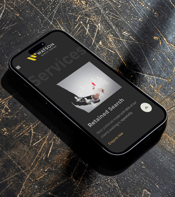
Watson operates on retained search and board level judgment, not transactional hiring.
Why is restraint important in leadership branding
Because authority is signaled through confidence, not volume.
Why was Beryl the right partner
Because Watson required perception design, not promotion.