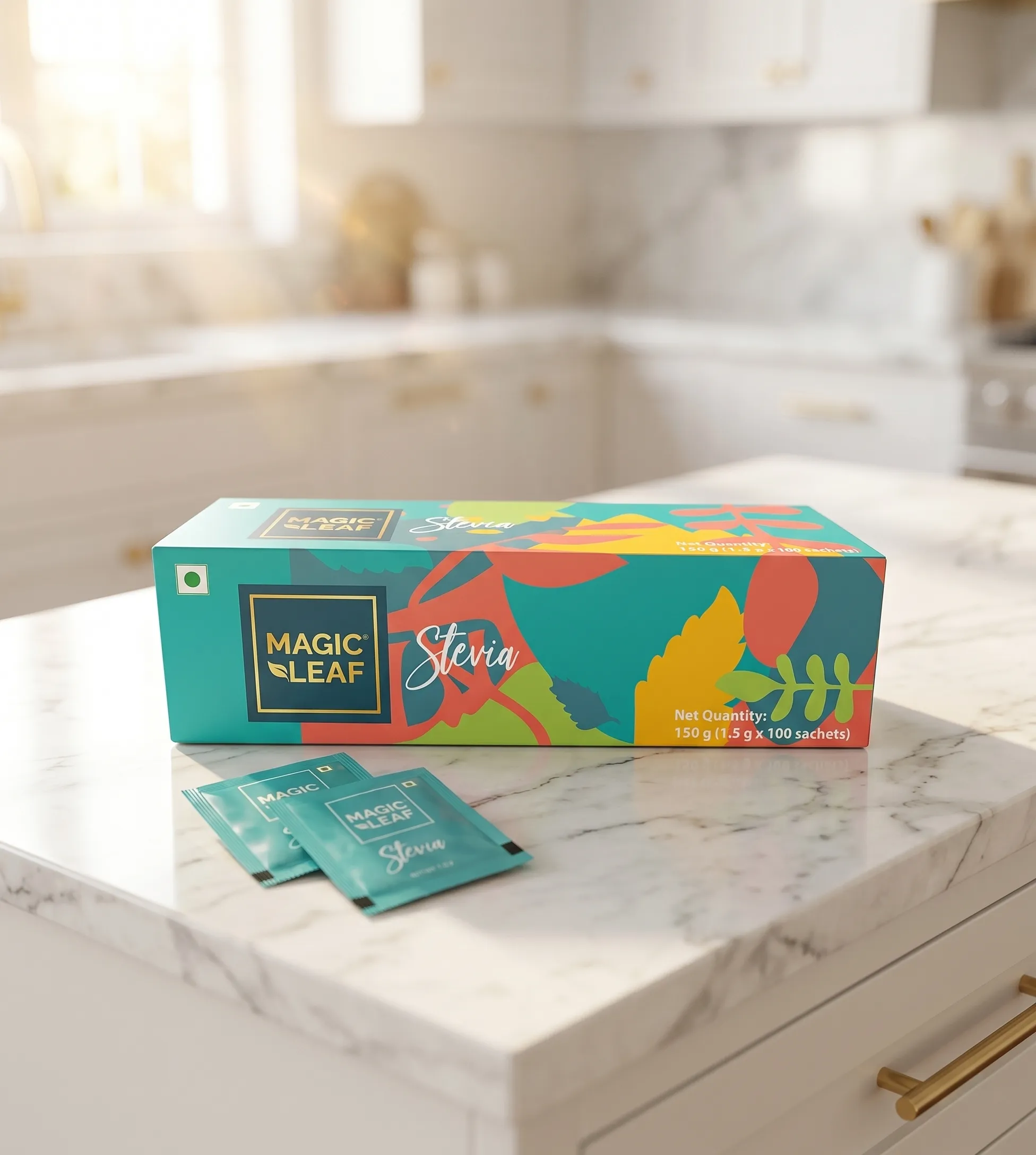
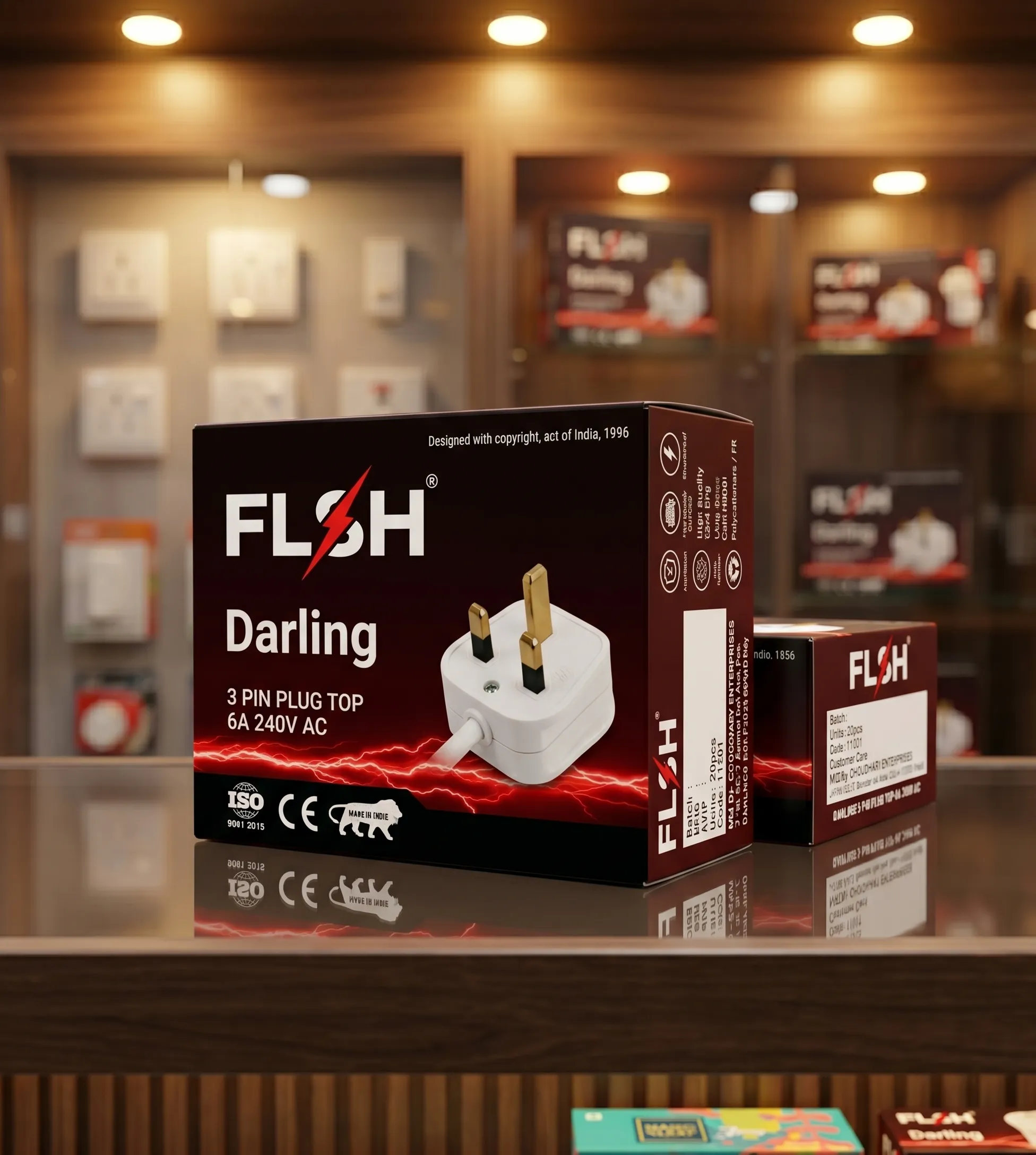
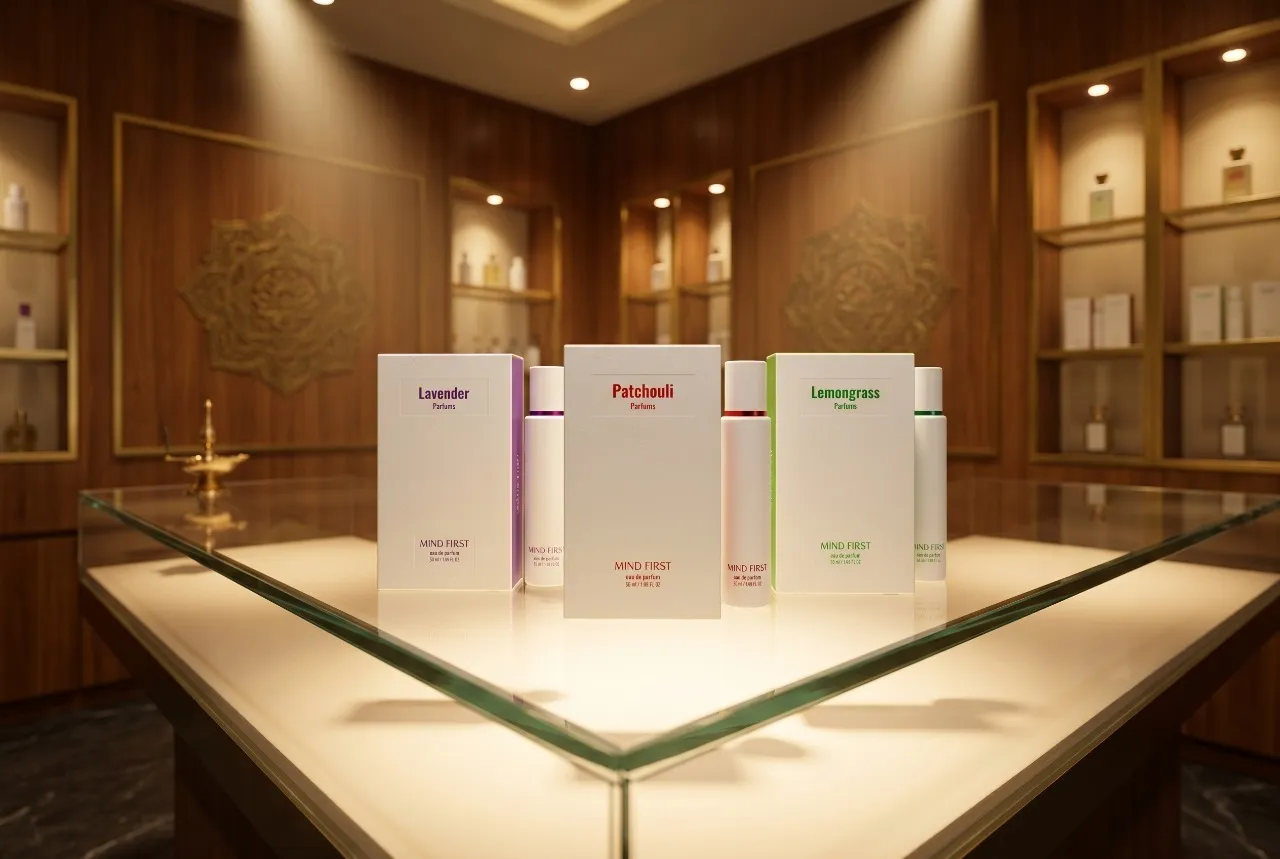
Mono carton packaging refers to paperboard based folding cartons used across pharmaceuticals, cosmetics, food, and consumer goods. These cartons are often the first physical layer of brand communication, carrying both regulatory information and visual identity. Despite their widespread use, most mono cartons are treated as compliance driven formats rather than design opportunities. Studies indicate that structured packaging with clear hierarchy can improve product recognition by over 30 percent. The challenge was to transform mono cartons from functional boxes into premium brand assets that communicate clarity, credibility, and value.
After the new packaging design launched, the impact was immediate.
1. Shelf recognition improved as hierarchy and layout became clearer. 2. Consumer trust increased due to better information structuring. 3. Visual consistency strengthened across product lines. 4. The system scaled efficiently across multiple SKUs without dilution. 5. And most importantly, the packaging elevated brand perception within a highly competitive retail environment.
That is the power of mono carton packaging done right. When structure meets design precision, packaging becomes a brand asset.
The Context. When Packaging Was Treated as a Formality
Mono cartons were everywhere, but rarely designed well. Too cluttered. Too technical. Too repetitive. Too forgettable.
The problem wasn’t the format. It was the lack of design thinking. Most cartons existed to carry information, not to communicate value.
The Challenge. To Design Within Constraints Without Losing Impact
The brief was clear.
Design mono cartons that meet compliance while elevating brand perception.
It needed to be informative but not overwhelming.
Structured but not rigid.
Premium but still practical.
A system that works across categories and regulatory needs.
The Insight. Why Most Mono Cartons Fail
Information overload kills clarity.
Research showed
poor hierarchy reduces readability significantly
excessive text overwhelms consumers
inconsistent layouts reduce brand recall
* lack of whitespace creates visual fatigue
Consumers do not read everything.
They scan for what matters.
Packaging must guide that scan.
We approached mono cartons as structured communication systems.
Our strategy revolved around three principles
– Purpose, deliver clarity and compliance – Design, create hierarchy and visual balance – Precision, ensure consistency across formats
The goal was not to fit information. It was to make information usable.
The Strategy. Designing Information as Experience
The Visual Identity. Where Structure Defines Perception
Mono cartons rely on layout discipline.
Typography created clear reading paths. Grids ensured alignment and balance. Spacing reduced clutter.
Every panel was designed intentionally. The packaging communicates confidence and clarity.
The Color and Material Psychology. Elevating Perception Through Subtlety
In mono cartons, subtlety defines premium.
The system used
– controlled color palettes for differentiation – minimal graphics for clarity – finish techniques like matte and emboss for depth
Each decision enhanced perception without excess.
The system was built on five pillars
Clarity, structured information Hierarchy, guided reading flow Consistency, across SKUs Precision, alignment and spacing Credibility, through design discipline
These pillars ensured performance across retail and compliance.
The Design Language. The Five Pillars of Mono Carton Packaging
readability improved across product categories
consumer trust increased due to clearer information
brand recall strengthened through consistency
new product additions integrated seamlessly
The packaging didn’t just inform. It communicated effectively.
The Tangible Impact. When Clarity Improved Engagement
After implementing the new mono carton system, the impact was measurable.
The Achievement. Turning Compliance Into Design Strength
Mono cartons evolved from a compliance layer into a brand asset. They began driving clarity, trust, and recognition.
For Beryl, this became a benchmark. Proof that constraints can elevate creativity.
What This Means for the Future of Mono Carton Packaging
Mono cartons will continue to dominate regulated industries. But design will define which brands stand out.
Clarity will replace clutter. Structure will replace noise.
Our Perspective. Why Structure Is Design
Mono carton design is not about decoration. It is about discipline.
Our approach ensures every element serves a purpose.
What We Delivered
Each step ensured precision and scalability.
mono carton design system
information hierarchy and layout grids
typography and visual consistency
scalable SKU architecture
print and production guidelines
With fifteen plus years in branding, Beryl understands how to design within constraints.
Our approach combines structure, clarity, and premium sensibility.
That is why the result was packaging that feels refined. Not overloaded.
The Beryl Edge
More information does not mean better communication. Better structure does.
Clarity is the ultimate premium.
What We Learned
FAQs
what is mono carton packaging?
Paperboard based folding cartons used for product packaging across industries.
why is mono carton design important?
Because it carries both brand identity and critical product information.
what makes mono carton packaging effective?
Clear hierarchy, structured layout, and consistency.
can mono cartons feel premium?
Yes, through design precision, material choice, and finishes.
is mono carton packaging scalable?
Yes, it works efficiently across multiple SKUs and categories.