Picture a young professional starting her morning routine. She reaches for a supplement box that looks clean, scientific, and trustworthy. The dosage instructions are clear, the packaging feels premium, and the brand voice sounds knowledgeable yet comforting. She takes her capsules with confidence because the brand feels credible. That sense of clarity, safety, and wellbeing is where design lives.
At Beryl, we help nutraceutical brands design what they are remembered for. From brand belief to packaging clarity, from UI and UX to science backed storytelling, we create systems that communicate trust, efficacy, and lifestyle alignment.
The global nutraceutical market is projected to cross 600 billion dollars by 2030. India’s nutraceutical segment is growing at more than 20 percent annually, driven by preventive health, fitness culture, and ingredient transparency. In this category, design does more than attract, it must reassure.
Start with the core story
Every nutraceutical brand stands on a foundation of trust, scientific proof, ingredient integrity, lifestyle relevance, or medical credibility. Consumers do not buy supplements, they buy assurance.
At Beryl, we start by defining your Brand Belief System, what should your brand make people believe about health and wellbeing. This belief becomes the backbone for your identity, product architecture, content voice, packaging, and digital experience.
Color psychology is critical here. Greens and whites signal purity. Blues and teals communicate science. Warm neutrals support wellness and lifestyle positioning. Typography, iconography, and layout grids must convey precision, not clutter.
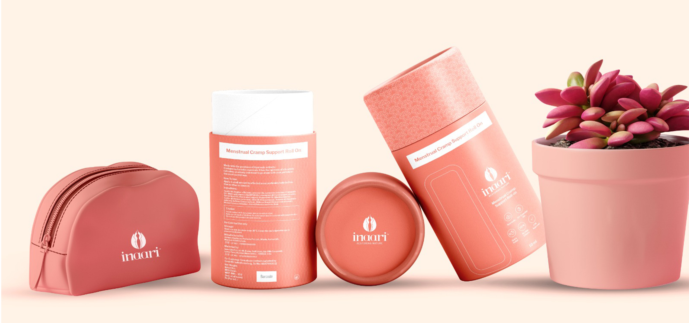
We unify these elements across bottles, sachets, shippers, ecommerce pages, educational content, and dosage instructions.
In nutraceuticals, design must eliminate doubt. A consumer’s decision happens in seconds and the brand must look safe, authentic, and knowledgeable.
Beryl’s UI and UX team designs supplement stores, ingredient education pages, and dosage dashboards that make information simple and actionable. We reduce jargon, simplify ingredient lists, and structure comparison flows that empower user confidence.
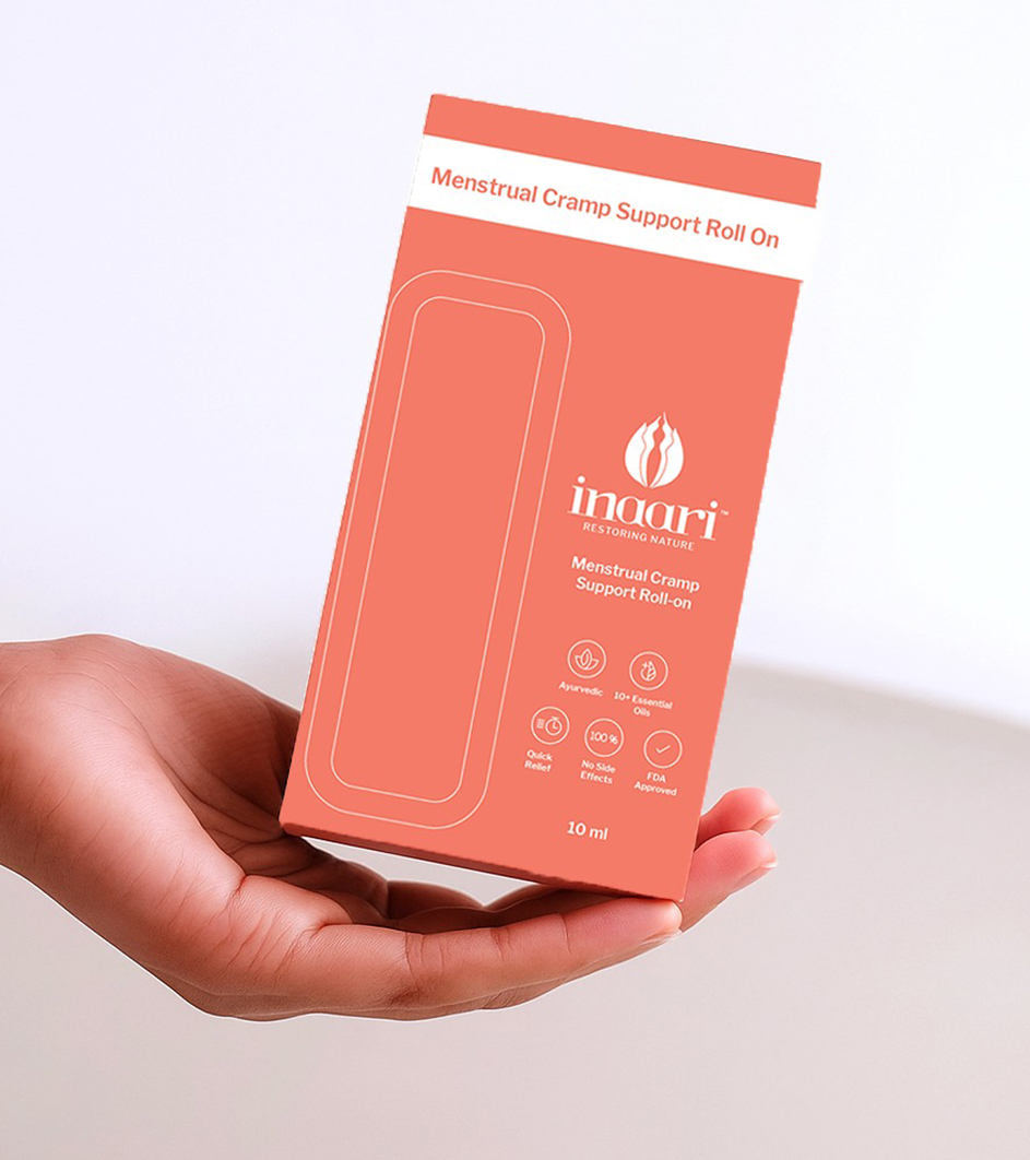
Packaging clarity is equally important. Our design team builds dosage systems, hierarchy rules, label grids, and claim structures that follow both science and consumer psychology.
Great nutraceutical design is not flashy. It is clinical calm.
Design the touchpoints that build credibility
In an industry crowded with big claims, transparency is the differentiator.
At Beryl, we help brands build communication systems rooted in truth, lab reports, ingredient sourcing stories, nutritional charts, and clear benefit pathways. Education increases trust. Trust increases repeat purchase.
Brands like Care Of, Thorne, and Oziva grew by combining clean design with scientific honesty. We decode these patterns and adapt them for India’s regulatory and consumer environment.
Build transparency before scale
Branding that reinforces scientific clarity
Nutraceutical branding must feel clean, knowledgeable, and responsible.
Beryl’s branding team creates science led identity systems:
Color logic rooted in purity, efficacy, and category clarity
Iconography for benefits, dosages, and active ingredients
Typography grids that ensure high readability on small formats
Identity systems that scale across SKUs, blends, and future formulations
We design branding that earns trust before the first dosage.
Designing for wellbeing, not confusion
Health categories are sensitive. Design must simplify decisions.
At Beryl, we unify branding, packaging, UI, UX, and scientific communication into one calm and clear ecosystem. From front of pack claims to ingredient education to reorder flows, everything builds a sense of responsibility and structure.
That is how we turn health products into wellness systems.
A mini field guide from Beryl
Define your brand belief, science first, purity first, or lifestyle first
Use color and typography to communicate safety
Design labels that remove cognitive overload
Build digital journeys that educate before selling
Treat packaging as a clinical document, not decoration
Do this, not that
- do use clean and structured label grids. do not overload with claims
- do highlight key ingredients clearly. do not hide behind jargon
- do maintain consistency across SKUs. do not reinvent design per product
- do communicate science simply. do not overwhelm users with data
- do design for regulatory clarity. do not push aggressive visual noise