entered a category obsessed with loudness. Beauty brands chased trends, over explained benefits, and packaged difference as noise. The products were good, the ingredients were honest, but the category had forgotten nuance. Subtle Co. needed more than packaging. It needed a belief system that could live quietly and still be felt.
After the brand system launched, the shift was immediate.
1. Consumers spent more time engaging with the packs because the design invited attention, not interruption.
2. Product differentiation improved as tactile cues replaced visual clutter.
3. Recall increased because the brand felt calm, thoughtful, and intentional.
4. And most importantly, Subtle Co. began to stand out by not trying to stand out.
That is the power of restraint led branding. When silence is designed well, it becomes unforgettable.
The Context: When Beauty Became Too Loud
The beauty and personal care category is crowded. Bold colors. Aggressive claims. Trend driven aesthetics.
Most brands compete for attention by shouting louder. Very few earn trust by speaking softly.
Subtle Co. was created to challenge that pattern. To build a brand that celebrates nuance instead of noise.
The Challenge: To Build a Brand That Feels Universal
The brief was deceptively simple. Create a beauty brand that works across skin types ethnicities geographies and genders
Without being clinical. Without being cosmetic. Without being trend dependent.
The brand needed to belong everywhere without trying to fit in anywhere.
The Insight: Why Subtlety Builds Trust
Our research revealed a counter intuitive truth. In categories driven by excess, restraint feels premium.
People trust brands that
do not over explain
do not exaggerate
do not overwhelm
Beauty, at its core, is personal. The brand needed to respect that intimacy.
We approached Subtle Co. as a complete system. Not just a name. Not just a logo. Not just packaging.
Our strategy revolved around three principles
Purpose: celebrate nuance and inclusivity
Design: let details reward attention
Tone: calm, confident, and human
Every element had to feel intentional. Nothing could feel loud.
The Strategy: Designing a System of Feeling
The Name: Where Softness Meets Strength
The name Subtle Co. was chosen deliberately.
Simple. Memorable. Universally inclusive.
It reflects how the brand behaves. Gentle in tone. Strong in conviction.
A name that does not impose itself. But stays with you.
The Visual Identity: Connection Through Restraint
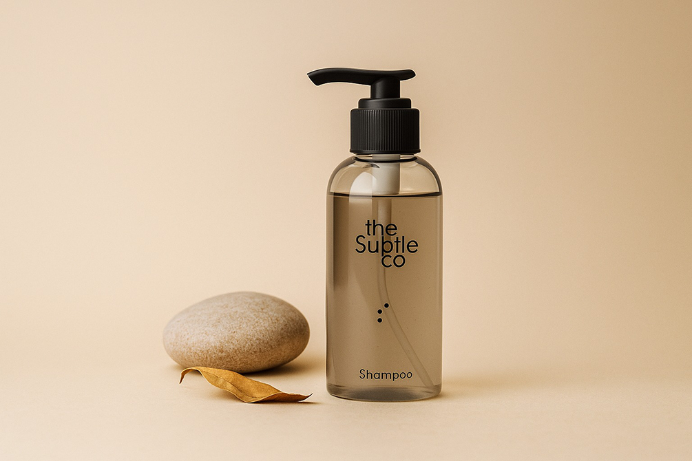
The logo was designed with connected letterforms. Soft, yet certain.
The connections symbolize care, continuity, and balance. A mark that transcends language and culture.
Not decorative. Not symbolic for symbolism’s sake. Just quietly confident.
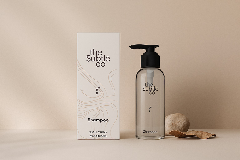
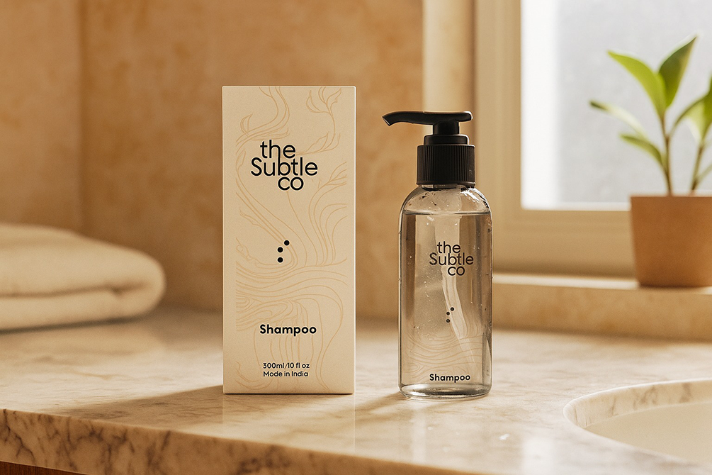
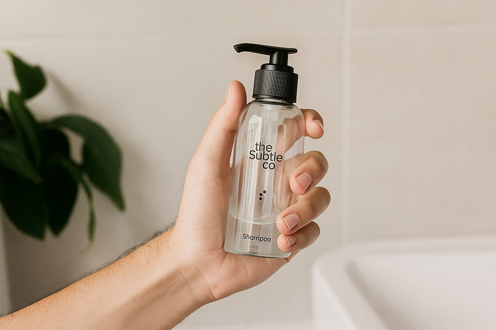
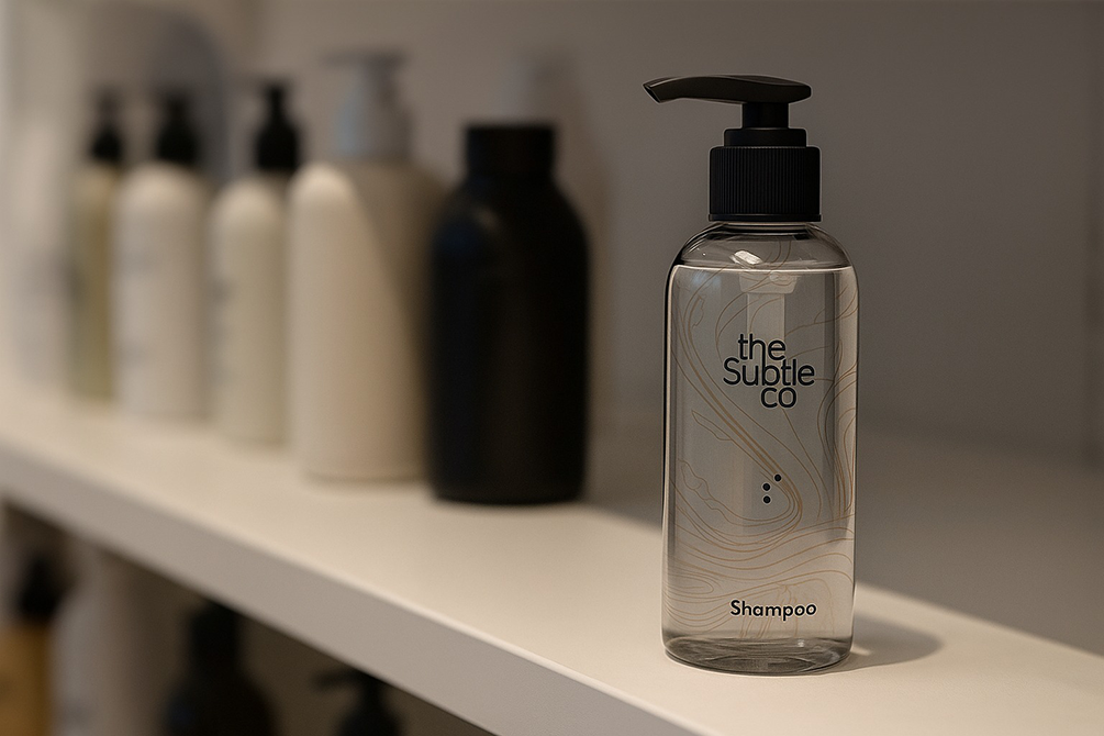
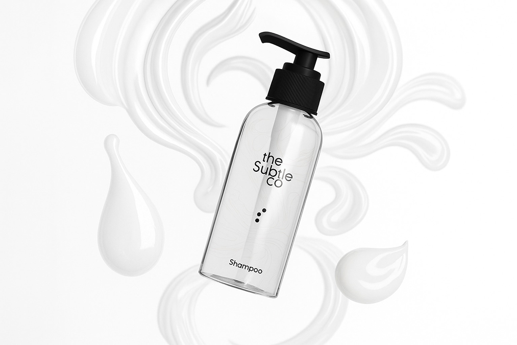
Packaging was treated as expression, not decoration.
Each line was hand drawn scratched then digitised and refined
Every variant is shaped by its core ingredient. Hibiscus forms delicate petals. Cappuccino blooms softly. Onion roots itself with grounded lines.
The ingredient becomes the artwork.
The Packaging Language: When Ingredients Shape Design
lines flow across packs when placed together
variants remain distinct yet connected
shelves transform into a visual ecosystem
A neural map. A forest of lines. One brand. Many stories.
The Tangible Impact: A System That Connects
Individually, each pack stands on its own. Together, they form a living system.
The Achievement: Designing for Real Use, Not Just Display
The design was not only visual. It was functional.
– tactile patterns help identify products in the shower
– differentiation works even with wet hands
– easy distinction between shampoo and conditioner
– accessible for users with spectacles or low visibility
Design didn’t just look good. It worked.
What This Means for the Future of Beauty Branding
Subtle Co. proves that beauty does not need excess to be premium. It needs thought. Sensitivity. And restraint.
In a category driven by trends, Subtle Co. is built to endure.
Our Perspective: Why Beauty Brands Need Quiet Confidence
Beauty is emotional and intimate. Design must respect that space.
By focusing on nuance, materiality, and human interaction, Subtle Co. became inclusive without being generic.
What We Delivered
Each layer was designed to work together as one calm, coherent system.
brand naming and positioning
logo and identity system
complete packaging architecture
ingredient led illustration system
tactile and functional design logic
unboxing and brand extensions
Beryl understands when design should speak. And when it should listen.
Our experience across beauty, FMCG, and lifestyle allowed Subtle Co. to become a brand that feels global without losing soul.
The Beryl Edge
The loudest brands are often forgotten first. The quiet ones stay.
Subtle Co. reminded us that restraint, when designed with intent, becomes a competitive advantage.
What We Learned
FAQs
Why did Subtle Co. avoid bold packaging trends
To build a timeless system rather than short lived attention.
How does ingredient led design help
It creates honesty and emotional connection without over explanation.
Is the brand gender neutral
Yes. The system is inclusive by design.
Does the packaging scale across variants
Yes. The line based system adapts seamlessly.
Why was Beryl the right partner
Because Subtle Co. required sensitivity, not noise.