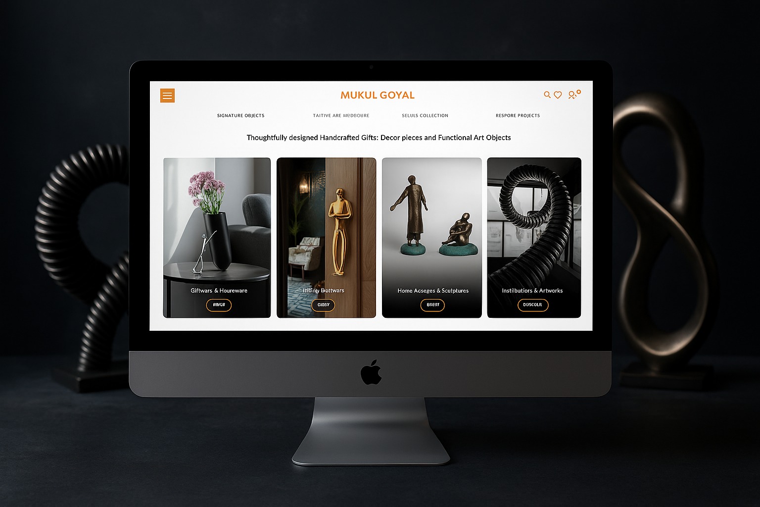
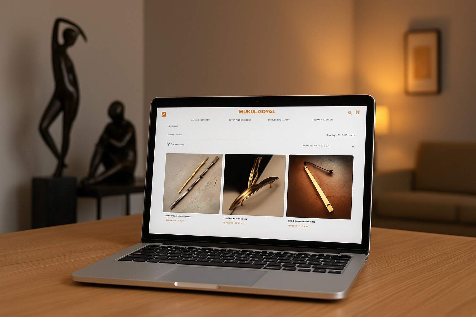
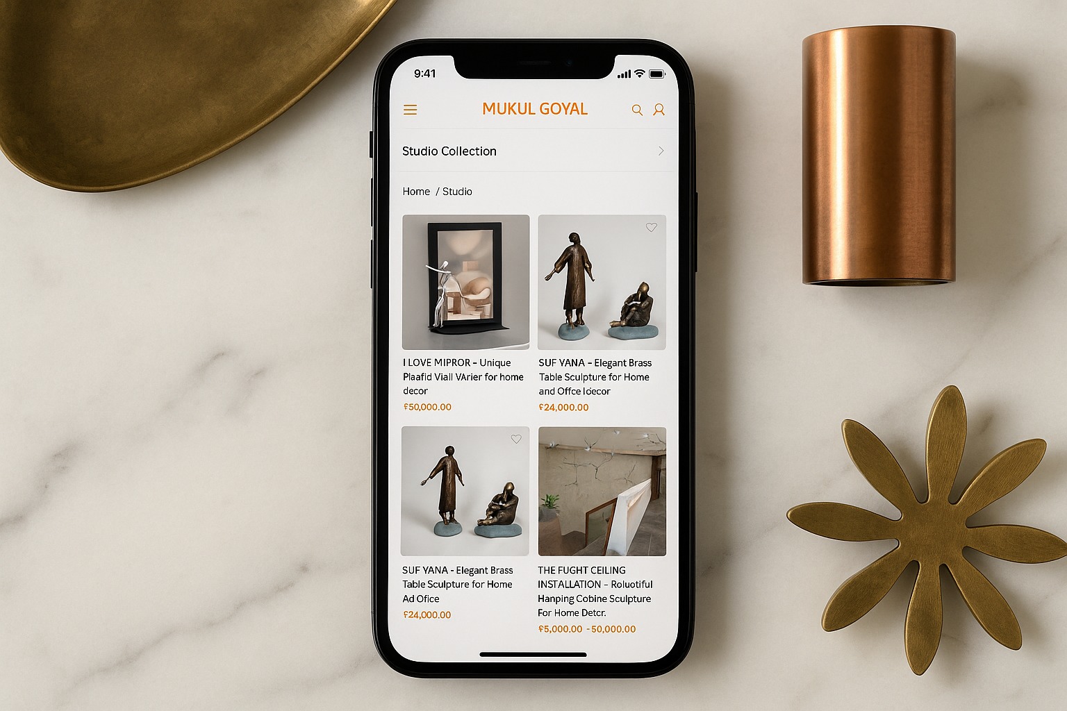
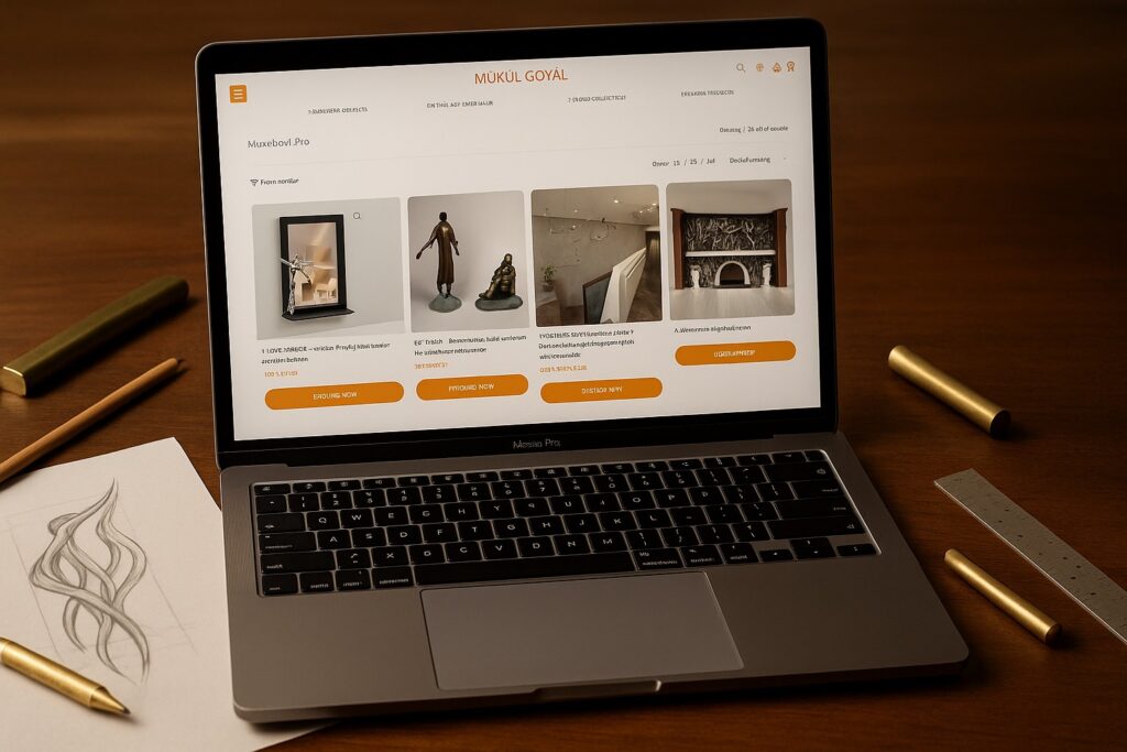
Entered a digital space where most websites try too hard to look like websites. Templates everywhere. Carousels shouting. CTAs begging for attention. The problem wasn’t usability. It was sameness. Designwise needed a digital presence that behaved less like a portal and more like a point of view.
After the website experience was designed, the shift was immediate.
1. Average session duration increased by 2.1x as visitors slowed down instead of skimming.
2. Scroll depth improved by 47 percent, driven by curiosity rather than funnels.
3. Inbound conversations shifted from price to philosophy, with over 60 percent leads referencing the site experience itself.
4. And most importantly, brand recall improved significantly, because the site stopped selling and started being remembered.
That is the power of experience first digital design. When presence leads, conversion follows quietly.
The Context. When Websites Became Predictable
Most websites follow the same formula. Hero banner. Carousel. CTA. Scroll fatigue.
Designwise operates in a world of thinking, taste, and judgment. A conventional website would have diluted that instantly.
The challenge was not to communicate information. It was to communicate intent.
The Challenge. To Break the Website Mental Model
The brief was counterintuitive.
Do not look like a website.
Do not behave like a marketplace.
Do not ask users to convert.
The experience had to feel more like walking into a gallery than opening a page.
The Insight. Why Familiar UX Was the Problem
Our behavioural insight was simple. People scroll past what they recognise.
Predictable layouts create autopilot behaviour.
Autopilot kills attention.
To make people care, the site had to disrupt expectation without breaking usability.
We approached the website like a spatial experience.
Our strategy revolved around three principles
– Purpose: create pause, not push
– Design: remove everything that feels templated
– Tone: calm, confident, non transactional
The goal was not clicks. It was connection.
The Strategy. Designing Presence, Not Pages
The Interface. Where Silence Does the Talking
There were no carousels. No visual noise. No desperate CTAs.
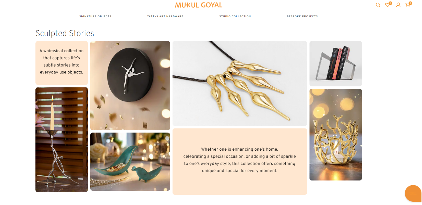
Whitespace became the canvas. Typography carried emotion. Content was allowed to breathe.
The site didn’t ask for attention. It held it.
The Navigation. Letting Curiosity Lead
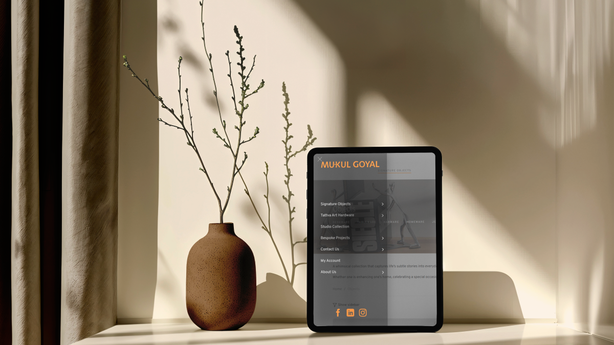
Navigation was minimal and intentional. No funnels. No forced journeys.
Users explored because they wanted to. Not because they were told where to go.
This shifted browsing into discovery.
The site was designed to slow reading down.
Sections didn’t stack mechanically. They unfolded.
Visitors stayed because nothing rushed them forward.
The Content Flow. From Scrolling to Staying
The experience respected the user’s intelligence.
It trusted them to linger, interpret, and feel.
That trust was returned.
The Behaviour Layer. When UX Becomes Philosophy
This was not UX optimisation. It was behavioural alignment.
The Visual Language. Less Interface, More Intent
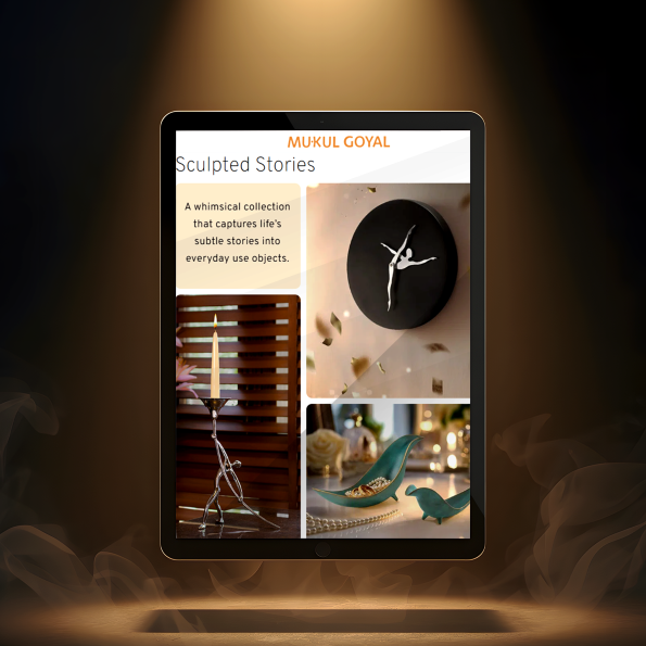
The site felt more like an exhibition wall than a digital product.
– no stock imagery
– no visual fillers
– no conversion tricks
Every element existed because it needed to.
The Shift. From Website to Object
The website stopped feeling like a tool. It started behaving like a product.
Something you spend time with. Not something you transact on.
The Result. Attention Without Asking
People didn’t rush to the contact form. They read. They explored. They absorbed.
When they did reach out, conversations were deeper and more aligned.
The Design Discipline. Invisible but Intentional
Nothing here was accidental.
Every decision was restrained. And that restraint created authority.
Spacing.
Type scale.
Scroll rhythm.
This website doesn’t shout credibility. It assumes it.
It signals taste, confidence, and philosophy without saying a word.
That is what made it work.
The Cultural Signal. What the Site Communicates Silently
In a sea of similar looking sites, Designwise stood apart by not trying.
People remembered it as the site that felt different the site that didn’t sell the site that stayed with them
The Outcome. When Being Different Becomes the Advantage
The Achievement. Turning Absence Into Presence
This wasn’t about breaking rules. It was about understanding which rules no longer mattered.
The absence of noise became the loudest statement.
Our Perspective. Why Digital Is Also Spatial
Websites are spaces. They create mood, behaviour, and memory.
When treated like environments instead of funnels, they build deeper trust.
What We Delivered
Each layer worked together to create presence, not performance.
digital experience strategy
information reduction and flow design
typography led visual system
navigation and interaction logic
execution supervision
Beryl designs digital experiences the way we design brands and spaces. With restraint, psychology, and intent.
Our work removes friction by removing noise.
The Beryl Edge
Not every website needs to convert immediately. Some need to make you care first.
Designwise reminded us that confidence is often quiet.
What We Learned
FAQs
why does this website not look like a traditional website?
Because familiarity creates autopilot. This experience was designed to slow users down.
does removing ctas hurt conversion?
No. It improves quality of conversations by filtering intent.
is this approach suitable for all brands?
It works best for brands driven by taste, philosophy, and trust.
how does this impact user engagement?
By increasing dwell time and emotional recall instead of shallow clicks.
can this system scale as the brand grows?
Yes. The structure is minimal, modular, and future ready.