entered a category defined by fear. Insurance brands spoke in fine print, warnings, and distance. Protection was positioned as paperwork, not reassurance. The problem was not coverage. It was perception. Oona needed an identity that felt human, modern, and constantly present, not reactive.
After the new brand identity and guidelines were rolled out, the shift was immediate.
1. The brand started feeling approachable without losing credibility.
2. Trust improved as the visual language communicated continuity and care.
3. Digital and physical touchpoints began speaking the same clear, confident language.
4. And most importantly, Oona stopped looking like an insurance provider and started feeling like a partner.
That is the power of identity led design. When protection feels visible, confidence becomes natural.
The Context. When Insurance Felt Distant
Insurance is essential. But most brands feel cold. Transactional. Reactive.
Customers associate insurance with claims, not care. Documents, not people. Oona wanted to change that narrative.
Headquartered in Singapore, Oona operates in a region where trust, clarity, and speed matter. The brand needed to reflect that maturity.
The Challenge. To Make Insurance Feel Present
The brief was precise.
Create a brand identity that communicates protection without fear.
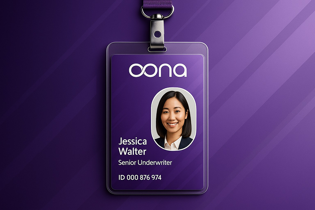
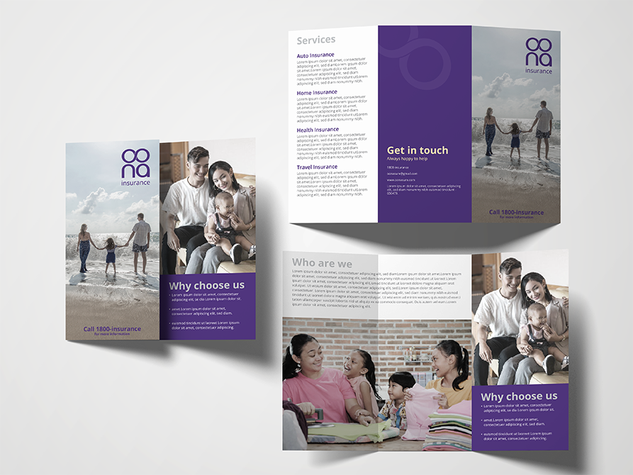
It had to work across
digital platforms
print material
policy documents
and everyday brand touchpoints
The identity needed to feel fast, upbeat, and contemporary, while remaining dependable.
The Insight. Why People Don’t Trust Insurance Brands
Research shows people trust insurance when it feels consistently present, not visible only during crisis.
Key issues identified
insurance feels invisible until something goes wrong
brand language is often legal and cold
visuals rarely communicate reassurance
customers don’t feel emotionally covered
Oona needed to signal one idea clearly.
We are always around you.
We approached Oona’s identity as a living system.
Our strategy revolved around three principles
– Purpose: communicate constant coverage
– Design: build a symbol that feels continuous and protective
– Tone: upbeat, fast, and reassuring
The goal was not to explain insurance. It was to make people feel covered.
The Strategy. Designing Coverage Into the Identity
The Visual Identity. Where Meaning Meets Motion
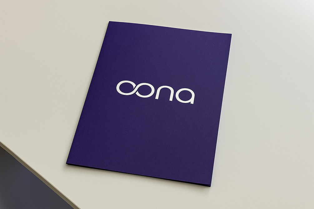
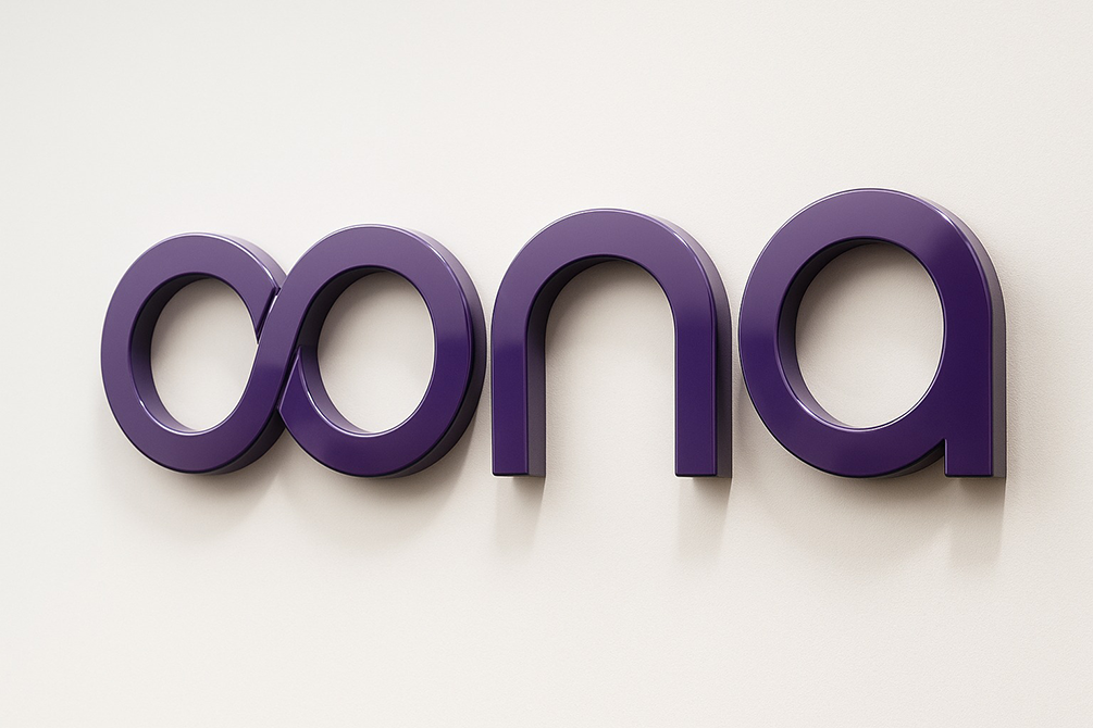
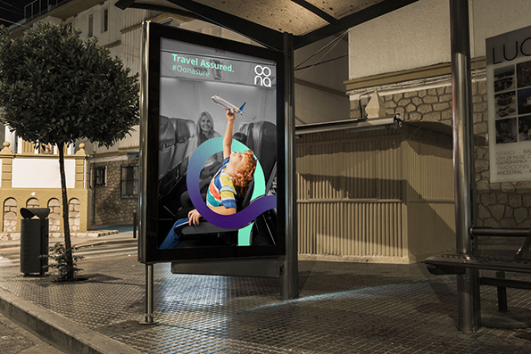
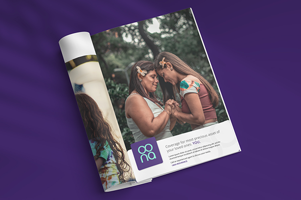
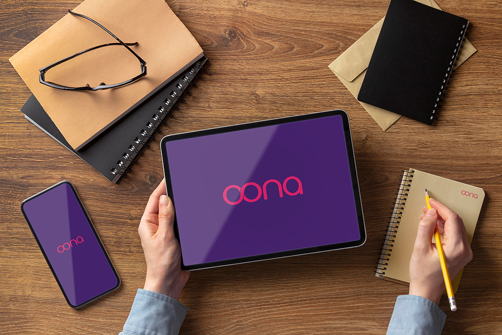
The logo was built around an infinity form that wraps around people and objects.
Not decorative. Not abstract. But intentional.
The infinity loop represents continuity presence and protection without interruption
It visually answers the core promise. We have got you covered.
The Color Psychology. Why Energy Matters in Insurance
Insurance branding often feels muted. Oona needed the opposite.
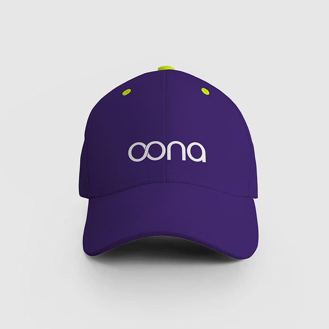
The color palette was designed to feel energetic modern optimistic
Brightness signaled agility. Contrast signaled clarity. Together, they helped insurance feel less intimidating and more human.
Oona’s brand system was built on five elements
Continuity, expressed through the infinity form Clarity, through clean layouts and spacing Consistency, across print and digital Speed, reflected in visual rhythm Human focus, always placing people at the center
This ensured the identity behaved like a system, not a logo.
The Design Language. The Five Elements of Trust
brand recognition improved across touchpoints
communication felt unified and intentional
digital assets carried confidence and warmth
internal teams aligned better with the brand promise
The design didn’t change policies. It changed how protection was perceived.
The Tangible Impact. When Identity Changed Perception
After the identity rollout, the impact was visible.
The Achievement. Turning Insurance Into Assurance
Oona’s brand evolved from an insurance identity into a reassurance system. Protection felt proactive. Not reactive.
For Beryl, this project demonstrated how deep thinking and symbolism can humanize even the most functional categories.
What This Means for the Future of Insurance Branding
Insurance does not need to feel cold. It needs to feel constant.
Oona proves that when brand identity communicates presence, trust follows naturally.