began as a manufacturing company with deep roots. 54 years in business. Trusted by India’s largest companies and defence institutions. Operationally strong. Financially stable. But despite decades of leadership, the outside world still saw it as just another supplier. The problem was not capability. It was perception.
After the rebrand, the shift was visible across the ecosystem. Decision makers began seeing Sharda as a brand, not a vendor. Talent conversations became easier because the company now looked future ready. Market conversations moved from pricing to partnerships. And most importantly, a five decade old company finally carried an identity worthy of its legacy.
That is the power of branding that reframes leadership. When respect becomes visible, premium becomes natural.
The Context: When Experience Is Mistaken for Age
Many Indian manufacturing companies have spent decades building operations, infrastructure, and trust. But time alone does not create brand value.
Sharda Containers had
– over 54 years of manufacturing leadership
– long standing relationships with large enterprises and defence
– proven capability at scale
Yet externally, the brand did not reflect this stature. The gap was not in execution. It was in identity.
The Challenge: To Look Like the Leader It Already Was
Sharda did not want reinvention.
It wanted elevation.
The challenge was to modernize perception without disrespecting legacy.
To create a brand that could speak to the next generation of clients, employees, and partners.
Not louder.
Not trend driven.
But authoritative, confident, and timeless.
The Insight: Why Manufacturing Brands Lose Premium
Our research revealed a recurring pattern in Indian manufacturing. Companies focus on running the business. Brands focus on earning respect.
Without a strong brand system
companies compete on price
talent sees them as old fashioned
leadership impact remains invisible
We approached Sharda’s rebranding as a leadership exercise.
Our strategy revolved around three principles
Purpose: honour five decades of credibility
Design: create a system that works across physical and corporate environments
Tone: calm, confident, and institutional
This was not about chasing modernity. It was about articulating authority.
Sharda had already earned respect internally.
The market just couldn’t see it.
The Strategy: Designing Continuity, Not Disruption
The Visual Identity: From Company Name to Brand Name
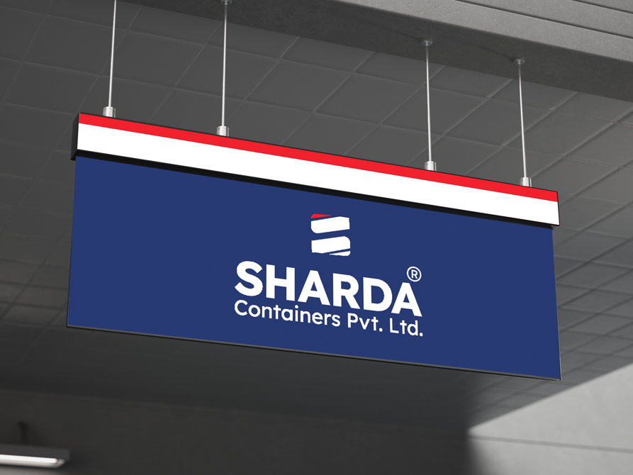
The shift from Sharda Containers Pvt. Ltd. to simply Sharda was intentional.
It signaled
– maturity beyond product definition
– confidence in brand equity
– readiness for expansion beyond containers
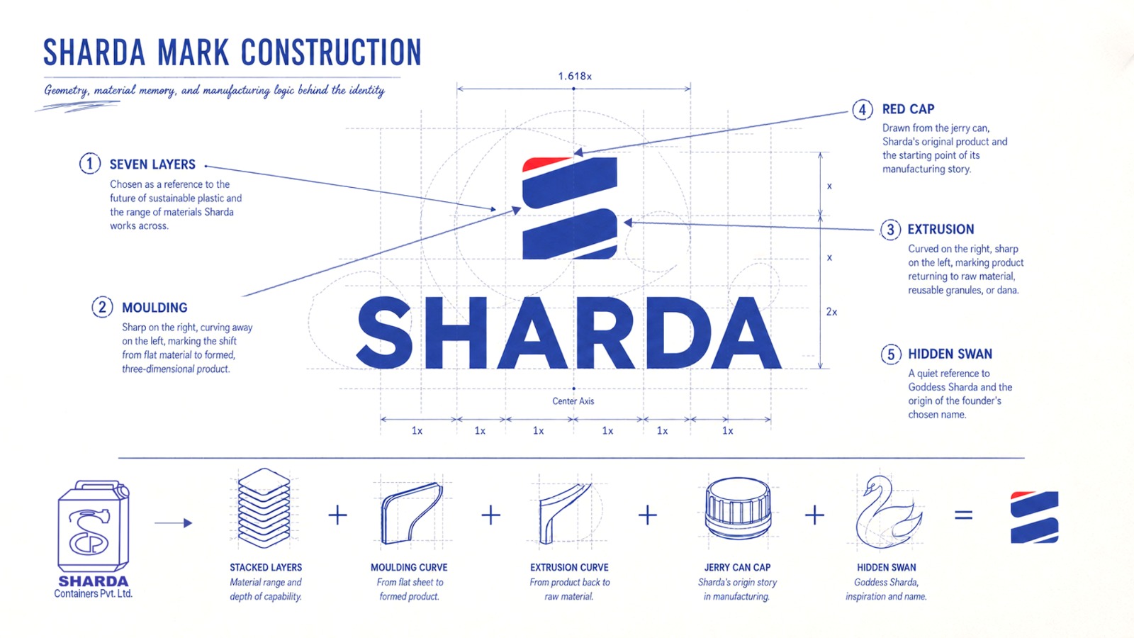
The identity was simplified, structured, and built to last. Not decorative. Not trendy. Just unmistakably strong.
The Brand System: Where Identity Touches Operations
This rebrand went far beyond a logo.
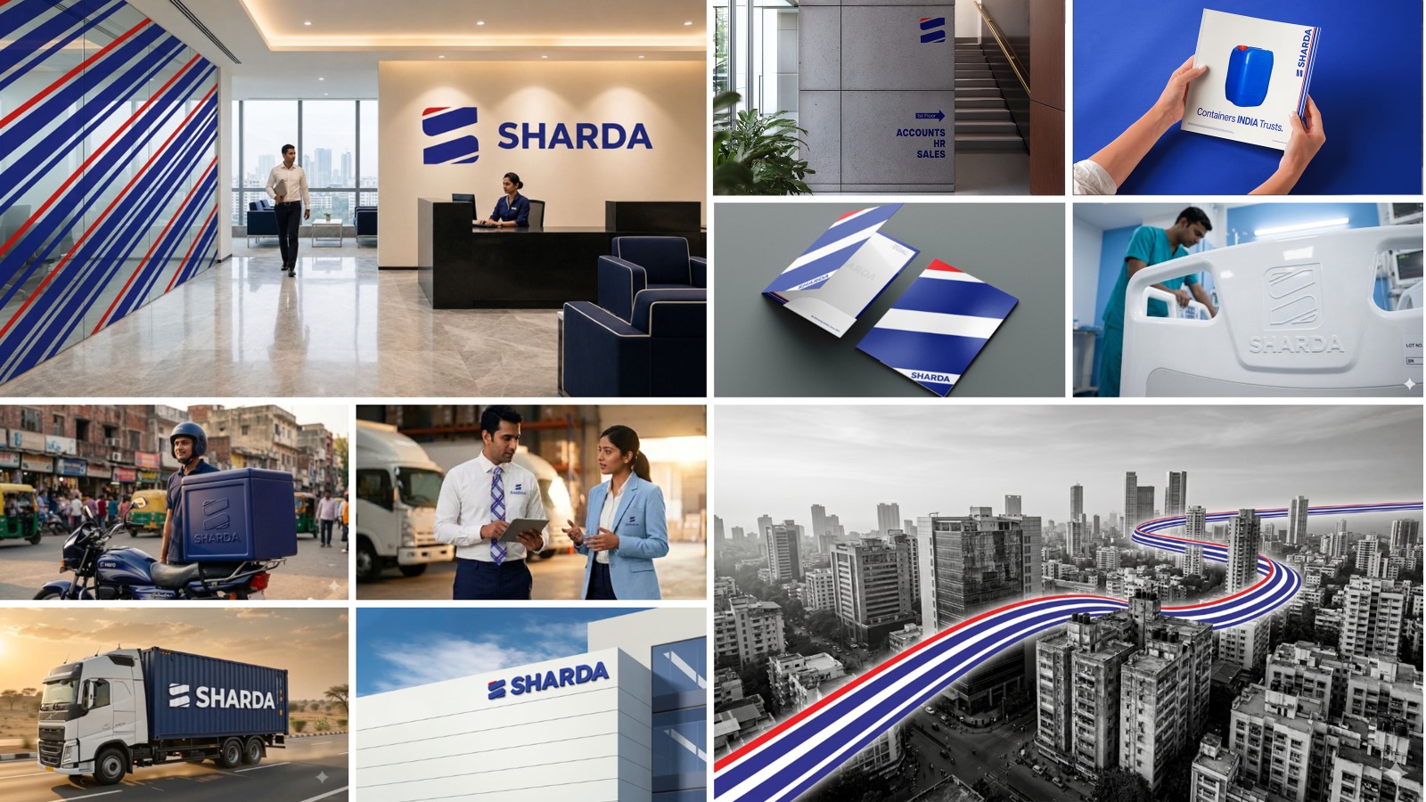
The brand system extended across
– stationery and corporate communication
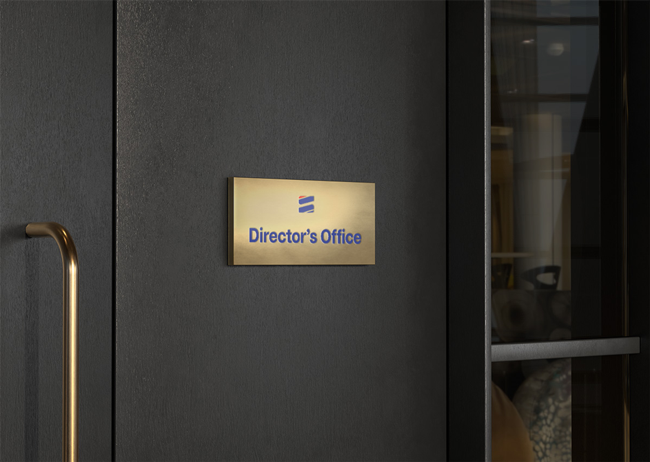
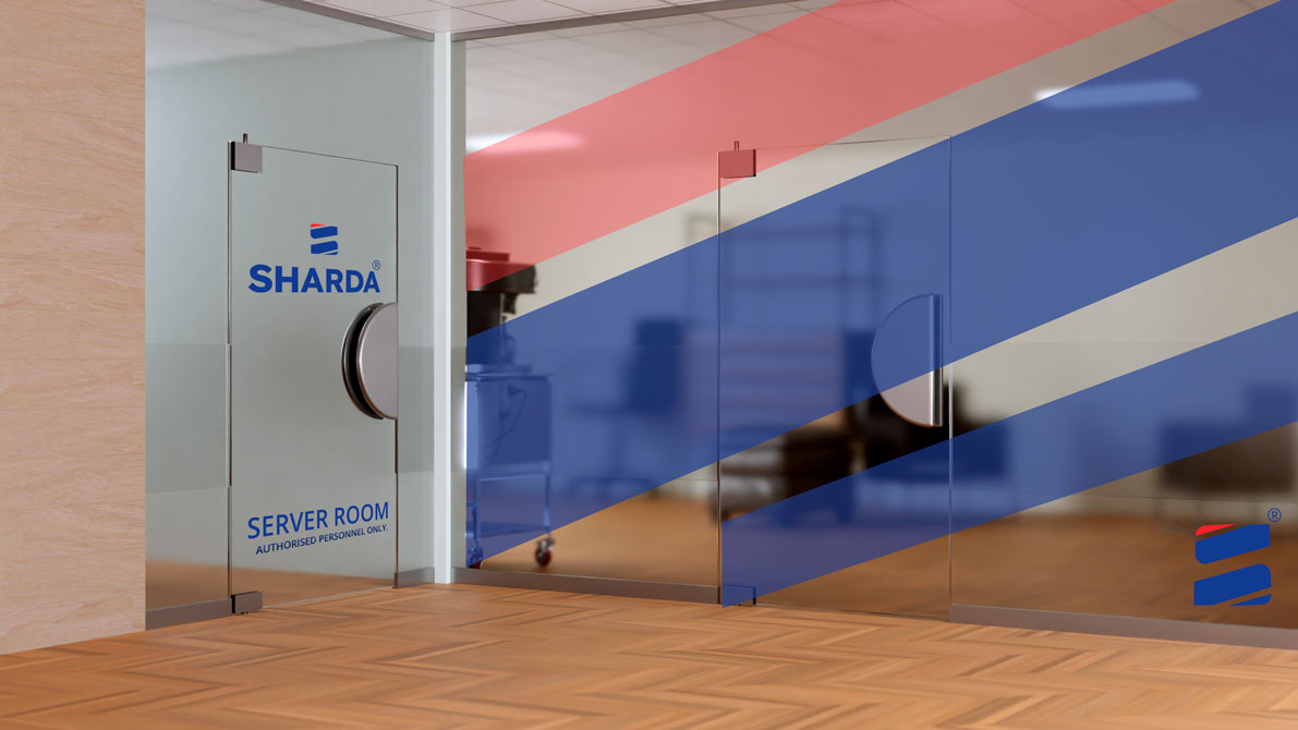
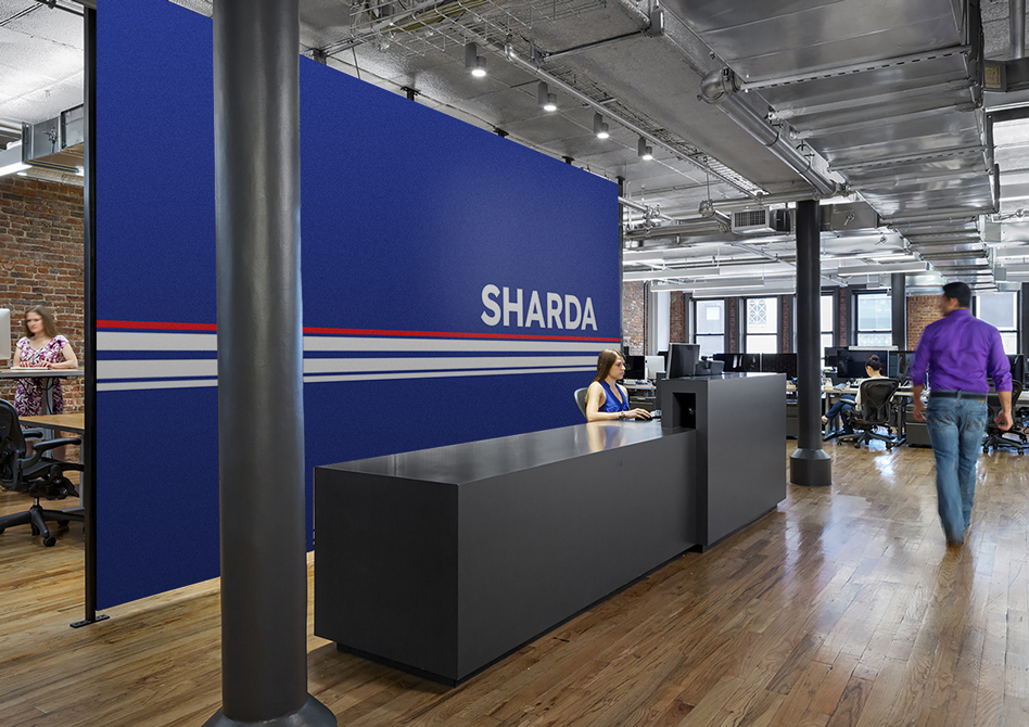
– office interiors and spatial branding
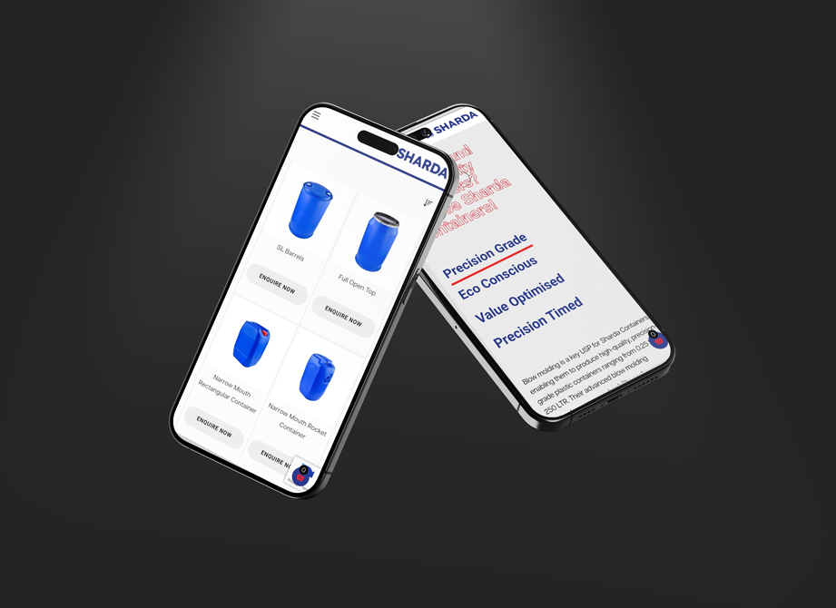
– proposals and sales collateral
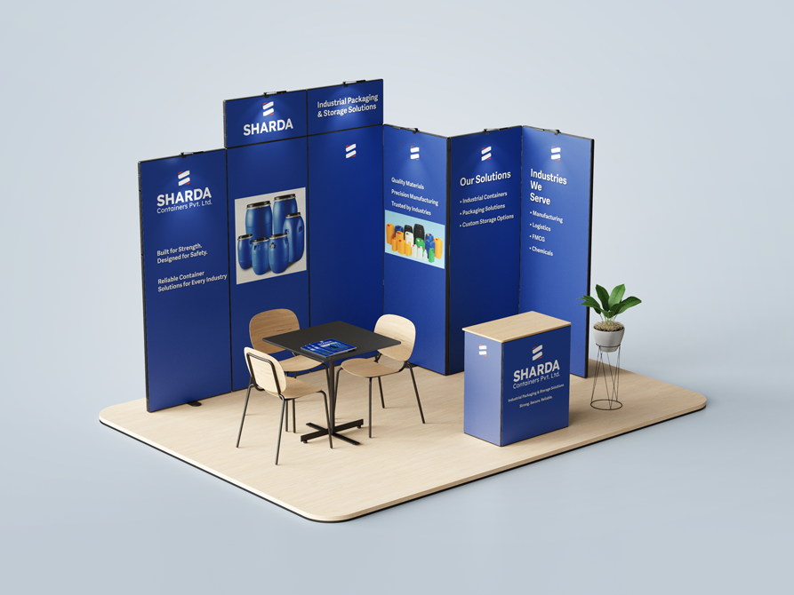
– exhibitions and industry presence
Every touchpoint was redesigned to speak the same language.
Even internal elements became brand carriers.
– uniforms that reflected professionalism and pride
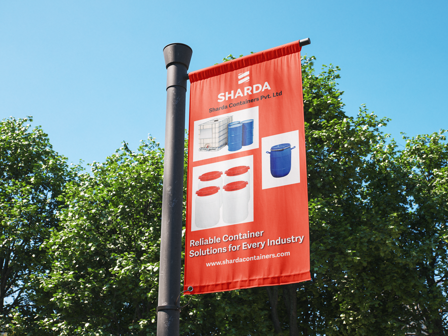
– logistics and truck branding that built recall on the road
– packaging that reinforced trust and consistency
Branding was no longer cosmetic. It became operational.
The Operational Layer: Branding the Everyday
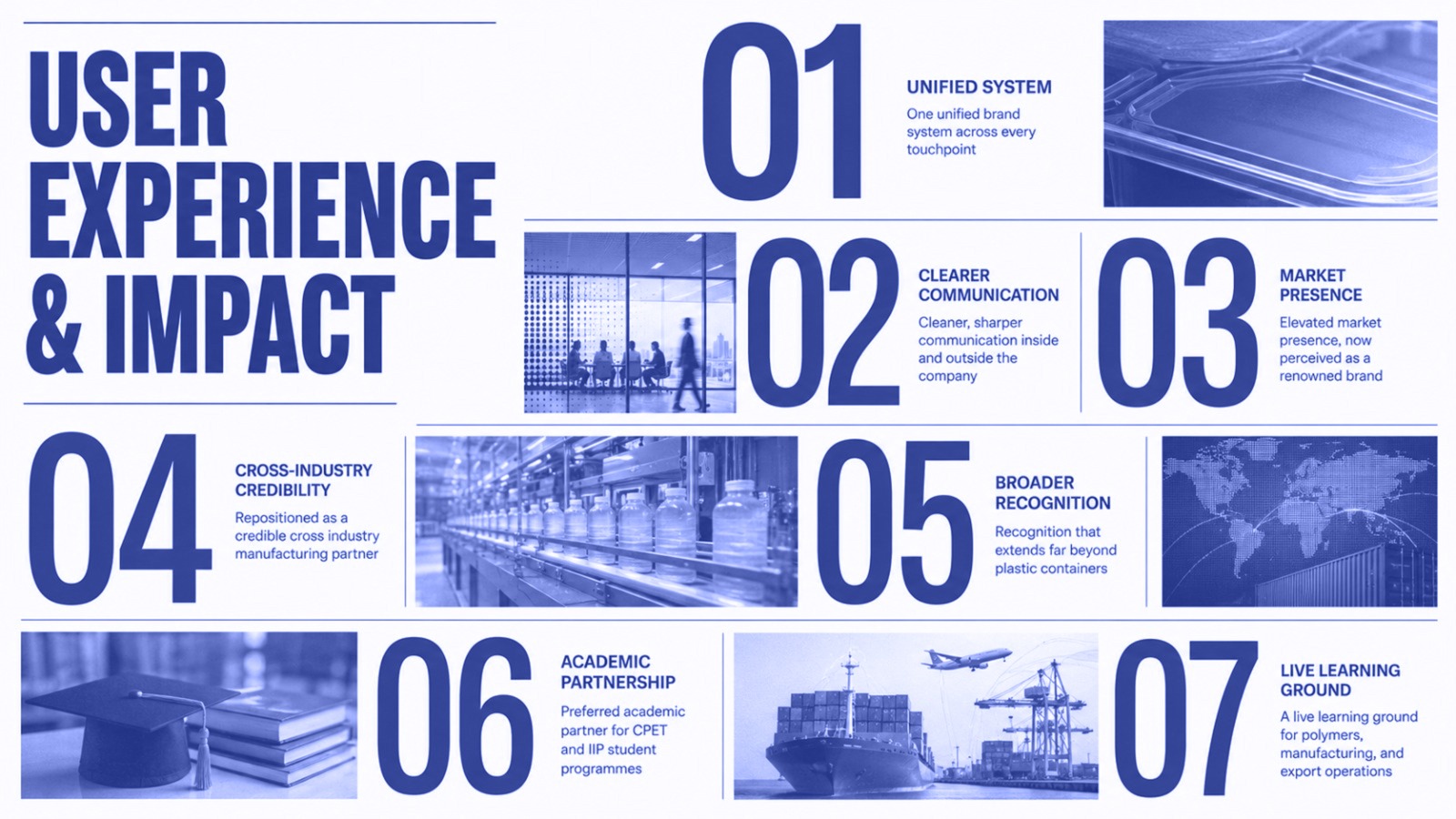
Sharda began attracting higher quality talent
client conversations moved from cost to capability
brand recall improved across markets
leadership presence strengthened at industry forums
The company did not change what it did. It changed how it was seen.
The Tangible Impact: When Perception Changed Direction
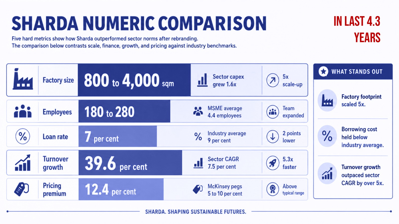
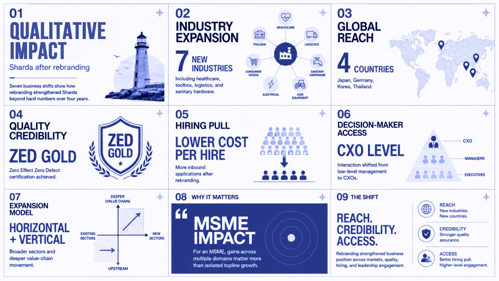
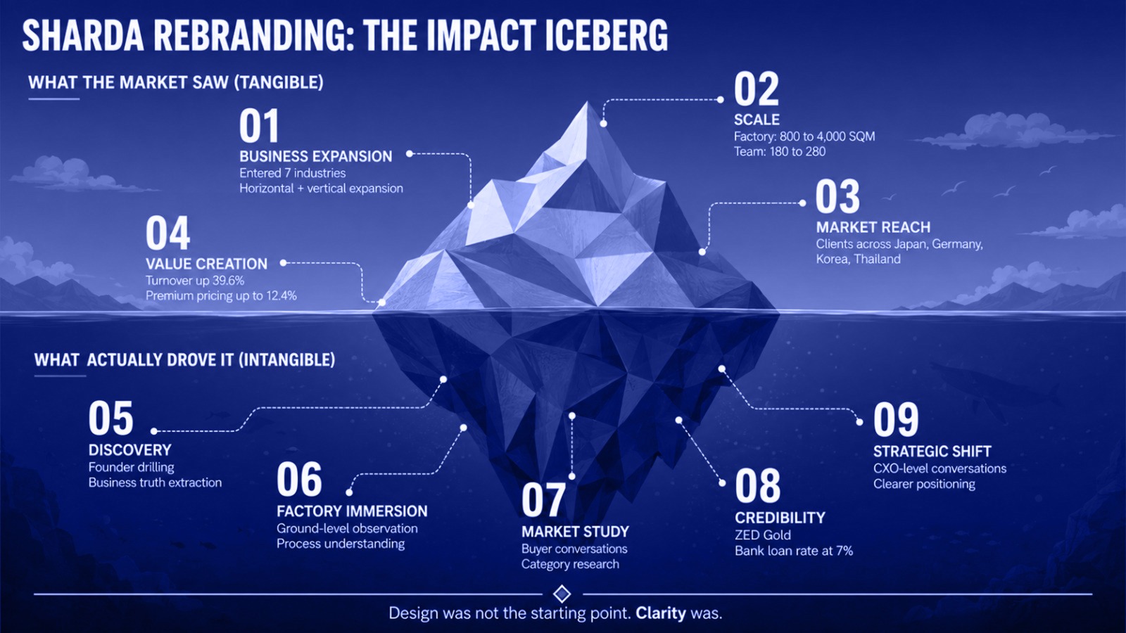
After the rebrand, the shift was measurable.
The Achievement: Turning Legacy Into Leverage
Sharda evolved from a respected manufacturer into a recognized brand. A name that carried authority beyond contracts.
For Beryl, this project proved that rebranding mature businesses is not about fixing weakness. It is about unlocking value that already exists.
What This Means for Indian Manufacturing Brands
Indian manufacturing does not lack quality. It lacks articulation.
Sharda shows that when legacy is translated into brand language, companies gain premium, confidence, and continuity.
Our Perspective: Why Rebranding Is a Leadership Decision
Rebranding is often mistaken as a design task. In reality, it is a leadership decision about the future.
Design is only the tool. Intent is the driver.
Sharda’s leadership understood this clearly.
What We Delivered
Each element was designed to work together as one brand.
brand strategy and positioning
name simplification and identity system
stationery and proposal design
interior and spatial branding
exhibition and on ground presence
uniforms, logistics, and packaging system
With deep experience across industrial, manufacturing, and legacy businesses, Beryl understands how to modernize without erasing history.
Our approach respects what was built, while designing for what comes next.
The Beryl Edge
Age does not weaken a brand. Silence does.
Sharda reminded us that when leaders choose to articulate their legacy, markets respond with respect.
What We Learned
FAQs
why did sharda rebrand after 54 years
To reflect its leadership, scale, and future ambitions more accurately.
was the rebrand cosmetic
No. It extended across operations, communication, and culture.
did the name change affect trust
It strengthened it by simplifying and clarifying the brand.
is this model applicable to other manufacturing companies
Yes. Especially family run and legacy businesses planning expansion.
Why was beryl the right partner
Because of its experience in handling legacy brands with sensitivity and strategy.