
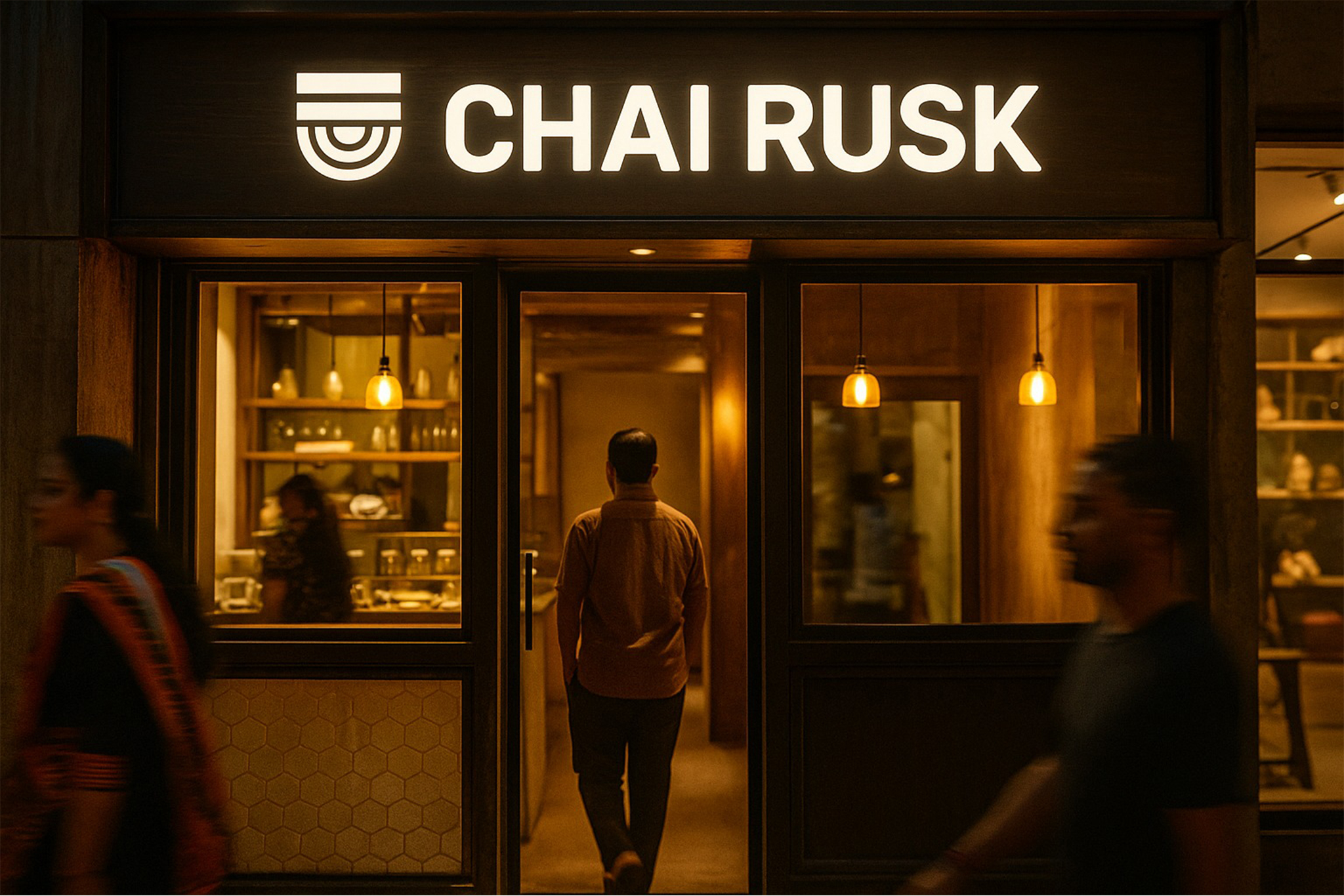
Picture a customer walking into a busy supermarket. She picks up a snack pack because the colors feel fresh, the claims are easy to understand, and the packaging looks trustworthy. She checks the back and the information is clean and clear. When she tries the product later, she remembers the brand instantly. That moment when shelf presence becomes preference is where design lives.
At Beryl, we help FMCG brands design what they are remembered for. From brand belief to packaging architecture, from retail visibility to digital storytelling, we create systems that drive recall, trust, and high velocity purchase.
The global FMCG market is projected to cross fifteen trillion dollars by 2030. India continues to be one of the fastest growing FMCG markets due to rising incomes, urban demand, and evolving retail ecosystems. In this category, design influences purchase decisions faster than advertising.
Start with the core story
Every FMCG brand stands for a promise, freshness, purity, indulgence, tradition, or energy. People do not buy products, they buy the feeling the product represents.
At Beryl, we begin by defining your Brand Belief System, the emotional promise the product must hold on the shelf. This belief shapes identity, packaging tone, flavor architecture, color story, retail impact, and communication hierarchy.
Color psychology is powerful in FMCG. Bright colors drive impulse. Greens communicate natural goodness. Reds signal indulgence. Typography, iconography, and layout grids must stand out instantly on a crowded shelf.
We unify these elements across packs, shippers, counters, retail POS, digital ads, and marketplaces.
FMCG is a battlefield of attention. A customer makes a buying decision in less than three seconds. Design must do the heavy lifting.
Beryl’s packaging and UI teams build clarity led FMCG experiences. We create flavor cues, ingredient visibility, claim structure, FOP hierarchy, and retail visibility systems that help your product win at first glance.
Digital presence matters too. From marketplace listings to PDP design to brand stores, everything must look recognisable and consistent.
Great FMCG design is not decorative. It is strategic clarity.
Design the touchpoints that drive instant recall
FMCG loyalty grows when trust grows. People return to brands that feel safe, clean, and transparent.
At Beryl, we create communication systems that simplify ingredients, nutrition tables, process stories, and sourcing claims. We design packaging communication that feels honest, not overwhelming.
Global leaders like Nestle, Kind Bars, and Tropicana have shown how clarity and authenticity drive long term loyalty. We decode these insights for Indian consumer behaviour.
Build trust before scale
Branding that creates shelf power
FMCG branding must be sharp, distinctive, and instantly recognisable. It must express emotion and functionality together.
Beryl’s branding team builds impact led identity systems:
Color logic that stands out in crowded categories
Icons that simplify ingredients, nutrition, and flavors
Typography systems optimised for small packs and fast reading
Identity grids that scale across pouches, bottles, boxes, and multipacks
We design branding that wins both in retail and in the home.
Designing for frequency, not confusion
FMCG is high frequency. Design must be simple enough to remember instantly and consistent enough to trust long term.
At Beryl, we unify branding, packaging, flavor architecture, retail systems, and photography into one consistent ecosystem. From shelf visibility to unboxing to digital reputation, every touchpoint reinforces identity.
That is how we turn FMCG products into household brands.
A mini field guide from Beryl
Define your brand belief, freshness first, indulgence first, or purity first
Build FOP hierarchy that communicates in three seconds
Use color and icons to simplify decision making
Keep nutrition and ingredient data clean and organised
Maintain consistency across retail, e commerce, and advertising
Do this, not that
- do build strong flavor cues. do not confuse with complex visuals
- do keep fop clean. do not overload with claims
- do use honest photography. do not exaggerate product visuals
- do design strong color codes. do not change styles across skus
- do ensure clarity across markets. do not localise without structure