Luxury footwear is tactile. It is felt before it is understood.
But in digital environments, that experience often gets reduced to grids and pricing.
Slash in Brackets needed more than an e-commerce website. It needed a digital environment that could translate craftsmanship into perception.
The Challenge: To Build a Digital Flagship, Not a Store
Most e-commerce platforms focus on transactions.
Slash in Brackets needed immersion.
The challenge was to design a system that works across:
– The global consumer, seeking premium experiences – The design-aware audience, valuing detail and form – The brand narrative, rooted in craft and culture
This was not about selling shoes. It was about expressing identity.
The Insight: Why Most Fashion E-Commerce Feels Generic
Our research revealed a pattern. Most premium fashion brands lose their edge online.
Key gaps observed:
Over-templated layouts
Weak storytelling integration
Poor translation of craftsmanship
Lack of editorial depth
Luxury is not about information.
It is about perception.
We positioned Slash in Brackets as a digital-first luxury editorial experience.
Our strategy revolved around:
-Purpose: elevate product into narrative -Design: create a gallery-like digital environment -Tone: minimal, confident, and culturally aware
The platform needed to feel less like a store and more like a publication.
The Strategy: Designing an Editorial Commerce Experience
The Visual Identity: Where Form Leads Function
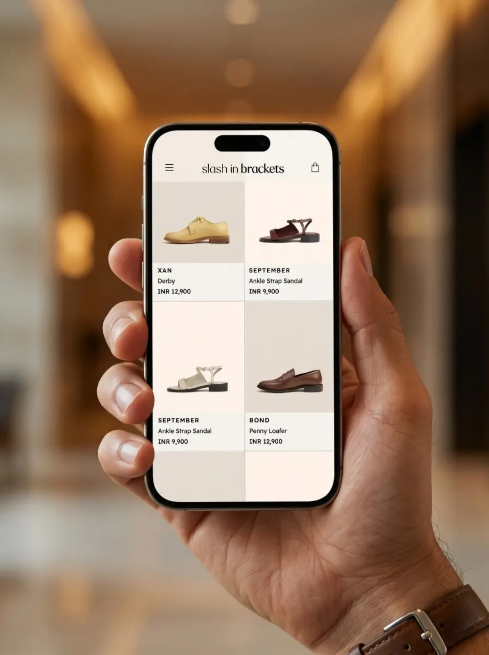
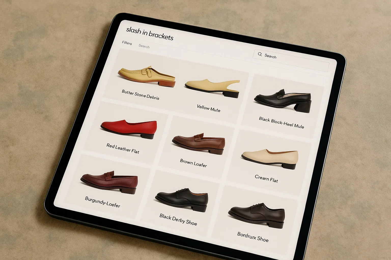
The interface was built with restraint.
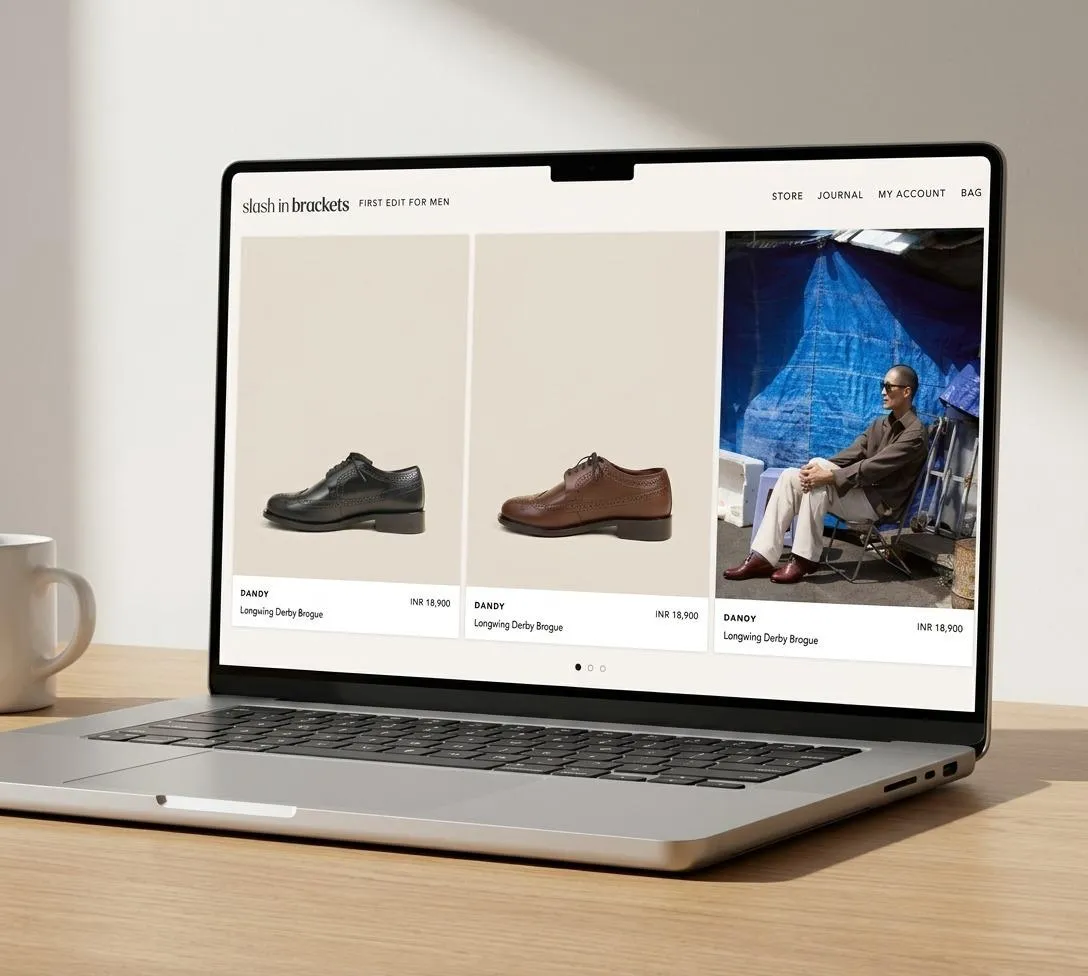
-Clean layouts with strong grid systems -High-contrast typography for clarity and emphasis -Generous whitespace to let products breathe
This created a canvas where craftsmanship became the hero.
Products like the Dandy brogue and Delhi mule were not just displayed. They were experienced.
The Content System: Storytelling as Structure
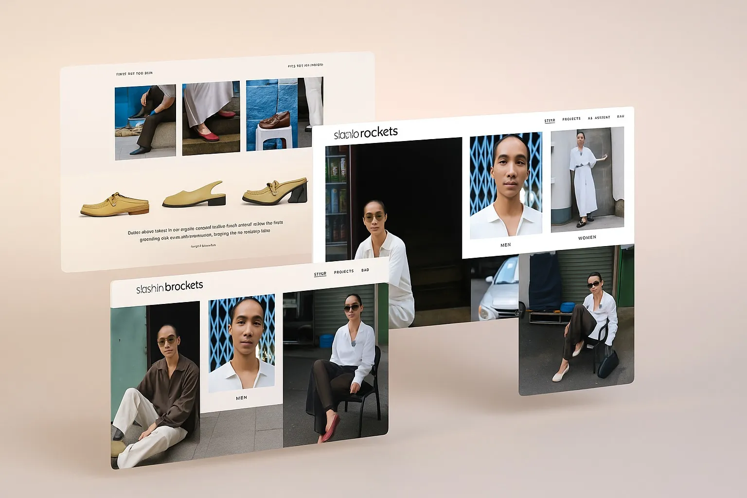
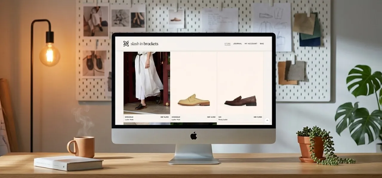
We embedded storytelling into navigation.
Campaigns like – LIFE WELL WORN – SAIGON EXPERIMENT
were not treated as separate content. They became part of the shopping journey.
This blurred the line between commerce and culture.
Navigation was simplified into core pillars:
– MEN – WOMEN – JOURNAL – STORE
We introduced structured discovery:
– Immediate access to the First Edit collection – Clear pathways from exploration to purchase -Reduced cognitive load across journeys
The goal was simple. Let users move without thinking.
The User Experience: Built for Clarity and Discovery
User exploration depth increased as visitors engaged with both product and editorial content
Drop-offs reduced due to clearer pathways and structured navigation
Purchase confidence improved with strong global trust signals
Engagement-to-conversion ratio strengthened across international users
The platform moved from transactional to experiential.
The Tangible Impact: When Experience Drives Conversion
Post launch, behavioral improvements were clear.
The Product Experience: Where Detail Builds Desire
Product pages were designed to go beyond specifications.
-Styling suggestions integrated into layout -Material and craftsmanship highlighted visually -Ethical sourcing clearly communicated
This transformed product pages into decision-making environments.
What This Means for Global E-Commerce Branding
E-commerce is no longer about listing products. It is about building belief.
Slash in Brackets proved that when storytelling and structure come together, conversion becomes a byproduct.