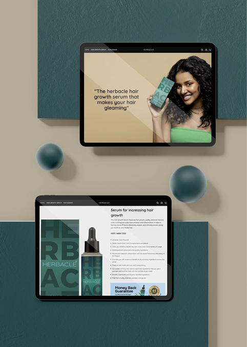
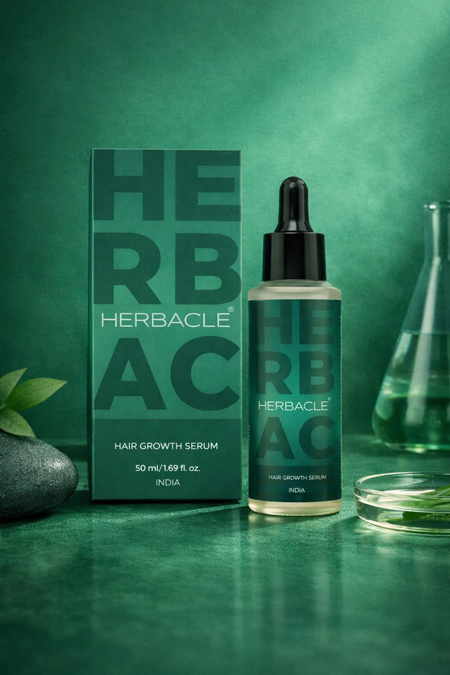
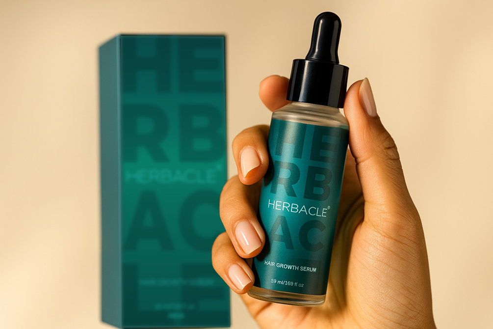
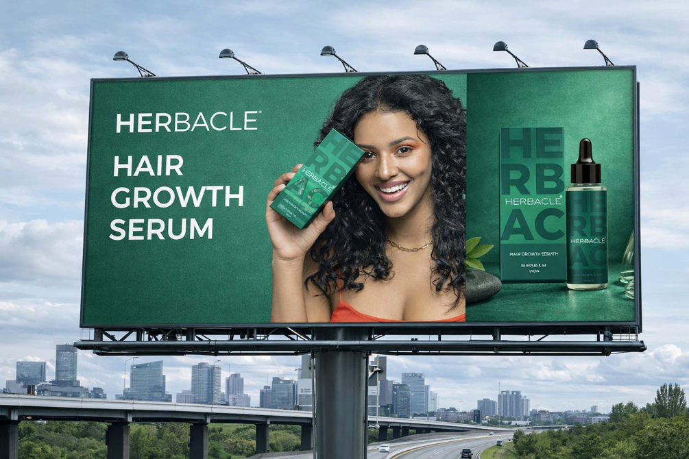
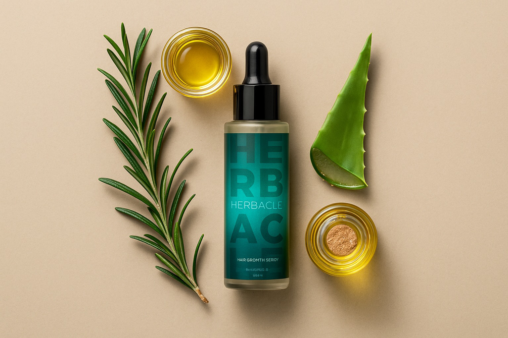
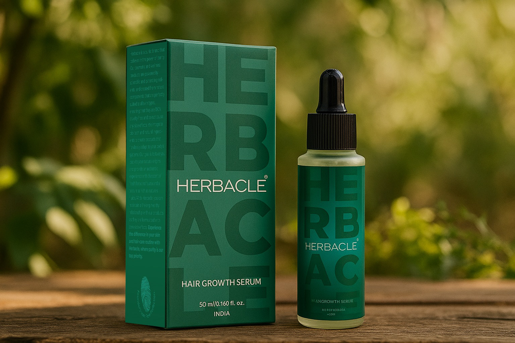
Herbacle entered a market overflowing with noise. Skincare and haircare brands everywhere promised miracles, overloaded packaging with claims, and diluted trust with gimmicks. The product was strong. The science was real. But the identity lacked presence. Herbacle needed a system that communicated seriousness with simplicity.
After the new identity launched, the shift was immediate.
1. People trusted the product because the design felt clinical yet warm. 2. Strong ingredients took center stage and became the hero of the narrative. 3. Retail acceptance improved as the packaging cut through clutter with medical clarity. 4. And most importantly, the brand finally looked as premium and credible as the formulation deserved.
That is the power of design that reframes perception. When clarity becomes visible, trust becomes natural.
The Context. When Serious Products Get Lost in Noise
The skincare market is saturated with flashy promises and confusing labels. Most packaging is overdesigned. Most claims feel exaggerated. Most brands bury the actual formulation.
The problem wasn’t Herbacle’s science. It was the lack of a visual system that communicated seriousness and credibility.
The Challenge. To Build a Brand That Feels Scientific, Not Sterile
The brief required balance.
A brand that looks premium but not intimidating.
Clinical but not cold.
Minimal but not empty.
Herbacle needed an identity that matched its formulation strength and signaled trust instantly.
The Insight. Why People Don’t Trust Skincare Claims
Behavioural research showed that customers trust what they can understand at a glance.
Insights revealed
ingredient clarity increases trust
minimal labeling improves perceived efficacy
bold structuring of percentages increases credibility
clutter reduces conversion
People don’t want noise.
They want truth, clearly communicated.
We approached Herbacle like a scientific design system.
Our strategy revolved around three principles
-Purpose: highlight real formulation
-Design: reduce noise and strengthen hierarchy
-Tone: honest, minimal, clinical without being cold
Every element had to serve clarity. Every surface had to communicate trust.
The Strategy. Designing Truth Into the Identity
The Visual Identity. Where Science Meets Symbolism
The logo was built from geometric logic. Balanced. Precise. Directional.
Not decorative. But a representation of growth, structure, and scientific rigor.
The identity had to look engineered, not embellished.
The Color Psychology. Why Monochrome Matters
Skincare packaging often uses heavy colors or cosmetic motifs. Herbacle needed to stand apart.
A monochrome system created cleanliness precision universality
Just as green creates emotional safety, monochrome creates objective clarity. Color stayed minimal so the science could speak louder.
Herbacle’s visual system was built on five elements
Hierarchy, to guide reading Typography, for medical grade legibility Whitespace, to let information breathe Grid, to structure scientific data Consistency, to build system wide trust
This framework created a packaging language rooted in precision.
The Design Language. The Five Elements of Clinical Clarity
ingredients like 5 percent Redensyl and 5 percent Procapil became the hero
information hierarchy made the product feel scientifically reliable
retail shelves favored Herbacle for its disciplined minimalism
customer comprehension increased due to clear labeling
The packaging didn’t just look premium. It made the science visible.
The Tangible Impact. When Packaging Highlighted Science
After the redesign, Herbacle’s impact was immediate.
The Achievement. Turning Formulation Into Identity
Herbacle became a brand where the formulation itself is the storytelling. No exaggeration. No hiding. Just clarity.
For Beryl, this proved that when truth becomes the design, trust follows naturally.
What This Means for Future Skincare Branding
Herbacle proves that skincare brands do not need loud visuals to stand out. They need honesty, structure, and discipline.
The system scales effortlessly across variants and future product lines, staying consistent and credible.