Most dental clinics communicate function. White walls. Medical jargon. Generic symbols.
But dentistry is deeply psychological. People don’t just visit for treatment. They visit carrying fear, hesitation, and vulnerability.
Dental Radiance needed an identity that could reduce anxiety before the first appointment even began.
The Challenge. To Make Precision Feel Human
The brief was layered.
Build authority.
Signal expertise.
But also create emotional comfort.
The identity had to balance two worlds simultaneously. Clinical precision and human warmth.
The Insight. Why Dental Branding Often Fails
Behavioural studies show that visual perception heavily impacts trust in healthcare environments.
Most clinics either feel too sterile or overly decorative.
One creates fear.
The other reduces credibility.
The solution was not choosing between soft or sharp.
It was designing the balance between both.
We approached the identity as a psychological system.
Our strategy revolved around three principles
-Purpose: reduce intimidation through familiarity -Design: combine precision with softness -Tone: modern, confident, and calming
The goal was not just visibility. It was emotional ease.
The Strategy. Designing Reassurance, Not Just Recognition
The Logo Concept. Where Dentistry Meets Symbolism
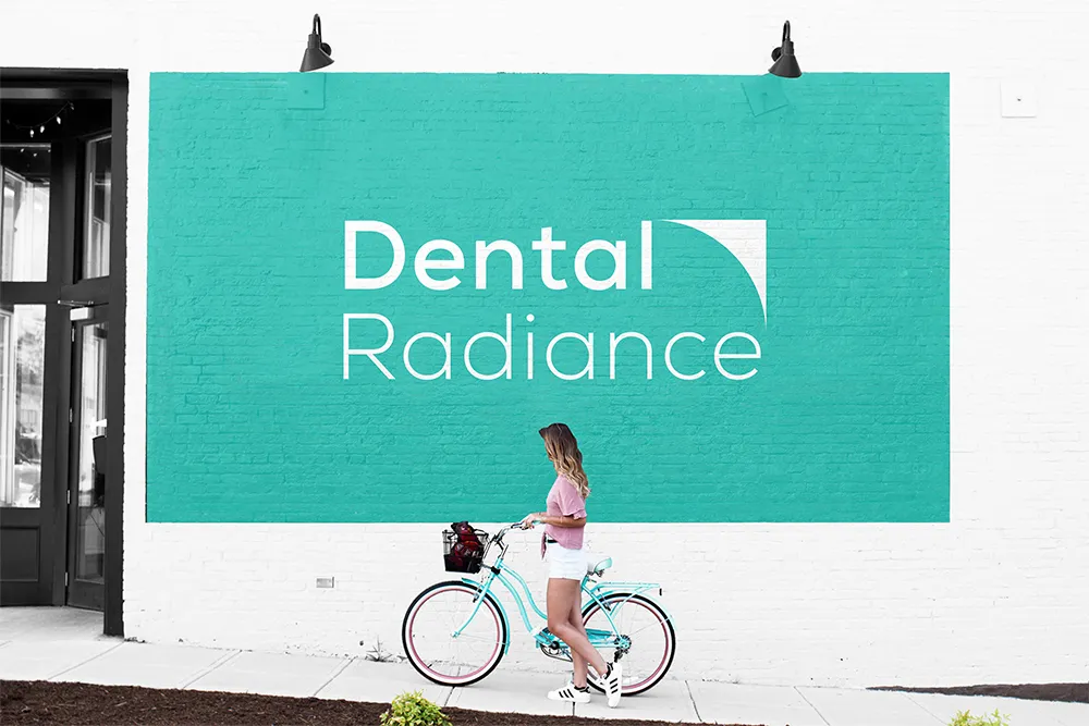
The logo was designed around a dual meaning system.
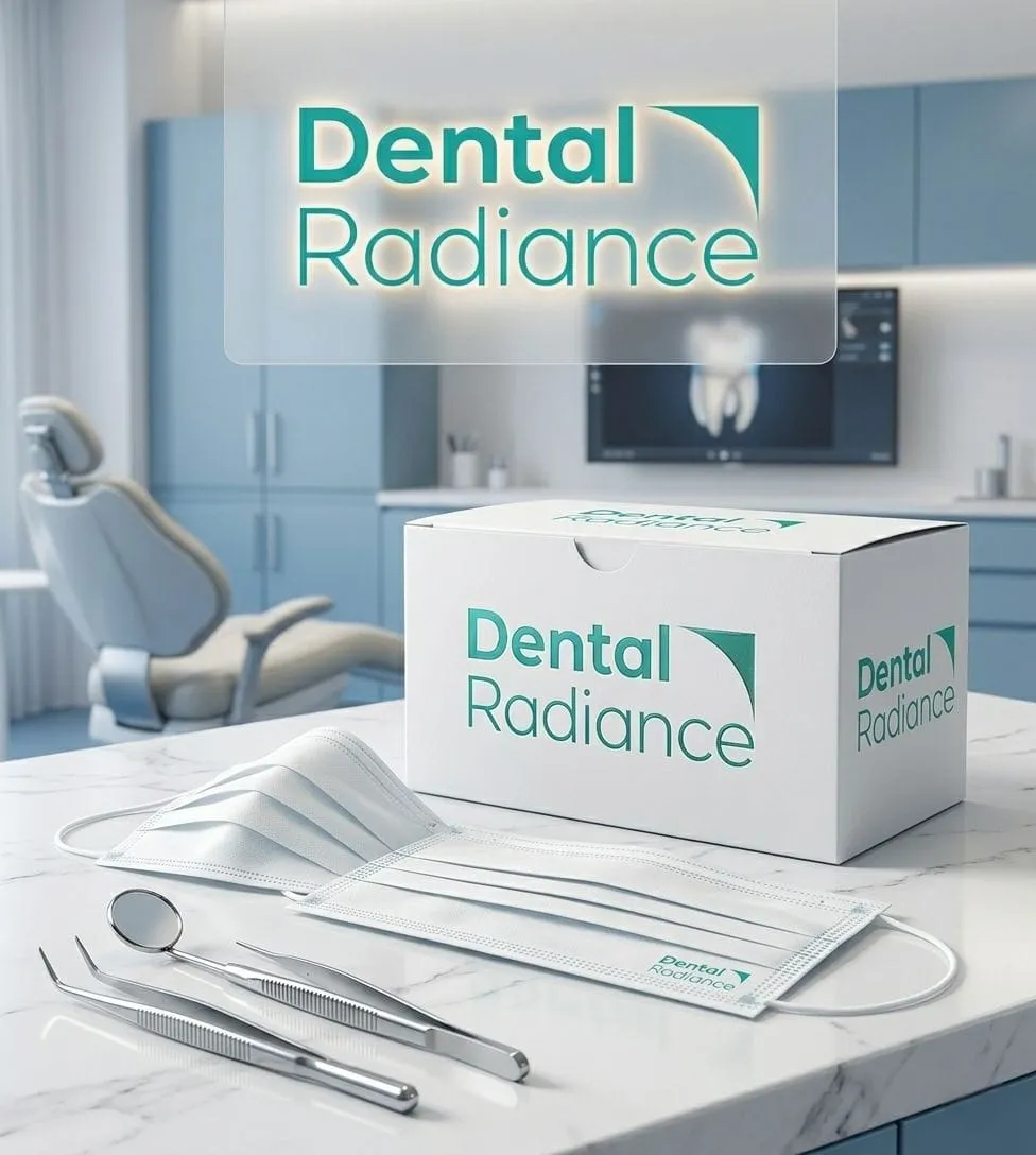
The sharp point draws inspiration from the canine tooth and radiating light. A symbol of precision, clarity, and dental mastery.
The softer curve balances the structure. Representing the human smile.
This contrast became the heart of the identity. Precise yet delicate. Technical yet reassuring.
The Shape Psychology. Precision Balanced With Care
Dental work is exact. But it also demands gentleness.
The visual form intentionally contrasts sharp geometry with soft curvature.
– sharp edge representing accuracy – smooth curve representing care and comfort – balanced composition representing trust
This created an identity that feels both professional and approachable.
The word “Dental” was intentionally kept bold.
Not decorative. Authoritative.
It signals expertise and confidence in the domain.
The clean modern typeface reflects a clinic that is aligned with current methods, technologies, and evolving dental practices.
The Typography. Authority Without Aggression
hygiene
updated technology
precision based care
contemporary dental methods
Without needing to say it directly.
The Modernity Layer. Signalling Advanced Care
Patients often associate modern branding with advanced treatment quality.
The identity system was designed to communicate
The Emotional Shift. From Fear to Familiarity
The identity softened first impressions immediately.
Patients perceived the clinic as calmer and more welcoming. The visual language reduced clinical harshness without reducing credibility.
That balance changed how people approached treatment itself.
The Result. When Design Builds Trust Before Conversation
The identity began working before the staff ever spoke.
Patients remembered the clinic more easily. Recommendations increased because the branding felt premium and trustworthy. And the clinic developed a distinct personality in a crowded healthcare category.
Nothing in the identity was ornamental.
The curves. The spacing. The typography weight.
Every decision reinforced the same message modern expertise delivered with care.
The Design Discipline. Every Detail Carries Meaning
The visual system was designed to extend beyond the logo.
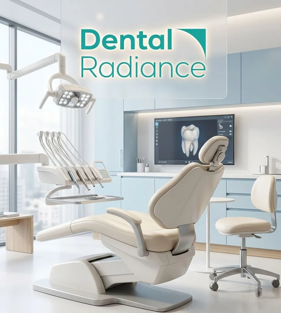
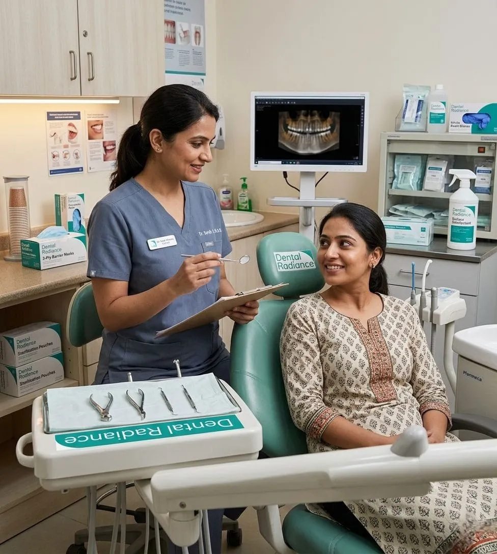
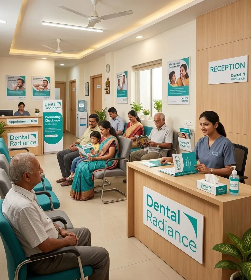
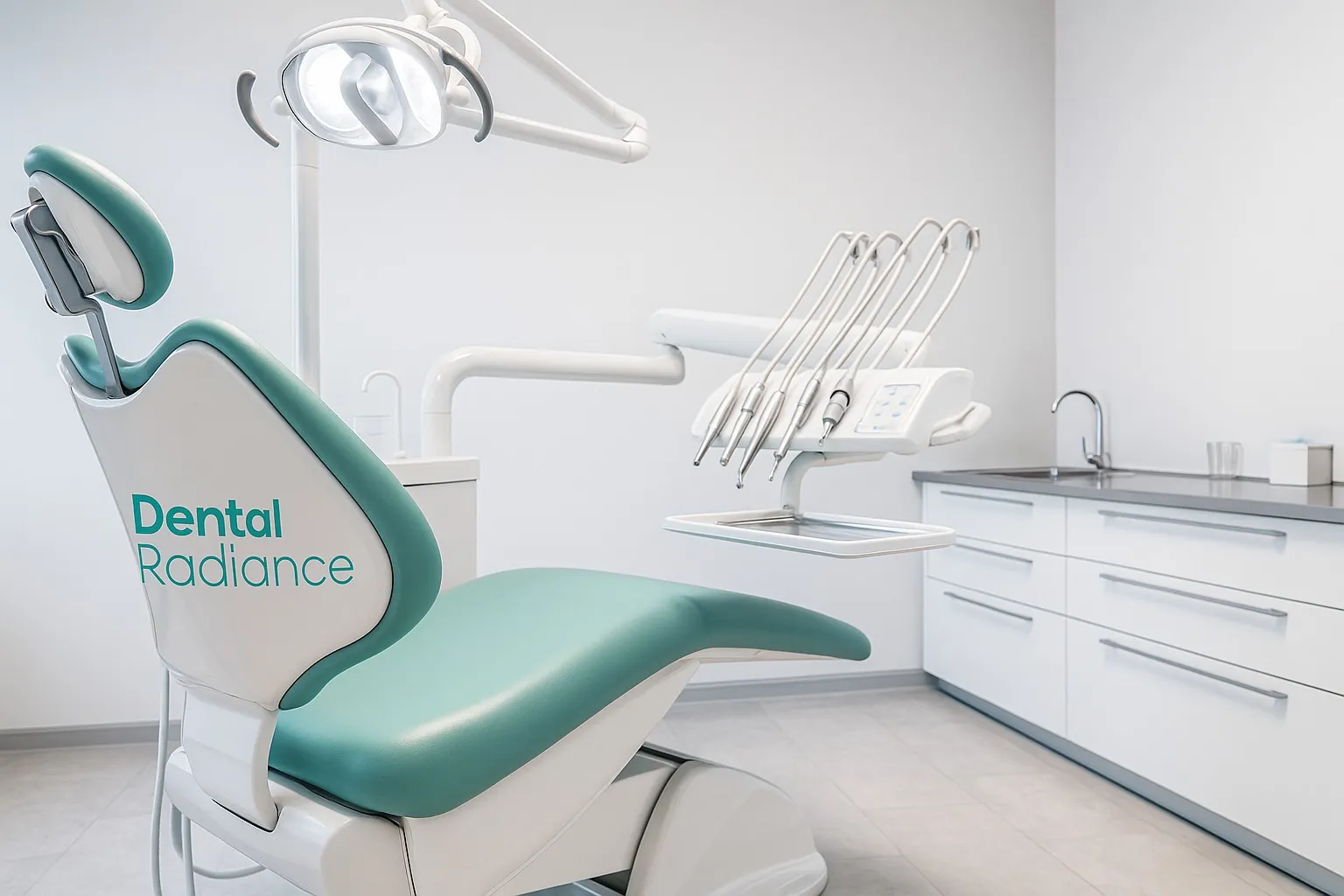
From clinic signage to digital communication, every touchpoint follows the same philosophy clean, calm, and intentional.
Consistency became part of the patient experience.
The Brand Language. Precision as Experience
The Cultural Context. Healthcare in the Mountains
Being located in the mountains added another dimension to the identity.
The clinic needed to feel premium enough for urban visitors, yet approachable enough for local communities.
The branding bridged both worlds naturally.
This was not just a logo project.
It was a perception shift.
Dental Radiance evolved from a local clinic into a modern healthcare identity that feels credible, warm, and future ready.
The Achievement. Turning a Clinic Into a Trusted Brand
Healthcare branding is not about decoration. It is about emotional psychology.
People decide trust visually before they experience treatment.
When branding reduces fear, it increases openness, confidence, and connection.