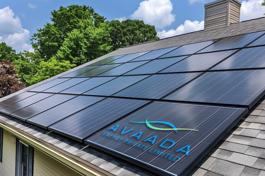
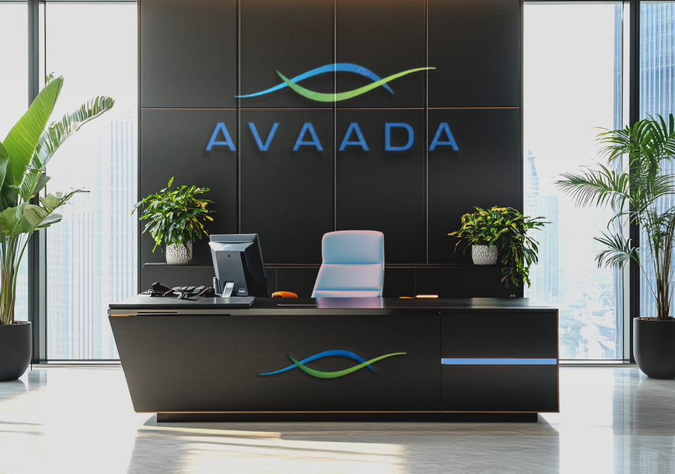
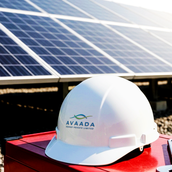
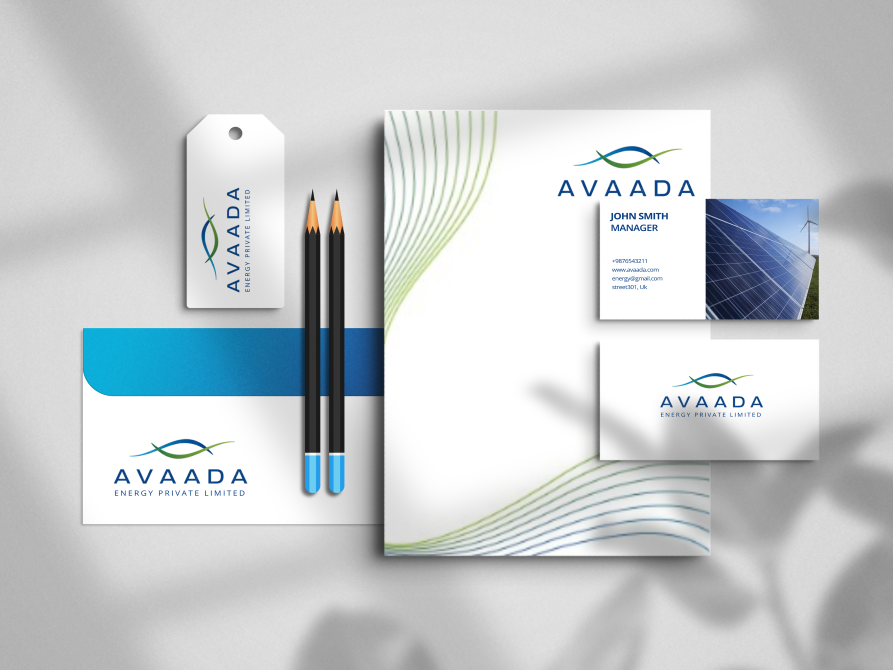
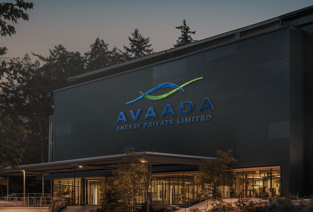
is a rare kind of story in Indian clean energy. A B2G business that did not just scale projects, it scaled trust. Government stakeholders do not buy promises. They buy consistency, compliance, and execution confidence. That is where branding stops being aesthetics and becomes a business advantage.
The name itself signals the intent. Avaada means a promise. So the mark had to do the same job.
1. Two simple lines, abstracted into two hands, one above and one below.
2. A visual cue that a promise is made, and a promise is kept.
That is what we built for Avaada. Not just a logo. A detailed brand guideline system that ensures consistency across every government facing touchpoint, tenders, documentation, and partnerships.
The Context: When Government Scale Demands Brand Discipline
Avaada operates in a world where scale is measured in gigawatts, and credibility is measured in execution.
The business has built one of the largest renewable portfolios in India, with around 6 GWp operational capacity, and public targets of 11 GWp by 2026 and 30 GWp by 2030. It has also cited commissioning a 1.25 GWp solar plant at a single site in Bikaner, Rajasthan.
At this scale, inconsistency is not a design problem. It becomes a trust problem.
The Challenge: B2G Brands Cannot Look Casual
B2G stakeholders deal in risk, compliance, and accountability.
A solar supplier can be technically strong and still lose confidence if the brand feels inconsistent across
– proposals – official documents – partner touchpoints – public facing communication
The ask was clear. Create an identity that looks simple, but behaves like a system.
The Insight: In B2G, Consistency is a Competitive Edge
In government ecosystems, visibility is not enough. Repeatability is everything.
When a brand is consistent, it signals operational maturity. When it is inconsistent, it signals chaos.
This mattered even more because Avaada’s work is deeply linked to government tenders and public agencies, including SECI, NTPC, and state utilities.
We anchored the identity around one principle.
Avaada means a promise. So the brand system had to communicate promise through discipline.
Our strategy revolved around three principles
– Purpose. Trust without noise
– Design. Minimal form, maximum meaning
– System. Guidelines that prevent dilution across vendors and departments
The Strategy: Build a Brand That Behaves Like a Promise
The Mark: Two Lines, Two Hands, One Commitment
The logo mark was designed for restraint.
Two simple strokes resolve into an abstract gesture of two hands, one above and one below. It is not illustrative. It is symbolic.
It reads as reassurance. It reads as responsibility. That is exactly what B2G needs.
The Name Logic: Promise as a Brand Asset
Avaada’s own positioning reinforces the name meaning as promise, and ties it to a sustainable future intent. That gave the identity a rare advantage. The meaning is not forced. It is native.
So the logo did not need to shout innovation. It needed to signal integrity.
This is where the real work happened.
We built detailed brand guidelines so the brand stays consistent across high stakes environments like government dealing and large partner ecosystems.
The guidelines were designed to control
– logo usage and clear space
– typography discipline
– color consistency
– layout behavior across documents, presentations, and large format applications
– do and do not rules that prevent dilution
In B2G, guidelines are not a brand book. They are an operating manual.
The System: Brand Guidelines as an Execution Tool
It has been reported as winning capacity in SECI solar tenders, including low tariff wins, alongside major peers.
It has also been reported as securing around 1.4 GWp of solar projects through SECI, GUVNL, and NTPC, with estimated annual generation figures and rural homes impact referenced in its own communication and industry reporting.
At this scale, brand consistency stops being optics. It becomes confidence.
The Tangible Proof: Scale Needs Trust Signals
Avaada’s scale is visible in public reporting and project wins.
The Achievement: A B2G Identity That Looks Simple and Works Hard
The identity is intentionally minimal. Because the business is already loud through scale.
The brand’s job was not to create hype. The brand’s job was to make every stakeholder interaction feel dependable.
That is what the mark and guidelines were designed to do.
What This Means for B2G Branding
B2G branding is not about being memorable on Instagram.