
30 Jun Your Logo Is the Last Thing You Should Design
What a Logo Actually Is
A logo is a symbol that holds meaning. That is it. Nothing more.
The critical word in that sentence is holds. A logo does not create meaning. It stores it. Every experience a customer has with your brand, every time they receive a product, every time they read your copy, every time they feel something because of you, that experience gets compressed and attached to the mark over time.
This is why Nike can run a global campaign with nothing but a Swoosh and no words. Not because the Swoosh is a brilliant piece of design that communicates everything in a curved line. But because decades of stories, athletes, achievements, and cultural moments have been poured into that symbol until it became a vessel for an emotion.
The Swoosh itself was designed by a graphic design student named Carolyn Davidson in 1971 for a total of $35. Phil Knight’s reaction when he saw it was famously underwhelming. He said: I don’t love it, but I think it will grow on me.
It grew on him because Nike spent the next 50 years filling it with meaning. The design was just the container. The brand was what went inside.
If you start with a logo before you have a brand, you have an empty container. And empty containers do not build businesses.
The $100 Million Proof That Strategy Must Come First
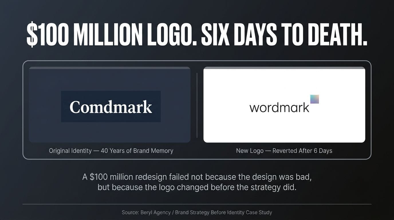
In 2010, Gap had one of the most recognised logos in American retail history. A white serif font in a dark blue box. Simple. Clean. 40 years of brand memory embedded in it.
They decided to modernise.
The new logo dropped the blue box, switched to Helvetica, and added a small gradient square in the corner. It was designed by the well-regarded agency Laird and Partners and cost an estimated $100 million including rollout.
Within 24 hours of launch, Gap’s new logo drew over 2,000 negative comments, a parody Twitter account with thousands of followers, and 14,000 spoof redesigns. The internet declared it a disaster.
Six days later, Gap brought back the old logo.
The strategic error was not the design. The design was fine. The error was that the logo change came first, without any corresponding shift in what Gap stood for, what it was selling, or who it was trying to reach.
As Barry Enderwick, former director of marketing at Netflix, put it: rather than make a strategic shift followed by a signal to consumers, they signalled first. Which only served to confuse consumers. People saw the same website, same stores with the same merchandise but with a new logo. It didn’t make any sense.
A new logo without a new strategy is noise. It does not communicate evolution. It communicates confusion. And consumers, who have built a relationship with a brand over years, experience that confusion as a kind of betrayal.
The $100 million was not wasted on a bad logo. It was wasted on a logo that had nothing behind it.
What Has to Come Before the Logo
If a logo holds meaning, the question becomes: what meaning do you want it to hold? That question cannot be answered by a designer. It has to be answered by the founder first. And it requires working through a sequence that most people skip because it feels less tangible than a visual.
The first question is: what is the one true thing about this business?
Not the product feature list. Not the mission statement. The one thing that is so fundamentally true about what you do and why you do it that everything else flows from it. Paper Boat’s one true thing was that traditional Indian drinks deserved to be celebrated rather than forgotten. Minimalist’s one true thing was that skincare deserved honesty over glamour. The Whole Truth’s one true thing was that the food industry was lying to people and someone should stop.
That truth is the foundation of a brand. The logo is just the flag you plant on it.
The second question is: who exactly is this for?
Not everyone. Specific someone. A brand that tries to speak to everyone speaks to no one. The designer who is trying to build your logo without knowing this will produce something that offends no one and moves no one. The brands that build loyal customers build them by being precisely right for a specific person, not vaguely acceptable to everyone.
The third question is: what is the personality of this brand?
Is it clinical and scientific? Is it warm and nostalgic? Is it irreverent and challenging? Is it quiet and premium? Every one of these personalities requires a completely different visual language. The same category, the same product, can be expressed in radically different ways depending on who the brand is and who it is talking to. Minimalist and Forest Essentials are both Indian skincare brands. Their packaging, their logos, their visual language are completely different because they are completely different brands built for completely different people.
Only after these three questions have real answers should a designer be briefed. Because now the designer has something to design toward. Not a blank shape. A set of decisions that need to be expressed visually.
Why Zomato’s Red Was Never Really About the Colour
Zomato’s bold red is one of the most recognised visual identities in Indian consumer brands. But the red is not why Zomato built a billion-dollar brand. The brand clarity came first. The red became iconic because of what it stood for, not the other way around.
Bold red evokes hunger and immediacy. It differentiated from Swiggy’s orange and the various international players in the market. But the colour was a decision made in service of a positioning that was already clear: a brand that was unapologetically obsessed with food, spoke to people in their language, and refused to be boring.
Zomato’s visual identity works because the tone of voice, the personality, the values, and the target customer were all clear before the design system was built. The logo is clean and powerful precisely because it is not trying to carry the entire brand. The brand is carried by every campaign, every piece of copy, every interaction. The logo just makes it recognisable.
When a brand knows who it is, the logo almost designs itself. When a brand does not know who it is, no logo can compensate.
The Pepsi Lesson: When a Logo Change Is Done Right
The counterpoint to the Gap story is Pepsi’s 2023 redesign.
Pepsi has updated its logo 14 times since 1898. Each time, the core visual equity has been preserved: the circular globe, the red white and blue palette, the wordmark. The 2023 redesign introduced a bolder, more electric blue, a modern custom typeface, and a new visual system that worked across physical and digital touchpoints from cans and bottles to vending machines, delivery trucks, and app interfaces.
The redesign rolled out alongside a clear strategic rationale: Pepsi was entering a new era for its 125th anniversary, leaning into being the more youthful, energetic alternative to Coca-Cola, and building a visual language that worked as well on a phone screen as on a billboard.
The redesign worked not because it was a better design than what came before. It worked because it was connected to a strategy. The visual change was a signal of a meaningful shift, not a change for its own sake.
The sequence that makes a logo redesign succeed is always the same: strategy first, brand personality second, visual expression third. Whenever a brand reverses that sequence, the results are what happened to Gap in 2010 and Tropicana in 2009 and 2024.
What This Means If You Are Building a Brand Right Now
If you are a founder who is about to brief a designer, pause for a moment and answer these four questions honestly before that conversation happens.
What is the one sentence that captures what this brand truly stands for? Not the tagline. The internal truth that informs every decision.
Who is the single person this brand exists for? Not a demographic. A person you can picture, with a specific problem your brand solves better than anyone else.
What three words describe the personality of this brand as if it were a person? These will tell a designer more than a mood board. Precise, clinical, direct is a different brief from warm, nostalgic, handcrafted. The logo, the typography, the colour palette, and the material choices all follow from this.
What do you want people to feel when they see your brand mark five years from now? Not what you want them to think. What you want them to feel. That feeling is what you are building toward. The logo is just the trigger.
A designer cannot answer these questions for you. That is not their job. Their job is to take your answers and find the visual language that expresses them with precision, simplicity, and longevity.
When you bring those answers to a designer, you are not briefing them on a logo. You are briefing them on a brand. And the difference between those two briefs is the difference between a mark that people recognise and a mark that people trust.
The Sequence That Changes Everything
Here is the sequence most founders follow:
Logo. Then name. Then tagline. Then figure out what the brand stands for.
Here is the sequence that builds brands that last:
What do we stand for and why does it matter? Who exactly are we for? What is our personality and how do we express it? What is our name, and does it carry the right meaning? Now design the visual identity. The logo is the last decision.
It feels counterintuitive. The logo is so visible, so concrete, so shareable. It feels like the beginning.
But every brand that has lasted, every mark that has become a vessel for meaning over time, started with clarity before it started with design.
The Swoosh was $35. But Nike was priceless before Carolyn Davidson ever picked up a pencil.
The logo was always last.
Brand strategy and identity is where Beryl begins every client relationship. Because a logo designed without strategy is expensive decoration. If you are ready to build something that lasts, visit beryl.agency.
Frequently Asked Questions
These are the questions we hear most often from founders about to brief a designer for the first time.
Why shouldn't I just start with a logo when building my brand?
A logo designed before you know who you are, who you are for, and what you stand for is just an expensive shape with nothing inside it. A logo holds meaning; it does not create meaning, and that meaning only gets stored in the mark once a clear brand strategy and real customer experience exist behind it. Starting with the logo means briefing a designer on a blank shape instead of a brand, which is why so many logos never connect commercially.
What should come before logo design in the branding process?
Before any visual design work begins, three questions need real answers: what is the one true thing about this business, who exactly is the brand for, and what is the brand’s personality. Only once a founder has worked through this sequence does a designer have something concrete to design toward, rather than guessing at a visual language with no strategy behind it. This is the correct brand strategy process for founders in India and anywhere else.
What is the right sequence for building a brand from scratch?
The sequence that builds brands that last starts with what the business stands for and why it matters, then who it is for, then its personality, then its name, and only at the end, its visual identity. Most founders run this sequence backwards, starting with a logo and working out what the brand means afterward. Reversing the correct order is the single most common reason new brand identities fail to create any real recognition or trust.
Why did Gap's 2010 logo redesign fail despite costing $100 million?
Gap’s redesign failed because the logo changed without any corresponding shift in strategy, positioning, or what the brand was actually selling. Within 24 hours of launch, the new logo drew over 2,000 negative comments, a parody Twitter account with thousands of followers, and 14,000 spoof redesigns, and the company reverted within six days. The failure was not a design problem; a new logo with no strategic shift behind it reads to customers as confusion, not evolution.
Why did Pepsi's 2023 logo redesign succeed where Gap's failed?
Pepsi’s redesign worked because it was connected to a clear strategic rationale tied to the brand’s 125th anniversary and a deliberate shift toward a more youthful, energetic positioning. The visual change preserved core brand equity, including the circular globe and the red, white, and blue palette, while modernising the system for digital and physical touchpoints. The lesson is consistent: a logo redesign succeeds when strategy comes first and the visual change simply signals a shift that has already happened inside the business.
How did Nike build so much meaning into the Swoosh if the logo itself was so simple and inexpensive?
The Swoosh was designed by a graphic design student for $35, and Phil Knight’s own reaction to it was famously unenthusiastic. The mark became iconic only because Nike spent the following decades filling it with stories, athletes, and cultural moments, none of which had anything to do with the shape itself. This is the clearest proof that a logo is a container for brand meaning, not the source of it.
Is brand strategy more important than visual identity for a startup or MSME?
Yes. Visual identity is how a brand strategy gets expressed, but it cannot substitute for the strategy itself. An MSME or startup that invests in a polished logo without first defining what it stands for, who it is for, and what personality it has ends up with design that looks competent but communicates nothing specific to a buyer or investor. Brand strategy has to be resolved first for any visual identity work to hold commercial value.
Why does Zomato's red logo work so well as a brand identifier?
Zomato’s red works because the brand’s tone of voice, personality, and target customer were clear before the design system was built, not the other way around. The colour differentiated Zomato from competitors and reinforced an identity that was already unapologetic and food-obsessed in every piece of copy and campaign. A distinct colour or mark only becomes ownable once the brand behind it is already clearly defined.
How do I brief a designer correctly if I am building a brand for the first time?
Before any design conversation, a founder should be able to answer four questions: what is the one sentence that captures what the brand stands for, who is the single person the brand exists for, what three words describe the brand’s personality, and what should people feel when they see the mark five years from now. Bringing these answers to a designer turns the conversation from a logo brief into a brand brief, which is the difference between a mark people recognise and a mark people trust. A designer’s job is to express these decisions visually, not to make them on a founder’s behalf.
Can two brands in the same category have completely different logos and visual identities?
Yes, and they often should. Minimalist and Forest Essentials are both Indian skincare brands, but their packaging, logos, and visual language are completely different because they are built for different people with different brand personalities. A logo should express the specific truth, audience, and personality of one brand, not a generic visual language for an entire category.
What happens if a company changes its logo without changing its underlying strategy?
The result is brand confusion rather than brand evolution. Customers who have built a relationship with a company over years experience an unexplained visual change as disorienting, because the products, stores, and experience around them have not changed to match the new signal. This is precisely what happened with Gap in 2010, where a new look with no strategic story behind it created backlash instead of renewed relevance.
How long should the strategy phase take before starting logo design?
There is no universal timeline, but the strategy phase should never be skipped to save time, because doing so is the most common reason brand identities fail to create commercial impact later. The work involves defining the one true thing about the business, the specific audience, and the brand’s personality, and these decisions need to be resolved with real clarity, not rushed, before a designer is briefed. A rushed strategy phase produces the same outcome as no strategy phase: an expensive logo with nothing behind it.
How does Beryl approach logo design differently from most design studios?
As one of the best branding agencies in India and the official design partner of the Confederation of Indian Industry (CII), Beryl treats brand strategy and identity as where every client relationship begins, never the logo itself. Before any visual work starts, we work through what the business truly stands for, who it is for, and what personality it should express, so that by the time a logo is designed, it already has real meaning to hold. This is why Beryl’s identity work is built to create recognition and trust commercially, not just visual polish at launch.
Why should a founder or MSME choose Beryl over a designer who starts directly with logo concepts?
Most designers and studios start where founders instinctively want to start: with the logo. Beryl starts one step earlier, with the brand strategy that determines what the logo needs to communicate in the first place, which is why our identity work holds up commercially rather than needing a costly redesign later, the way Gap’s did. As one of the best branding agencies in India for end-to-end brand building, from naming and strategy through to visual identity, packaging, and digital presence, Beryl ensures every visual decision is an expression of a clear strategic foundation. If you are about to brief a designer, we would like to have the strategy conversation first.
