

30 Jun When Should a Business Rebrand? Lessons from Naturals Ice Cream, Bisleri, and India’s Most Successful Brands
There is an ice cream shop in Juhu, Mumbai that a fruit vendor’s son started with four workers and a 200 sq ft room in 1984.
For over thirty years, it was a beloved local secret. The ice cream was extraordinary pure fruit, no chemicals, no artificial anything and those who knew it, swore by it.
But only those who knew it.
By 2015, the brand’s turnover was modest, its footprint limited, its name recognised mostly by loyal Mumbaikars who’d grown up queuing outside that original Juhu outlet.
The product had not changed. The quality had not changed. But the world around it had completely.
That was the year Raghunandan Kamath’s son stepped into the business.
And in 2017, Naturals Ice Cream changed its logo. Just one element: the ‘A’ in Naturals was inverted. A small cone placed inside. A new tagline. And everything, absolutely everything, changed.
Not the recipe. Not the sourcing. Not the people. Just the signal the brand sent to the world about who it was now.
Today, Naturals Ice Cream is present in 35 cities, over 140 stores, and clocking a turnover estimated at ₹400 crore.
Same ice cream. Different era.
What Rebranding Actually Is
Most people misunderstand rebranding. They hear the word and think: logo change. New colours. Maybe a trendy font. A press release that says the company is ‘evolving for the future’.
That’s not rebranding. That’s redecoration.
Real rebranding is a business decision about what story you are telling and who you are telling it to.
Sometimes that decision is driven by growth. You are expanding geographically and your brand feels regional when it needs to feel national. You are entering a new customer demographic and your visual identity is speaking to a generation that’s retiring.
Sometimes it’s driven by competition. Your market has become cluttered and every player looks the same. You are invisible on the shelf because you blend into a sea of identical choices.
Sometimes it’s a crisis. Your reputation has taken a hit and the old brand has become the container for a narrative you can no longer afford to carry.
And sometimes honestly, more often than people admit, it’s simply that your audience has been loyal to you for years, loves your product, and is quietly, gently, looking for something that still feels like you but also feels like now.
There’s an interesting psychology behind this. Think about how often you change a product on your dressing table, not because the old one stopped working, but because you wanted something new. Your audience does the same thing with brands.
The question is never whether to rebrand. The question is whether you recognise the moment when the brand you built is holding back the business you’re trying to become.
The Day Bisleri Picked a Colour ,And Won the Market
In 1969, a brand called Bisleri introduced India to packaged drinking water. For decades, it effectively owned a category it created.
Then came the 2000s.
A pesticide controversy hit in the early 2000s, triggering a significant fall in market share. At the same time, the competition arrived all at once, Aquafina from Pepsi, Kinley from Coca-Cola, and a flood of local players. Bisleri watched its market share erode on two fronts simultaneously.
Here is what’s interesting about what they did next.
They didn’t launch an aggressive ad campaign. They didn’t slash prices. They didn’t try to out-shout the newcomers.
They changed their colour.
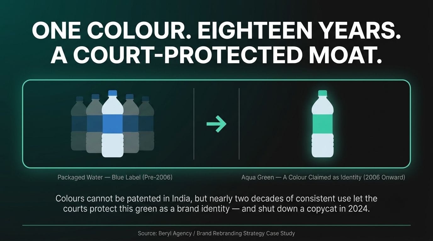
In 2006, Bisleri moved from the blue label that had defined packaged water for years, that every competitor also used to an aqua green. A colour that belonged entirely to them, because no one else had claimed it.
→ Every other packaged drinking water brand was blue. One different colour on a crowded shelf is worth more than any ad spend. ,The logic was clean:
What happened next took nearly two decades to fully reveal itself.
In January 2024, a packaged water startup called Aquapeya appeared on Shark Tank India, raised ₹70 lakh from judges Namita Thapar and Ritesh Agarwal, and became briefly famous. Then the Bombay High Court stepped in.
Bisleri filed suit against Aquapeya for trademark infringement. The core of the case? Aquapeya had deliberately used the same green as Bisleri. The founders admitted it on national television, they said consumers in certain regions identify water brands by colour, and green meant Bisleri, so green was what they used.
The High Court agreed. Aquapeya was ordered to cease operations.
In India, colours cannot be patented. Ferrari can patent its red. Tiffany owns its teal. But what Bisleri proved is that if you commit to a colour completely enough, for long enough, a court of law will protect it for you anyway.
One rebranding decision in 2006. Eighteen years later: still winning courtrooms because of it.
The Moment That Matters Most: When the Next Generation Walks In
There’s a pattern that repeats across every strong rebranding story in Indian business.
The founder builds something real. Something with genuine quality at its core. They survive the early years on the strength of the product alone: word of mouth, loyal customers, slow and steady expansion.
Then the second generation arrives.
They see the business differently. Not better or worse, differently. They have grown up with the brand as consumers as much as inheritors. They know instinctively what it feels like to encounter the brand as a stranger would. They see the gap between what the product actually is and what the brand is communicating about it.
→ Founded 1984. Rebranded 2017 when the founder’s sons took active roles. From limited Mumbai presence to ₹400 crore turnover, 35 cities, 140+ stores. ,Naturals Ice Cream:
This isn’t a coincidence. It’s a structural truth about how brands evolve.
The generation that builds a business builds it with one eye on survival. The generation that inherits it can afford to look up. They can see what the brand could be, not just what it has been.
Some founders recognise this and deliberately hold the rebrand in reserve ,keeping it as a launchpad for the next generation, a head start they can give their children that no money can replicate. A new identity, a fresh story, handed to someone with the energy and the cultural fluency to run with it.
This is not a wrong strategy. It is, in fact, one of the most thoughtful things a business founder can do.
What Makes a Rebrand Work (And What Makes It Fail)
This is where most people get it wrong.
A rebrand that works is not a rebrand that looks good. It is a rebrand that is true.
The Naturals rebrand worked because the cone in the inverted ‘A’ was a visual metaphor that earned its place, it said ‘we are ice cream, we have always been ice cream, and now we are confident enough to say it in every city in India.’
The Bisleri rebrand worked because the green wasn’t a trend. It was a deliberate stake in the ground, a commitment to owning that visual real estate in the consumer’s mind forever.
Rebrands fail when they are motivated by boredom rather than strategy. When a company changes its logo because the founders are tired of it, not because the audience needs something new. When the new identity is designed without understanding who it’s for and what it needs to say.
They also fail when the rebrand is only skin-deep. A new logo on top of an unchanged product experience, an unchanged customer service attitude, an unchanged internal culture. The audience is smarter than that. They feel the gap.
The logo is the last thing you change. Everything else has to be ready first. The logo is just the announcement that you’ve already become something new.
The brands that get this right treat the rebrand as a moment in a longer story, not the story itself. Naturals didn’t become ₹400 crore because of a logo. It became ₹400 crore because the business was ready to scale, the leadership had changed, the strategy was in place. The logo was the signal that the gun had fired.
The Legacy Question
What about the brands that have kept the same logo for a hundred years and survived?
They exist. Godrej. Tata. A handful of names that have transcended their visual identity so completely that the name itself carries all the meaning.
But here is what’s true about those brands: they are legacy brands not because they never changed, but because they invested so much, so consistently, so deeply in building equity into their name that the name became immune to time.
That takes decades. That takes the kind of institutional commitment to brand-building that most Indian businesses, especially MSMEs, especially B2B companies, have never made, because nobody told them to.
Most Indian businesses that have kept the same identity for twenty years have not built a legacy. They have built familiarity in a shrinking circle. The audience that knows them is aging. The audience that doesn’t have no reason to start.
The choice is not between rebranding and staying the same. The choice is between rebranding with intention ,or watching the brand slowly become invisible to everyone who doesn’t already know you.
So When Is the Right Time?
There is no fixed answer. No ten-year rule. No trigger that applies universally.
But there are questions worth asking:
→ Does your brand still reflect the quality of what you actually make?
→ Is your audience changing ,in age, in geography, in aspiration ,faster than your brand is?
→ Is there a new generation in your business, waiting for the signal that something new has started?
→ Do you look identical to your competitors on the shelf, online, in every sales context?
→ Has something happened ,to your market, your reputation, your strategy ,that the old brand cannot carry?
If the answer to any of these is yes, the conversation has already started. The rebrand is already due.
The only question is whether you will make it a deliberate act of strategy or wait until the market makes the decision for you.
Raghunandan Kamath passed away in May 2024.
His sons run Naturals today. The brand is in 35 cities.
The ice cream recipe is unchanged.
He built something real, and then he made sure it could survive him.
That is what a rebrand, done right, actually does. It doesn’t change the brand. It protects it ,for whoever comes next.
Beryl works with businesses at exactly this moment when what you’ve built deserves to look like what it actually is. End-to-end brand building, from identity and naming to packaging, digital presence, and everything between. If you’re ready to have the conversation, we’d like to be in it.
Frequently Asked Questions: Branding for MSMEs in India
These are the questions we hear most often from founders and family businesses thinking about rebranding for the first time.
What is rebranding and how is it different from a logo redesign?
Rebranding is a business decision about what story your company is telling and who it is telling it to. A logo redesign is just one possible output of that decision, not the decision itself. Most companies confuse the two, change a colour or a font, and wonder why nothing in the business actually shifts. Real rebranding strategy for Indian businesses starts with the audience and the story, and the visual identity comes last, not first.
When is the right time for a business to rebrand in India?
There is no fixed timeline or ten-year rule for when a business should rebrand. The right moment usually shows up as a pattern: your audience is changing faster than your brand, you look identical to competitors, a new generation is stepping into the business, or your visual identity no longer reflects the quality of what you actually make. If any of these signals are present, the rebrand is already due, whether or not the business has consciously noticed it yet.
Does rebranding mean changing the product or the company name?
No. The most successful Indian rebrands, including Naturals Ice Cream and Bisleri, changed nothing about the product, the recipe, or the people behind it. What changed was the signal the brand sent to the market about who it was now. A rebrand protects what you have already built; it does not require you to abandon it.
Why do family businesses in India often rebrand when the next generation takes over?
When the second generation steps into a family business, they tend to see it differently from the founder who built it. They have grown up encountering the brand as customers as much as inheritors, which gives them a clearer view of the gap between what the business has become and what the brand still communicates. This is why founder-to-next-generation transitions are one of the most common and most effective moments for a deliberate, strategic rebrand in Indian businesses.
Can a colour or visual element really be protected by Indian courts?
Colours cannot be patented in India, but consistent, long-term ownership of a colour can still be defended legally, as Bisleri proved when it won its trademark infringement case against Aquapeya over the colour green. The key factor was commitment: Bisleri had used that aqua green consistently for nearly two decades before the case reached court. This shows that brand consistency itself becomes a form of legal and commercial protection over time, not just a design choice.
How do I know if my rebrand is happening for the right reasons?
A rebrand driven by strategy looks different from one driven by boredom. If the change is motivated by growth, a shifting audience, new competition, or a new generation entering the business, it is strategic. If it is motivated mainly by founders being tired of the old look, with no real change underneath, it usually fails to move the business commercially. The audience can tell the difference between a brand that has earned its new identity and one that has only redecorated.
Why do some rebrands fail to change anything for the business?
Rebrands fail most often when they are only skin-deep: a new logo sitting on top of an unchanged product experience, customer service, or internal culture. The logo should be the last thing that changes, once the business behind it is genuinely ready to be seen differently. When companies skip the strategy and jump straight to design, the audience feels the gap immediately, and the rebrand has little real commercial effect.
Should legacy brands like Tata or Godrej ever rebrand?
Brands that keep the same identity for decades are not exceptions to rebranding logic; they are proof of a different kind of investment. Names like Tata and Godrej have built so much equity into their identity over time that the name itself carries the meaning, which takes decades of consistent, deliberate brand-building most MSMEs have not had the chance to do. For most growing Indian businesses, especially MSMEs and B2B companies, staying visually static for twenty years builds familiarity in a shrinking circle, not legacy.
How long does a rebranding project typically take?
Timelines vary depending on scope, but a rebrand that is done properly always starts with strategy before any visual design work begins. Skipping that sequence is the most common reason Indian rebrands look polished but fail to change buyer behaviour, investor interest, or hiring outcomes. The business should be operationally and culturally ready before the new identity is introduced to the market.
Will rebranding confuse my existing customers?
A well-executed rebrand does not confuse loyal customers; it gives them a sharper, more confident version of the brand they already trust. The real risk is not confusing the people who already know you. It is staying invisible to everyone who does not know you yet, which is a far larger and more permanent cost to the business.
What makes a rebrand commercially successful rather than just visually different?
A commercially successful rebrand treats the new identity as one moment in a longer business story, not the story itself. Naturals Ice Cream did not reach ₹400 crore in turnover because of a new logo; it reached that scale because the leadership, strategy, and business readiness were already in place, and the rebrand simply announced it. The visual change works only when everything else in the business has already earned it.
How does Beryl approach rebranding for Indian businesses?
As the official design partner of the Confederation of Indian Industry (CII) and one of the best branding agencies in India for end-to-end brand building, Beryl treats rebranding as a business strategy exercise first, not a design exercise. Before any creative work begins, we identify why the current brand is holding the business back and who it needs to speak to next. From naming and identity to packaging and digital presence, every element we design is built to reflect what the business has actually become, not just refresh how it looks.
Why should an MSME or family business choose Beryl for rebranding instead of a general design studio?
Most design studios start with visuals. Beryl starts with the business decision underneath the visuals, which is why our rebranding work is built to hold up commercially, not just look good at launch. As one of the best branding agencies in India and the official design partner of CII, we work end-to-end across identity, naming, packaging, and digital presence, so the rebrand is never just a new look but a complete, coherent signal to the market. If your business has outgrown the brand it is currently wearing, we would like to be part of that conversation.
