what if your brand is holding you back more than your competition is?
rebranding gives MSMEs a second chance to look relevant, trusted, and future-ready. it’s not just a facelift, it’s how you unlock new markets, new customers, and new growth.
Trustindex verifies that the original source of the review is Google.
Very creative and motivated team. Every client's brief is read multiple times like a love letter to ensure no detail is missed. Designs are sophisticated and classy, and they stand out.
Worked on a tiny project for them and got paid on time.
Design Clinic India
Trustindex verifies that the original source of the review is Google.
Welcome to the hub where all your professional needs, from branding to UI/UX and beyond, are met with expertise! Our journey with Beryl Agency spans over a year, and the founder's wealth of knowledge has been instrumental in our company's remarkable 10X growth. Not only have we flourished as a business, but our team has also imbibed invaluable design ethics and more. We wholeheartedly recommend Beryl Agency. Cheers to continued success!
Chetna Agarwal
Trustindex verifies that the original source of the review is Google.
Very satisfying experience with Beryl Agency.
Abdul Chaudhary
Trustindex verifies that the original source of the review is Google.
The Beryl agency is highly skilled at providing outstanding branding solutions, particularly in the areas of logo and package design. Their designs stand out for their exceptional originality and attention to detail, which gives their clients distinctive brand identities. They create powerful tactics that connect with target audiences by having a thorough understanding of client demands. Their service is characterized by efficiency and professionalism, which guarantees a smooth encounter. The Beryl agency, which offers unmatched innovation and skill that propels brands to new heights, is essentially synonymous with excellence in branding and design.
Abhijay Kumar Jayant
Trustindex verifies that the original source of the review is Google.
Beryl Agency provides everything you need for great design, from branding advice to creating logos and user-friendly websites. They focus on making designs that stand out and help businesses succeed.
your market can’t trust you if your brand hasn’t moved forward; it questions everything you offer.
draining money, confusing choose the wrong direction anddraining money, confusing employees, shaking investoremployees, shaking investorconfidence, and blocking future funding.What happens when rebranding failschoose the wrong direction andyou risk losing customers,you risk losing customers,confidence, and blocking future funding.studies show failed rebrands often lead to revenue drops of 15–25% in the first year. outdated identity replaced with an irrelevant one signals inconsistency, causes employee disconnect, and gives competitors a stronger foothold while your brand looks unstable.
and this is why a ₹35000 rebranding will never work for your business
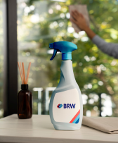
see how changing one colour on a bottle helped Bisleri recover a market share it had been losing for years.
we begin with a deep audit of your brand’s past and present. every symbol, story, and customer touchpoint is dissected to see what built trust and what now creates friction. this is where we separate equity worth protecting from baggage worth discarding.
02
we reimagine your strategy with precision. rebranding n isn’t just a new story, it’s a careful rewrite of your positioning, promise, and tone balancing continuity with change so investors, employees, and customers don’t feel alienated but inspired.
03
we craft design evolutions with responsibility. each logo line, color shift, or identity overhaul is stress-tested in real-world scenarios. we simulate consumer reactions, measure cultural fit, and ensure the new identity can carry the brand for decades, not just trends.
We deliver brand guidelines that ensure consistency across packaging, website, social media, and more — so your brand stays clear, strong, and scalable.
04
training internal teams, aligning marketing, preparing investor decks, and building consistency across every touchpoint so the new brand doesn’t just look different, it behaves differently.
final step
the final rebrand comes with everything you need to run it seamlessly, a complete brand book, detailed guidelines, master files, ready-to-use templates, and rollout support.
– detailed study of existing brand equity, perception, and market standing – identification of gaps between brand image, audience expectations, and business goals – repositioning strategy crafted to protect legacy while driving renewed relevance
Credibility & Price Repositioning
– redefining visual and verbal identity to restore confidence and trust – aligning brand image with product value to justify pricing and premium positioning – storytelling that elevates perception and strengthens buyer conviction
360° Identity Refresh
– reimagined logo, color palette, and typography refined for modern relevance – refreshed visual system extended across packaging, digital, print, and space – consistent design execution to ensure authenticity and credibility at every touchpoint
Internal, Investor & Market Confidence
– communication frameworks that reassure employees, investors, and stakeholders – internal culture alignment workshops and investor presentation redesigns – building a rebrand that signals growth, steadiness, and renewed trust
Brand Book & Rollout Systems
– creation of updated brand book, design templates, and master files – implementation support across internal teams and vendors for consistent adoption – smooth transition plan ensuring new brand rollout without confusion or resistance
Rebranding for Growth & Expansion
– architecture planning for new categories, verticals, or global markets – compliance, linguistic, and cultural alignment for smooth regional rollout – future-proof design systems that evolve with scale, not against it
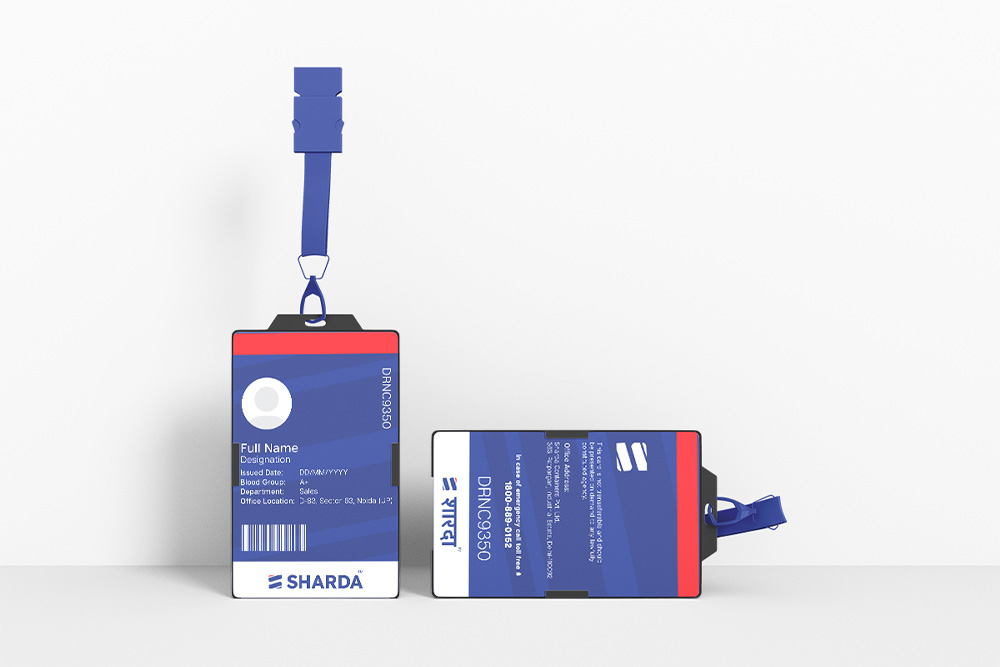
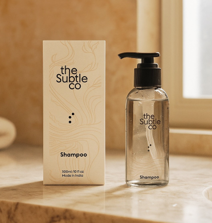
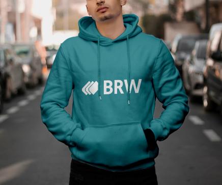
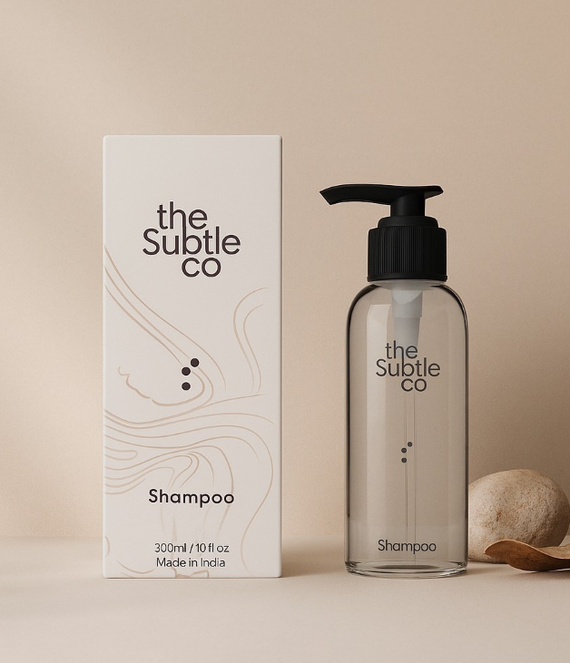
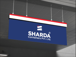
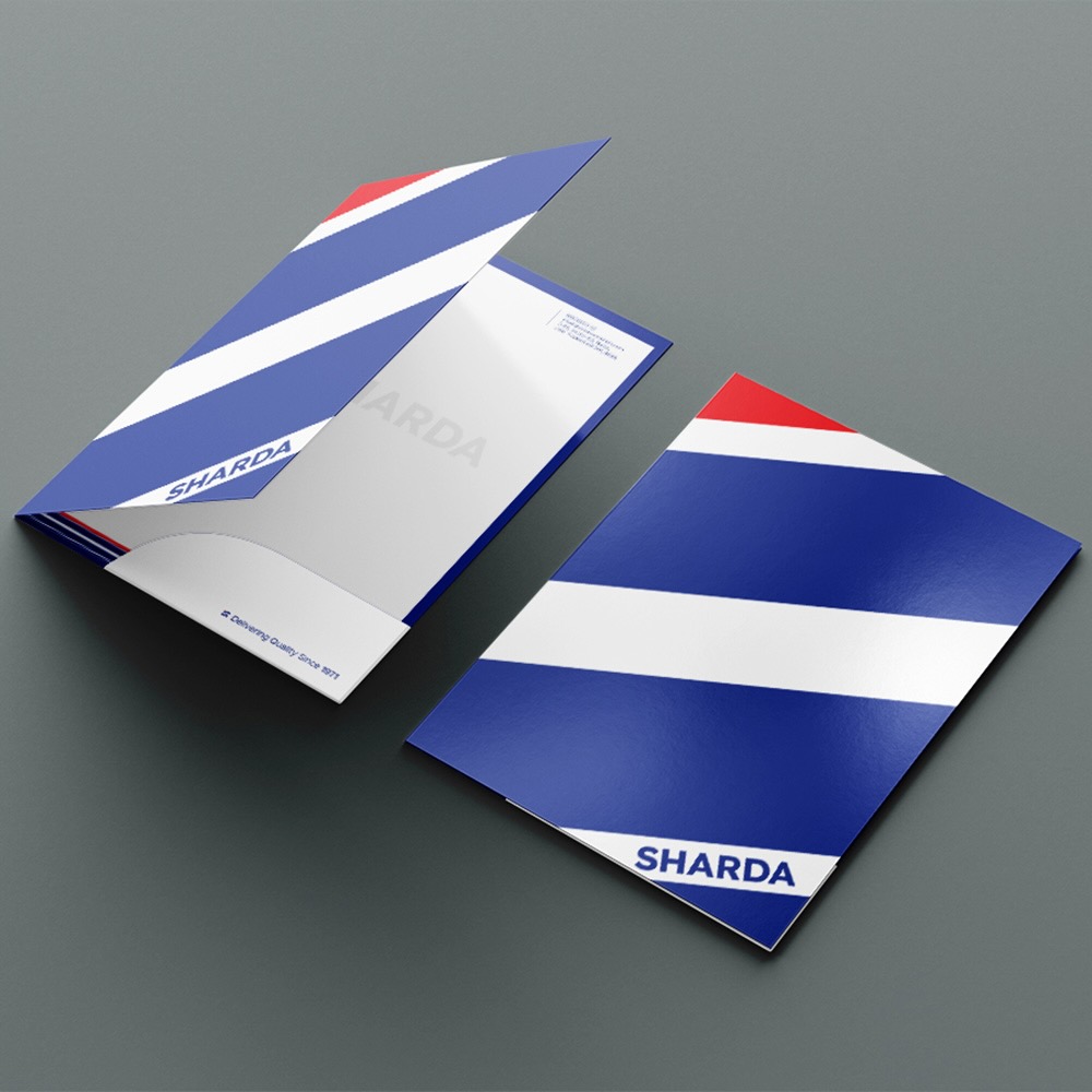
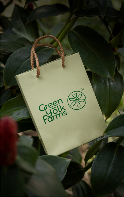
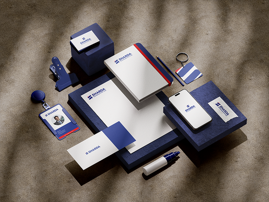
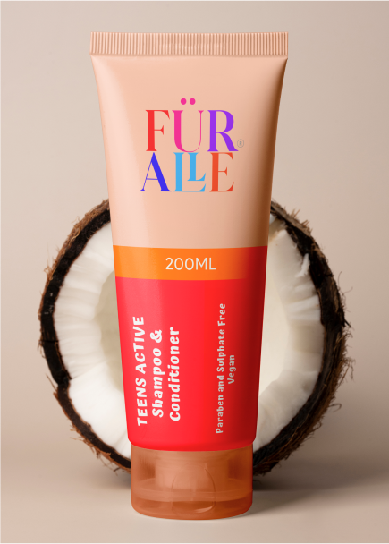
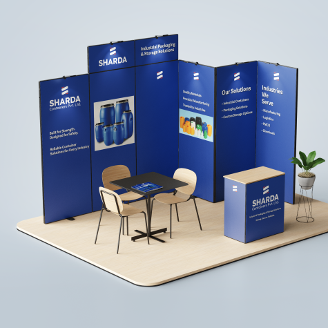
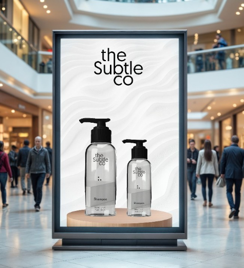
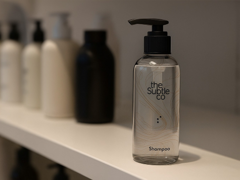
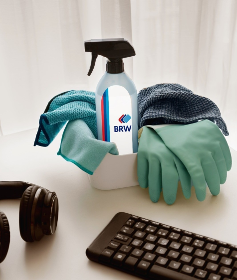
this is how rebranding is actually created-see a few examples below.
020301oona
a strong rebranding created by us gives
- renewed trust, with MSMEs regaining 40–50% market share within months
- stronger recall, as startups see 20–25% higher brand awareness post refresh
- investor confidence, with 75% of VCs influenced by brand perception
- faster expansion, with MSMEs entering new markets 30% quicker after rebrand
- premium identity, as rebrands drive 15–23% revenue growth in year one
Masonry Gallery
most asked questions
what is rebranding, and why do companies need it?
rebranding is a strategic redesign of your brand’s identity, voice, and visuals. companies typically rebrand to stay relevant, reach new markets, reflect internal shifts, or outgrow outdated perceptions.
how is rebranding different from a brand refresh?
a brand refresh updates select elements like fonts or colors. rebranding is a deeper shift—often involving a new logo, strategy, messaging, and visual system.
when is the right time to rebrand?
you should consider rebranding when your business pivots, merges, faces identity confusion, or your current brand no longer reflects who you are.
what does beryl offer as part of a rebranding project?
we cover complete brand audits, strategy, logo and identity design, packaging, ui/ux, space branding, and launch collaterals—built for clarity, consistency, and business growth.
how long does a typical rebranding project take?
timelines vary, but most projects take 6 to 10 weeks depending on scope, feedback cycles, and number of brand touchpoints being redesigned.
will our existing customers get confused after rebranding?
not if it’s done right. beryl ensures a clear transition strategy that retains core brand values while introducing your evolved identity seamlessly.
why choose beryl for rebranding design?
with 1300+ projects over 15 years, beryl combines business thinking with design craft—delivering rebrands that don’t just look good, but work harder.

 120+ businesses reborn with us