BharatX
entered a space driven by volatility, speculation, and mistrust. In a 2025 consumer sentiment report, 59 percent of people familiar with crypto said they are not confident in its security. Cryptocurrency promised freedom, but most brands spoke in complexity, jargon, or fear. The technology was powerful. The intent was revolutionary. But the language felt distant. BharatX needed more than a logo. It needed Branding for Fintech that could earn trust while speaking of progress, dignity, and inclusion.
After the fintech brand identity was designed, the shift was immediate.
1. People perceived BharatX as more credible because the brand felt grounded, not abstract.
2. Trust improved as cultural familiarity balanced technological ambition, a critical lever in financial services branding.
3. Engagement increased as the brand spoke of opportunity without intimidation, aligning with broader findings that 36 percent report lacking trust in crypto platforms and exchanges and 43 percent cite security and fraud concerns.
4. And most importantly, BharatX began to feel like a movement rooted in India, yet relevant to the world.
That is the power of identity led Branding for Fintech.
When trust is designed in, participation becomes natural.
The Context: When Technology Outpaced Trust
Cryptocurrency can reshape money, the internet, and individual rights.
But adoption keeps colliding with one wall. Trust.
Most crypto branding feels either too technical or too speculative.
BharatX set out to democratize money globally, with a platform built around product, security, authorization, and compliance.

The Challenge: To Humanize a Complex Financial System

The brief was ambitious. Create fintech branding that speaks of financial freedom without fear.

It had to feel secure for institutions, simple for individuals, and credible for regulators. Indian in origin, global in ambition.
The Insight: Why Crypto Adoption Depends on Belief
Crypto is not just technology. It is a social movement.
People participate in financial systems when they believe they are equitable, accessible, efficient, and transparent.
So the BharatX cryptocurrency brand identity had to communicate belief before features.
Trust first. Then participation.

insurance feels invisible until something goes wrong

brand language is often legal and cold

visuals rarely communicate reassurance

customers don’t feel emotionally covered
Oona needed to signal one idea clearly. We are always around you.
We approached BharatX as Branding for Fintech where trust is the product.
Our strategy revolved around three principles
– Purpose. Democratize money globally
– Design. Balance cultural familiarity with modern precision
– Tone. Confident, secure, inclusive
No hype. No jargon. No intimidation.
The Strategy: Designing Trust as a System
The Name: Rooted Locally, Relevant Globally
The name BharatX was intentional.
Bharat grounds the brand in Indian origin and values.
X signals the future, exchange, and exponential possibility.
Together, it creates a fintech startup branding signal that is both familiar and forward looking.
The Visual Identity: Where Culture Meets Credibility
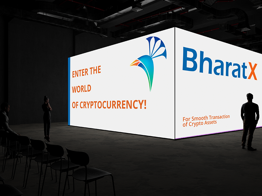
The logo is the key building block of identity.
The signature combines the symbol and company name.
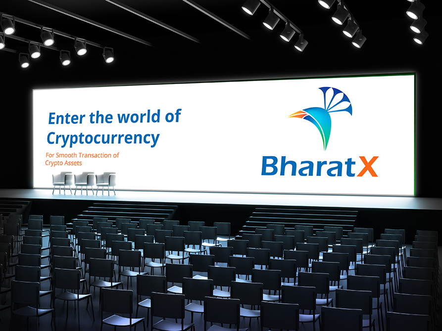
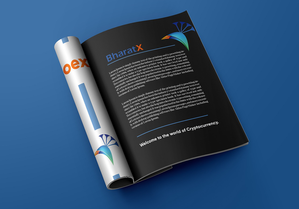
The symbol is a golden bird evoking Indian origin and trust, inspired by the peacock, incorporating the chakra for cultural yet modern symbolism.
This is fintech logo design with meaning, not decoration.

The logotype was selected for modern clarity and refined legibility.
Eras Demi was chosen for its clean structure and balanced curves, aligned with the overall fintech brand identity design.
The Typography: Precision with Warmth

Blue. Trust, security, reliability

Orange. Optimism, energy, forward motion
Together they support crypto branding that feels safe, not speculative.
The Color System: Trust and Energy in Balance
BharatX uses two primary colors that became recognizable identifiers.
The Achievement: Turning Crypto Into a Trust Narrative
BharatX became a platform that speaks in human terms about a complex space.
It positioned participation as empowerment, not gambling.
For Beryl, this reinforced a core truth in Branding for Fintech.
Trust signals beat feature lists.


What This Means for the Future of Insurance Branding
Insurance does not need to feel cold.
It needs to feel constant.
Oona proves that when brand identity communicates presence, trust follows naturally.
What This Means for the Future of Fintech Branding
The next decade of fintech branding will be judged on trust, not buzzwords.
On transparency, not theatrics.
On systems, not slogans.
BharatX shows how a cryptocurrency brand identity can feel culturally anchored while staying globally credible.

Our Perspective: Why Financial Freedom Needs Design Thinking
Money is emotional.
Trust is psychological.
Freedom is personal.
Design thinking translated complex finance into a language people can believe in.
That is the real job of financial services branding.
What We Delivered
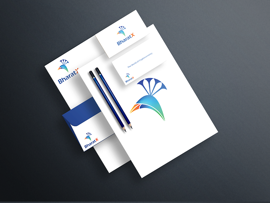
Each element was built to reinforce trust at every touchpoint.

Brand strategy and positioning

Fintech logo design with cultural symbolism

Typography selection and identity rules

Color system and brand guidelines
Beryl builds brands where credibility is non negotiable.
Our approach blends psychology, culture, and clarity to deliver Branding for Fintech that lasts.
The Beryl Edge
Financial freedom does not start with technology.
It starts with belief.
BharatX proved that when a brand feels trustworthy, people are willing to explore new financial worlds.
What We Learned
FAQs
What makes Branding for Fintech different from regular branding
It must earn trust before it earns attention.
Why use cultural symbolism in fintech brand identity design
Because familiarity can reduce perceived risk and increase trust.
Why do blue and orange work for fintech branding
They balance security with optimism, trust with momentum.
What is the role of a fintech logo design in crypto brands
It acts as a trust shortcut in a category where skepticism is high.
Can fintech startup branding still feel global if it is culturally rooted
Yes. BharatX shows how local anchor and global ambition can coexist.
