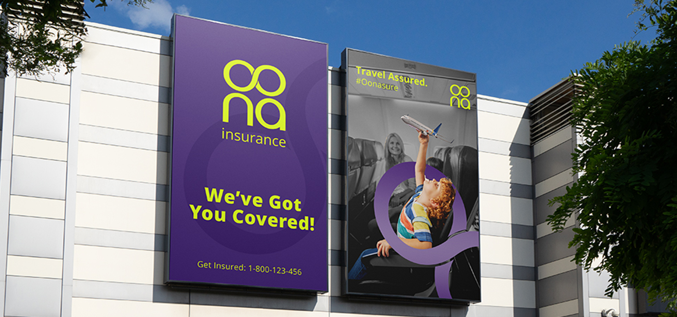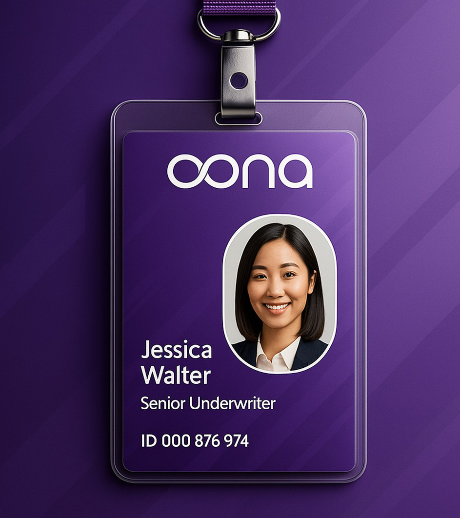
Insurance Industry
Picture a young couple reviewing their first health policy. The website explains everything in simple language, the premium calculator feels transparent, and the brand voice feels calm instead of intimidating. When they finally click buy, they feel safe and understood. That moment when fear turns into clarity is where design lives.
At Beryl, we help insurance brands design what they are remembered for. From brand belief to policy communication, from digital journeys to claims experience, we build systems that make insurance feel trustworthy, transparent, and human.
The global insurance market is projected to cross seven trillion dollars by 2030. India is one of the fastest growing insurance ecosystems driven by health, motor, term, and digital only products. In this category, design does more than inform. It earns belief.

Start with the core story

Every insurance brand stands for a philosophy of protection, stability, fairness, or responsibility. People do not buy policies; they buy peace of mind.

At Beryl, we begin by defining your Brand Belief System, what should people believe about safety, financial security, and support. This belief becomes the foundation for identity, communication tone, UI hierarchy, and product architecture.

Color psychology has strong impact here. Blues and greens communicate reassurance and stability. Clean neutrals communicate professionalism. Typography and iconography must feel modern and confident without feeling clinical.
We unify these elements across websites, apps, policy documents, onboarding flows, agent tools, and claims communication.
Insurance journeys are filled with friction. Fine print, confusing premiums, and unclear claims create anxiety. Design must remove that burden.
Beryl’s UI and UX teams build digital insurance journeys that feel transparent and calm. We simplify premium breakdowns, explain coverage clearly, create visual benefit tables, and design claims dashboards that reduce fear.
Physical communication matters too. Policy PDFs, claim forms, brochures, and welcome kits must support clarity and confidence instead of overwhelming users.
Great insurance design is not decorative. It is clarity delivered at the right moment.
Design the touchpoints that build trust
Insurance brands earn loyalty through honesty. People stay with brands that do not hide information.
At Beryl, we build communication systems that explain exclusions, waiting periods, premium changes, and claims with empathy and clarity. When people understand coverage, they feel protected instead of trapped.
Global leaders like Lemonade and Oscar Health have shown that clean design and transparent communication outperform complex product marketing. We decode these insights for Indian insurance needs and expectations.
Build transparency before marketing
Branding that strengthens credibility and care
Insurance branding must feel stable, modern, and responsible. It cannot feel aggressive or overly playful.
Beryl’s branding team builds clarity led insurance identity systems:

Color logic that communicates trust, stability, and protection

Icons that simplify coverage, benefits, and risk categories

Typography systems that stay readable even in dense policy details

Identity grids that scale across brochures, web, app, and agent communication
We design branding that helps people feel safe and supported.
Designing for confidence, not confusion
Insurance decisions are emotional. Design must support clarity at every step.
At Beryl, we unify branding, UI, content strategy, policy communication, and claims design into one simple and human system. From premium calculators to renewal reminders to claim status updates, every touchpoint calms the user.
That is how we turn insurance products into protection experiences.
A mini field guide from Beryl

Define your brand belief, stability first, honesty first, or care first

Build UI that removes fear from buying decisions

Simplify policy documents with clear hierarchy and icons

Use emotional communication that supports families

Maintain one consistent design language across all products
Do this, not that
- - do simplify policy wording. do not bury information
- - do design clean premium tables. do not overload with variables
- - do communicate claims clearly. do not hide behind jargon
- - do maintain visual hygiene. do not create cluttered pdfs
- - do build trust led onboarding. do not chase urgency led messaging
Case slices that prove the point

blanc9
Branding, packaging, and website, showing how clean design elevates trust across lifestyle categories.

window passion
Website and space design, demonstrating how consistent design across digital and physical environments builds reliability.

inaari
Branding and packaging, ideal for categories that require clarity and responsibility in communication.
At Beryl, we decode why such brands work, and design insurance experiences that feel simple, supportive, and trustworthy.
- - simple layouts reduce fear during decision making
- - cool tones increase perceived stability and credibility
- - clear iconography improves understanding of coverage
- - transparent claims flow increases long term loyalty
- - clean typography reduces confusion in complex documents
- - empathetic communication reduces anxiety during claims
Beryl’s integrated brand, UX, and communication teams bring clarity, honesty, and care into your insurance brand.
The psychology behind insurance design
Your next three moves
Define your brand belief system, the emotional promise your insurance brand must hold
Build your ecosystem, identity, UI, policy communication, and claims journeys in one unified visual language
Create your clarity system, coverage breakdowns, visual tables, onboarding guides, and renewal communication
FAQs insurance founders often ask
how should i position my insurance brand
Position around stability, transparency, and care depending on your core belief system.
what colors work best for insurance brands
Blues, greens, and calm neutrals that communicate trust and reassurance.
how can design increase policy purchase confidence
Clear premium tables, simplified coverage breakdowns, and transparent communication.
should policy documents follow a strict design system
Yes. Consistent hierarchy, icons, and formatting reduce confusion and errors.
can beryl design both the brand identity and the claims dashboard
Yes. We build unified design ecosystems across brand, product, and communication.
what makes an insurance website convert better
Simple calculators, clear benefits, transparent exclusions, and calm UI patterns.
should exclusions be highlighted clearly
Yes. Honest communication builds long term trust and reduces disputes.
how important is emotional tone in insurance communication
Very. Insurance decisions are fear driven. Empathy increases comfort.
should renewal communication be aggressive or calm
Calm, clear reminders work better than urgency led tactics.
how do i scale design across multiple insurance products
Use a master grid for color, typography, iconography, policy structure, and coverage tables.
If you are building the next insurance brand people trust with their future

