Rebranding icons for Generation Alpha, what stays sacred, what must flex
If you are trying to “refresh” an icon for Gen Alpha, you are not redesigning a logo. You are redesigning recognition. In a world of app icons, tiny thumbnails, reels, stickers, AR filters, and watch screens, the brand is judged in microseconds and remembered in fragments. We captured the core tension well: evolve a global icon without losing its soul, because Gen Z and Gen Alpha expect freshness, inclusivity, and cultural relevance, while still punishing anything that feels like betrayal.
The hard truth is that attention is now brutally front loaded. Visual appeal judgments for websites can happen in about 50 milliseconds, which means your “first impression” is often formed before reading begins.
And reading often does not begin anyway. Nielsen Norman Group has been saying for years that users scan rather than read word by word, which is why icons, labels, and visual hierarchy carry disproportionate weight.
Now layer Gen Alpha behavior on top. Kids are living inside screens earlier and longer. Common Sense Media reported that from 2019 to 2021, daily entertainment screen media rose from 4 hours 44 minutes to 5 hours 33 minutes for tweens, and from 7 hours 22 minutes to 8 hours 39 minutes for teens.
Even if you do not love “generation theory”, the environment is measurable. Ofcom’s 2025 children’s media literacy report says almost all children aged 3 to 17 went online in 2024, and YouTube remained the most used app or site, with 88% of 3 to 17s using it in 2024. That is the stage where your icon is performing.
This is why we keep pushing one idea at Beryl. The logo is no longer the hero asset. The system is. The icon is just the most compressed version of that system.
The psychology underneath this shift matters, because it explains why “small design changes” can create outsized business outcomes.
– Predictive processing: the brain is constantly forecasting what it expects to see. When your packaging or icon breaks those learned predictions, the user experiences friction, not novelty.
– Cognitive fluency, also called processing fluency: the easier something is to process, the more people tend to like it and trust it, even when they cannot explain why. Classic research ties fluency to more positive aesthetic response.
– Schema congruence: people store a brand as a schema, a mental template of color, shape, typography, and tone. If you violate too many schema anchors at once, recognition collapses.
– Mere exposure effect: familiarity itself can drive preference. That is why “heritage cues” remain powerful, even for young consumers.
– Signal detection theory: on a crowded shelf or an app grid, your logo is competing as a detection problem, not a persuasion problem. The first job is to be correctly identified.
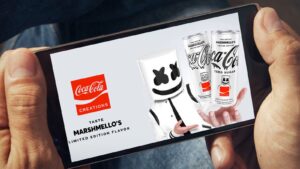
The best modern example of this is Coca Cola Creations. The core stayed sacrosanct through hierarchy, while the surrounding design became a playground. Campaign mentions how Creations stretched the visual language through variants like the gaming led Byte expression and the Marshmello collaboration, while keeping the iconic essence intact.
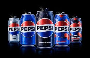
If you want a “how to do it without losing the plot” reference, look at Pepsi’s 2023 redesign case study published by PepsiCo Design. Their own language is revealing: they aimed to connect heritage with a bold future, unlocking flexibility across physical and digital spaces, and building motion and “pulse” into the identity system.
The other side of the story is what happens when you “fix what is not broken” and delete recognition assets.
Tropicana’s 2009 packaging change is still a warning label for every CEO. Multiple summaries of the case report that sales dropped 20% within two months, with an estimated loss around $30 million, and the brand reverted.
And backlash is no longer only cultural. It is financial, instantly. we pointed to Cracker Barrel’s 2025 logo change backlash, and CBS News reported that shares fell 7.2% in one trading session, shedding about $94 million in market value.
Here are two more real world examples that matter for “icon thinking”, not just “logo thinking”.
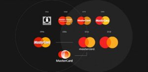
– Mastercard deliberately prepared the market for a wordless symbol. In 2019, Mastercard announced it would drop its name from the brand mark in select contexts, letting the overlapping circles stand on their own across physical and digital touchpoints.
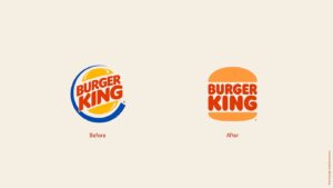
– Burger King’s 2021 rebrand leaned into simplification and heritage cues, built to work better across modern digital surfaces while still feeling “Burger King”. Coverage highlighted that the identity returned to earlier forms while modernising the system for today.
Now the question every founder asks us is: what does Gen Alpha actually change in the brief?
– It changes the unit of brand building from campaign to ecosystem.
– It changes the primary canvas from billboard to phone grid.
– It changes the winning move from “tell a story” to “create loops”, rituals, collectibles, community participation.
– It changes the expectation from “be consistent” to “be recognisable while shapeshifting”.
Lets call this cultural fluency and sensory expansion. That is not just marketing poetry. It is memory engineering. When Sprite builds an experience like Waterbomb style festival activations, it is embedding multi sensory cues and user generated content loops, so the icon lives on social feeds as experience proof, not as an ad.
This is where the “icon” becomes more than a shape. It becomes a set of cues across modalities.
– Visual cue: color, silhouette, contrast, motion language.
– Auditory cue: sonic logo, notification tone, short mnemonic.
– Interaction cue: swipe patterns, micro animations, haptics.
– Social cue: remix culture, templates, filters, sticker packs.
– Cultural cue: collaborations that signal belonging, not sponsorship.
In Beryl terms, we treat this as an Icon Stack. If you want to rebrand for Gen Alpha, you audit and rebuild this stack, in order.
– The core mark, what must never change: signature color, silhouette geometry, primary wordmark logic, or one sacred symbol.
– The micro mark, what survives at 24 to 32 pixels: simplified silhouette, no fragile details, high contrast.
– The motion mark, what feels alive on screens: reveal, bounce, pulse, morph rules.
– The social kit, what travels through creators: templates, stickers, story frames, filter language.
– The packaging hierarchy, what wins in a 1 second glance: brand anchor first, then product, then play.
The sonic and sensory cues, what becomes subconscious recognition.
The research supports the direction. More fluent designs tend to be liked more, because fluency increases positive response. And when the stimulus is visual, comprehension can operate at very short exposures, which is why shape and contrast are not “design details”, they are commercial variables.
Also, do not confuse “simple” with “generic”. Simplicity is not the goal. Recognisability is the goal. Sometimes complexity signals premium, craft, or excitement, depending on category and personality. Your job is to choose the right level of complexity for the context of use.
A practical way to avoid the classic rebrand disaster is to manage change as a portfolio, not as a single reveal.
– Keep one to two anchors untouched, usually color and silhouette.
– Change one major element at a time, typography this cycle, motion language next cycle.
– Pre train the audience through transitional states, limited drops, collaborations, seasonal packs, so the new cues become familiar before they become permanent.
– Use “recognition tests” at icon sizes, not just design reviews on large screens.
If you want one line that we use internally to stop teams from overdesigning: do not optimise for the boardroom. Optimise for the phone grid.
Closing thought, and this is an opinion you can take to a CXO room: Gen Alpha does not need your brand to look younger. They need your brand to behave more human. That means culturally present, sensorially rich, and systemically consistent. Update the icon, yes. But protect the memory structure, because once recognition breaks, you do not “reintroduce” a legacy brand. You rebuild it from scratch, at a far higher cost than the rebrand itself.
