There is an old saying for the clients and the service providers which translates to a simple sentence that if the client is asking you to then five steps to help the product, you take a few steps in addition to be able to deliver on a larger scale effectively and efficiently. We at Beryl India strive to live up to that saying. After all, if one is operating in the market, the market is made up of varied calibre competitors, the task is not just to be your best but to emerge as a convenient and obvious choice on the tip of the consumer’s tongue.
Getting drunk on the royal life
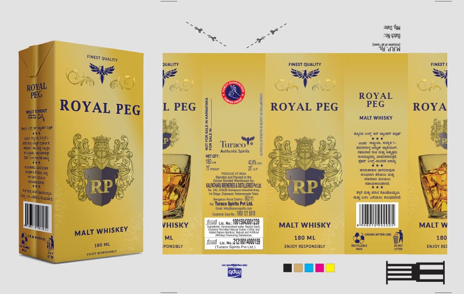
When we came on board with Royal Peg, an alcohol label which comes with its own set of unique features, unlike the ones you see in the market, we realized the scope and potential to offer. When it comes to alcohol no two brands are the same, likewise for any commodity in the market which offers value. When it comes to a niche product like that of alcohol it became integral for us to get into the shoes of the consumer and think what could be the deciding factors as he stands on the other side of the counter of the shop, buying alcohol. It is our personal observation that a person spends about sixty to ninety seconds in the purchase activity of the alcohol. In that Minimum window that is available to us to play our cards, its best to get straight to the point and cast a striking differentiating factor from the other alcohol brands in the shelf of the wine shops.

The Luxury Whiskey
01
The Luxury Whiskey
Soon after the first meeting in which we touched ground upon the motivations of manifesting this product to the market, the packaging, the logo, the colour scale of the surface area of the product, intended reach and the target market in order to successfully project the vibe a luxury brand like the Royal peg commands for itself. Going by the age old and yet true principle of “customer being the king” only holds its place when the client and the branding firm find a sweet spot of free communication and mutual interest in placing the product from the store to the houses of the people. With enough information and channelization of our multiple strategy we found that sweet spot.
02
Selecting the colour palate
The colour of alcohol packages which are available in the market are usually in dark colours or the colour of green, blue and black. In the sea of many which where Royal Peg had a possibility to get lost, we have gained by using an outer face which includes over thirty shades of yellow ranging from the lemon yellow to the golden yellow. This choice of colour in place of a real solid colour helps it to stand out and also mark a niche for itself.
03
The journey of making the brand exquisite
Realising that the customer need a strong recall value to be able to repeat an old purchase we have decorated the vector of Royal Peg with the lions and the golden fabrications. Now the packaging looks so exquisite that people remember it as a single malt whiskey brand whose outer surface has lions on them. We pictured them saying,” Bhaiya, wo sher wali single malt whiskey dena”.
Taking in the thread of the product
The exclusive and the differentiating packaging enabled the upselling of the product. With the kind of packaging we managed to upscale the sales of the product which remains a testament to the profit-oriented angle we brought to the table. This benefited the growing consumer base of the product to a further degree.

Symbol of premium product
Despite of the fact that this was not our aim, the perfection which we strived towards designing the packaging gave returns which were much bigger than the investments. Also, there is a vector of a bird on the top of the packet. It symbolizes the fine and premium product.
Exhibiting a lifestyle by differentiating the brand
With the alcohol brand, we exhibit a lifestyle. What differentiates a successful brand of a product to a product is a strong narrative. In our attempt to breathe narrative in the product we kept in mind the idiosyncrasies of the consumer, the taste, the colour scheme and the recall value which we provide. By the end of the process what we delivered is much more than a product. The object which rests in the shelf of the shop and later to home shelves is much more. A kind of lifestyle which has unmatchable parallels and cuts at a mark above.


