Back
- our services
all services ➞
solutions ➞
Artificial Intelligence
Experience Transformation
Customer Engagement
Digital Commerce
Digital Engineering
Cloud & Infrastructure
Application & Infrastructure
Management
Global Capability Centers
- expertises
- works
- insights
- get in touch
about koko tawa
portraying the intentions
they look forward to a strong, healthy and long-term relationship. This is only possible when they maintain an informal approach and be transparent about their motives with the stakeholders.

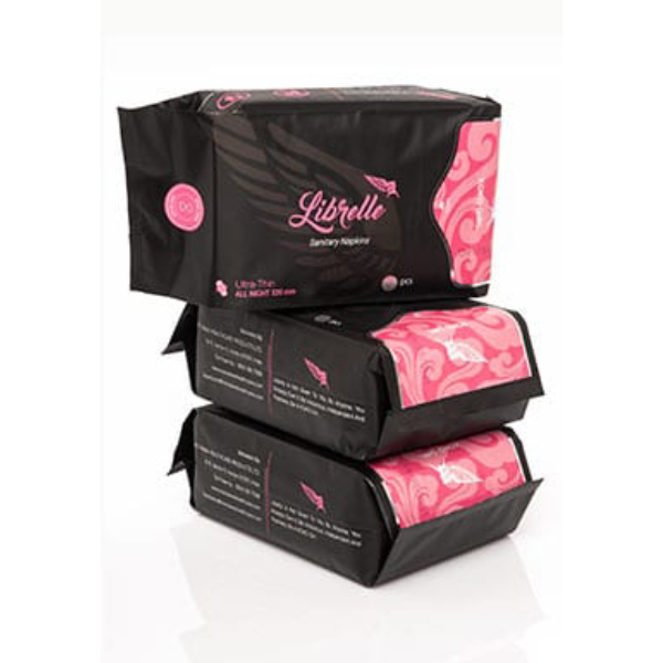
products
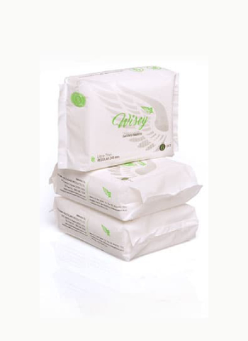
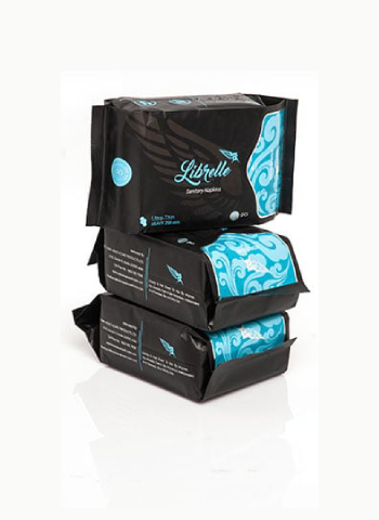
why choose us
step_01
the brand performed detailed research to get a note of the overlooked areas of healthcare. This research resulted in various outcomes such as access of healthcare to all corners, better and quality healthcare products, affordable to apiece background of people, better hygiene, and female sanitization. Basically, the brand aims at changing the entire scenario for healthcare.
step _02
the Koko Tawa logo is designed by taking the basic functioning of living beings together. The infinity beating of a heart represents eternal living. The brand has taken the infinite design of the logo to depict immortality. The term immortality here connotes the solutions to endless healthcare issues that the county is facing at the moment.
step_03
the second aspect of the logo is the double helix system that seeks the formation of each living being on this earth. Meaning, that the brand aims to become the base of the healthcare industry by promoting good health and quality life all around. This signifies the brand’s approach to unleash the issues from the base and maintaining it throughout.
step_03
the font of the logo is Sans-serif which means informal. The reason behind choosing this particular font was that the brand wants to informal and friendly with their customers.
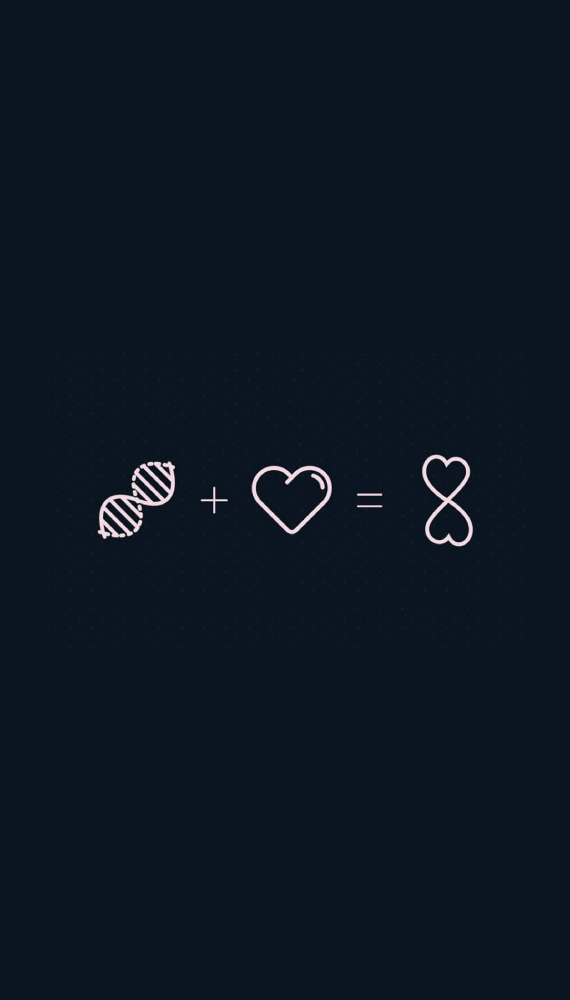
the structure of the logo is designed in a unique way. Both the ends of the logo are identical which means transparency. The brand urges to be transparent throughout their journey. During the process of logo design, many other options were given a thought. For instance, plus sign, the heartbeat frequency, the caduceus, red crescent, the rod of Asclepius, and many more. However, none other than the current conglomerate logo was able to make its place due to shady and unclear meaning. The brand wanted to make its idea of healthcare very clear from its logo. Nevertheless, after detailed research, they were able to build their foundation for the logo.
Making a Difference
Koko Tawa (The Brand) was brought to life when the team felt neglected and felt an urge to make the menstruating days better. This was the basic idea that ignited the team to go forward and antipode healthcare for good.
reviews
i am sure everyone will be highly satisfied with their work. They offer quote at great price and their design forecasting ideas were very unique.
priyanka jain
the most important part is branding, and their expertise can be felt. Thanks to Beryl, they did a fantastic job in launching and displaying our drapery.
raghav
founder
berylagency
berylagency
berylagency
berylagency
berylagency
agency
insights
career
services
© 2025 – 2026 | alrights reserved by berylagency