- our services
all services ➞
solutions ➞
Artificial Intelligence
Experience Transformation
Customer Engagement
Digital Commerce
Digital Engineering
Cloud & Infrastructure
Application & Infrastructure
Management
Global Capability Centers
- expertises
- works
- insights
- get in touch
about gleevoaz

products

why choose us
step_01
the gradient blue block which escalated in an increasing slope then curls its way downwards and slowly disintegrate into smaller gradient blue bite sized dots and with each shade going lighter than the previous one they turn into green, making a circle like formation with the dots.
step _02
the small dots show the binary or the digital data which is not optimized after the process. In contrast to the analog data which is not usable and outdated and redundant this small bite sized circles representing the usable and treated data which can now be used by the consumers.
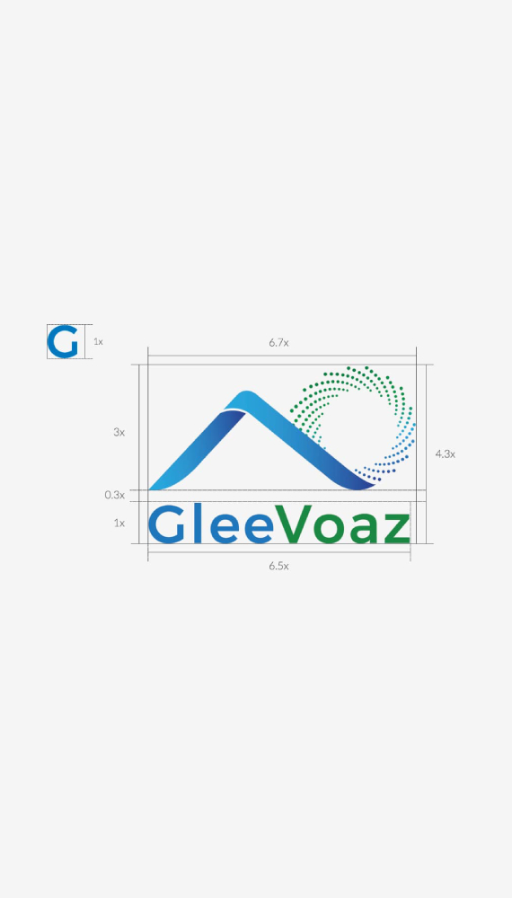
there are not many logos in the market of companies which dictate the function that is performed by the appeal of the logo itself, we made it possible with the logo of Gleeovaz. Focusing on the usability and adaptability aspect of the logo we have made sure that the background which is chosen is transparent in nature. The user now will not have to take ten things in consideration while using or applying the logo in a different format. In the same line of thought, the way by which a person recognizes a firm is by its logo, even before you see the name attached the firm. For all you know it could be the only thing that you end up remembering. Making a succinct and efficient way of communicating information about your business thus making a significant impact on a firm’s public perception.
reviews
agency
insights
career
services
© 2025 – 2026 | alrights reserved by berylagency