FinServe

FinServe is a team of professionals who work together for design and implementation of comprehensive solution for sustainable credit rating. Their experience in the industry is their competitive edge that helps the client to gain loyal insight of their portfolio.
about FinServe

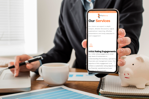
realizing the importance of a digital presence

every business needs a website. Despite having a well-established business as “credit rating advisory” and despite of extremely low competition in the industry, the client identified the need and importance of website. Imagine if you tell somebody about you or visit somebody, it is normal for people to search you online. Here we’ll emphasis on the fact that everybody needs a website as a business essential.

representing the business success

we also suggested to categorized clients in percentage presented as success of business.
#image_title

gallery

apparel that makes you land in the lap of luxury

1.
the queen’s sweep

when we shot the breeze and learnt the ropes, we clearly knew minimalist design would be the best fit. Keeping in mind that we must not produce garbage that ends up in landfills, we decided on rendering eco-friendly options. A small note which read “Hey there! I’m a 100% Recyclable mailer” would surprise the customer and make the brand more likable. “Going green” has a major impact on the brand as well as the environment. We were very sure that sustainability would make the brand trustworthy and gives consumers a thought that they have made a great choice. To make unboxing experience special, we uniquely curated the box with an elegant look. We thought of a short note with an exclamation mark that would put a smile on the face of the person unwrap the package.

2.
effortlessly chick

when we came in line with the aspirations of the brand, we associated the brand logo with its mailer and box designs. Despite the era we live in, black and white never goes out of style. It stays as the in-colour for ages and gives a classy look. Appropriately as a part of branding, the B and 9 logo inspired by the keys of the piano was to be printed on the mailer on one side. Why Piano? The melodious instrument being originated from Italy represent the name of the brand. The magic tiles of the piano with black and ivory keys makes it the queen of instruments due to its elegance. The royalty of a piano mirrors the brand and the logo take the shape of the keys.

3.
a personal note sets you apart

a thank you card delights the customers. It is a way of saying I appreciate your support simple thank you would make a huge difference and changes the way how a brand is perceived. The card contains the links to social media pages of Blanc9 which would build a relationship with the brand. That makes the customer want to show off the piece of clothing they picked up and they never forget to tag the brand in their stories. Who wouldn’t want to flaunt their new collection and recommend it to their friends? We give the customers a chance to put their opinions through the social media handles. It gives a personal touch to the person unboxing and paves way for a satisfying experience.

creating a relationship with the client

the client was then talked for hours to get cases from the conversation: 4 micro case study helps customer directly relates with their own issues and cases. EMPATHY

creating the brand value

in nut shell, Website that beryl created, made client one the most renowned brands in the niche and double the business in span of 3 years.

happy customer

testimonials

icon-1
neha sharma
ceo, blance9

Let's make

big thinks

together

berylagency
berylagency
berylagency
agency
contact
career
insights

© 2025 – 2026 | alrights reserved by berylagency